— DisclosureThis article may contain affiliate links. We may earn a commission at no extra cost to you.
We sometimes earn a small commission when you buy through our links. It costs you nothing extra and helps us keep writing. Read our full policy →
The color of your bathroom is not a cosmetic decision.
It is an emotional one.
You experience your bathroom’s color at the most vulnerable moments of the day — first thing in the morning when your defenses are down, last thing at night when you are winding toward sleep. You see it reflected back at you in the mirror alongside your own face. You see it through steam, through water droplets, through the half-open eyes of someone who is not fully awake.
A cold, stark white bathroom says: wake up. Get moving. This is not a place to linger. A warm cream bathroom says something entirely different: you are welcome here. Take your time. This room is yours.
The difference between those two messages is one shade. One undertone. One decision about whether the white on the wall leans toward blue or toward cream.
That is how powerful bathroom color is. Not because it is decorative — because it is felt. By your skin under the light it reflects. By your eyes before your brain has finished processing. By the part of you that decides within three seconds whether a room is a place you want to stay or a place you want to leave.
These 27 color ideas will help you choose shades that make you stay.
Part 1: Warm Whites and Creams — Getting the Foundation Right
Most bathrooms start with white. The question is which white — and the answer matters more than any other color decision in the room.
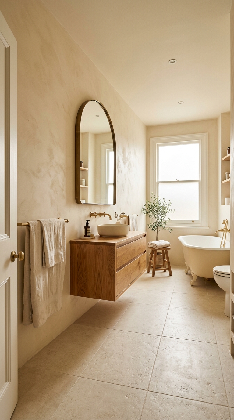
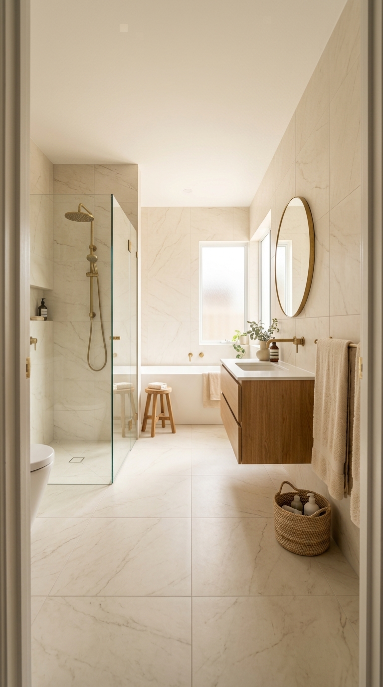
1. Warm White — The Single Most Important Choice
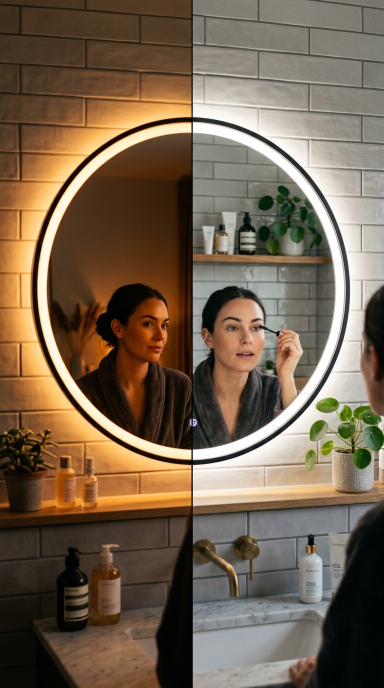
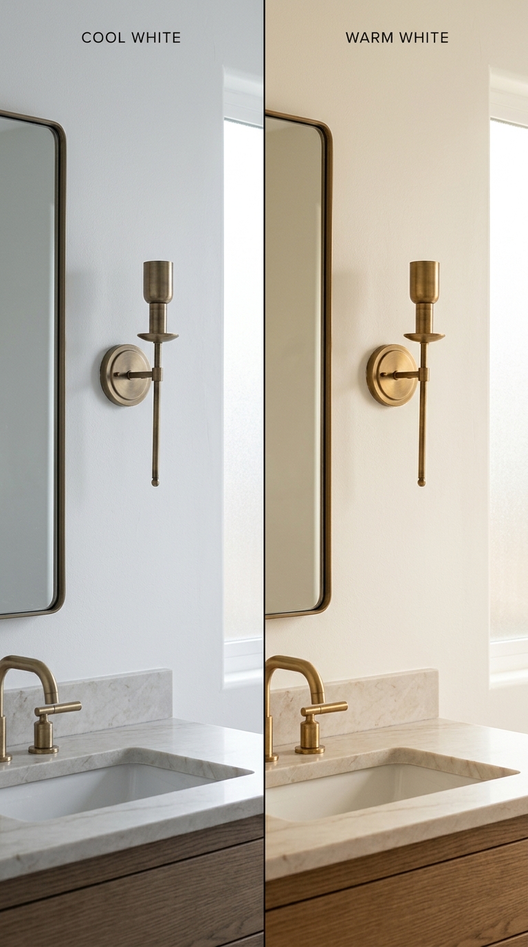
The difference between a warm white and a cool white on bathroom walls is the difference between a room that welcomes you and a room that examines you.
Cool white — with a blue, grey, or green undertone — reflects light with a clinical efficiency that makes skin look pale and shadows look harsh. It is the default white in most rental bathrooms and builder-grade homes, and it is the reason most people think of their bathroom as the least inviting room in the house.
Warm white — with a cream, yellow, or pink undertone — reflects light with a softness that flatters everything it touches. Skin looks warmer. Shadows look gentler. The room feels like it is holding you rather than displaying you.
Test three warm whites on a large tile sample or painted board. Observe them in the bathroom’s specific light conditions — morning, afternoon, and under the artificial light you actually use at night. The right warm white will feel warm at every hour without appearing yellow.
2. Soft Cream — One Step Warmer Than White
For bathrooms that receive abundant natural light, soft cream takes warm white one step further. It is unambiguously warm — not white with a warm undertone, but a genuine cream with depth and richness.
Soft cream on bathroom walls creates a cocoon quality that pure white — even warm white — cannot match. The room feels enveloped. The light bouncing off cream walls is warmer than the light entering through the window, which means the room generates its own warmth independent of the light source.
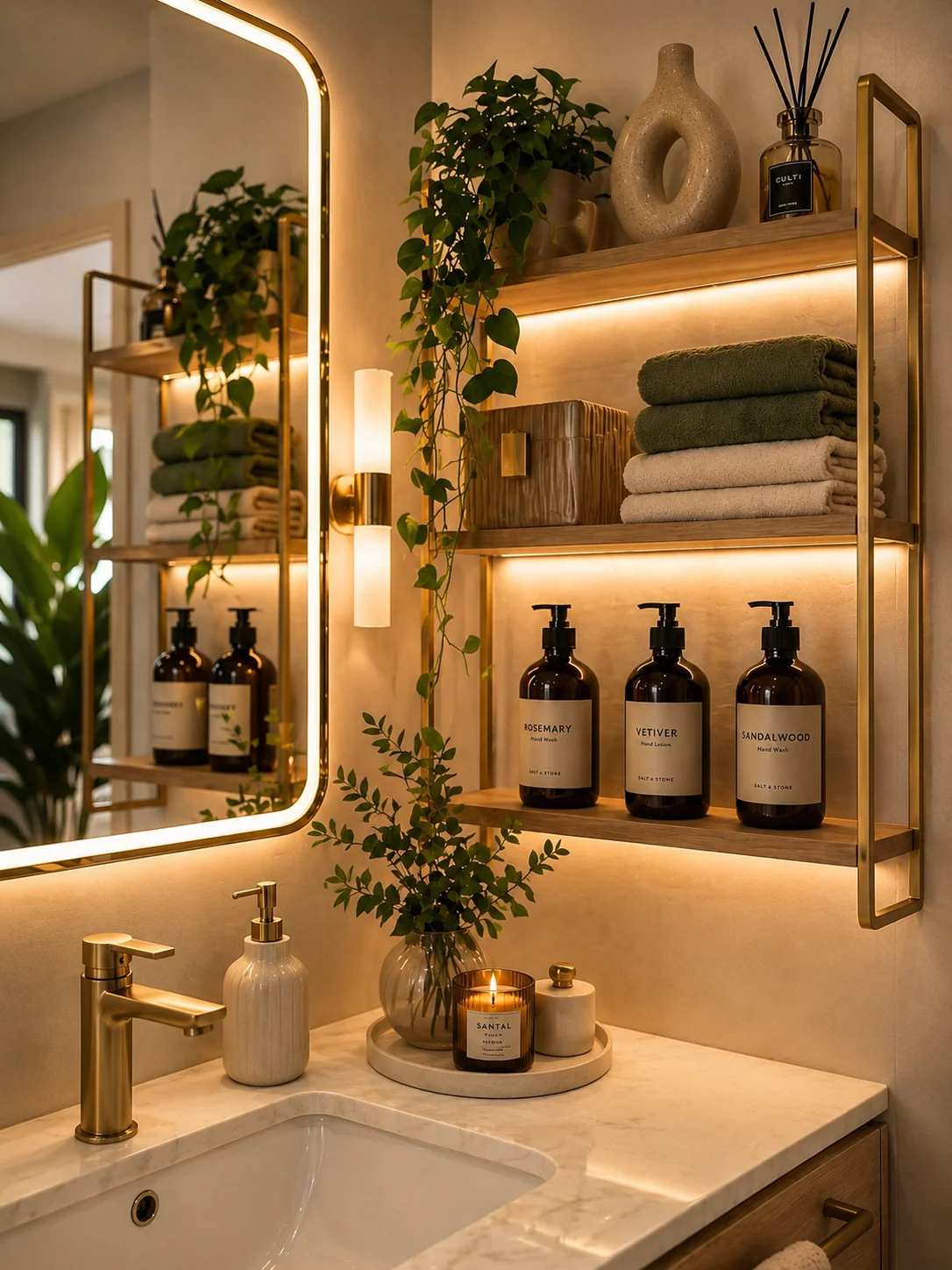
This works particularly well in bathrooms with warm oak vanities and brass fixtures. The cream walls, honey oak, and warm brass create a tonal family so cohesive that the room appears to have been designed by a single mind rather than assembled from separate decisions.
3. Natural Linen — The Colour of Undyed Fabric
There is a specific warm neutral that exists between cream and sand — the colour of undyed natural linen fabric. It is warmer than cream without being as deep as sand. It has a barely perceptible pink undertone that makes skin look healthy and warm in the mirror.
This colour on bathroom walls is extraordinarily flattering. Under morning light, it reads as the softest warm neutral. Under evening lamp light, it deepens to a gentle warm sand. It shifts throughout the day without ever looking cold or flat.
Pair it with a floating oak vanity, warm stone countertop, and brass fixtures. The natural linen wall colour makes every warm material beside it look richer.
4. Warm Sand — For the Statement Neutral
When cream feels too light and you want the walls to have genuine visual presence without introducing colour, warm sand is the answer.
Warm sand is a full neutral — it reads as a colour in its own right rather than a shade of white. On bathroom walls, it creates a sense of depth and enclosure that lighter neutrals cannot achieve. The room feels deliberately designed rather than defaultly white.
Warm sand works best in bathrooms with good natural light or excellent warm artificial lighting. In very dark bathrooms with no natural light, warm sand can feel heavy without sufficient illumination to bring it alive.
5. The Warm White Ceiling — Never Forgotten
In a bathroom where the walls are any colour deeper than the palest warm white, the ceiling should be the lightest tone in the room — a warm white that is one to two shades lighter than the walls.
A ceiling lighter than the walls creates the impression of height. It lifts the room. The eye reads the brighter surface overhead as further away, and the room feels taller than it is.
A ceiling the same colour as warm sand walls, by contrast, closes in from above. The room feels lower, heavier, more compressed. Unless that cocoon effect is deliberate, keep the ceiling lightest.
Part 2: Earthy Tones — Colour That Comes From the Ground
The safest and most beautiful bathroom colours are the ones that come from the earth. Terracotta, clay, warm mushroom, soft olive, dusty sage — these colours have been part of human shelter for thousands of years, and they trigger a subconscious recognition of warmth and safety.
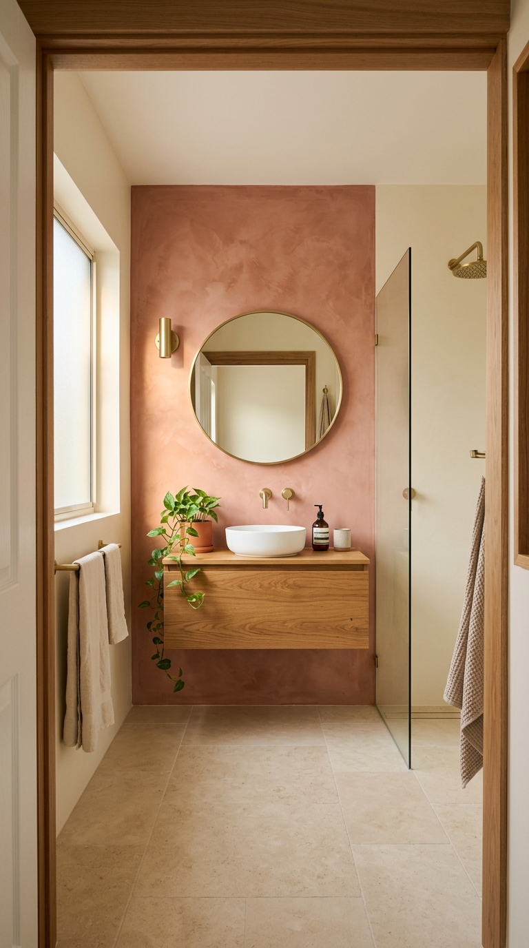
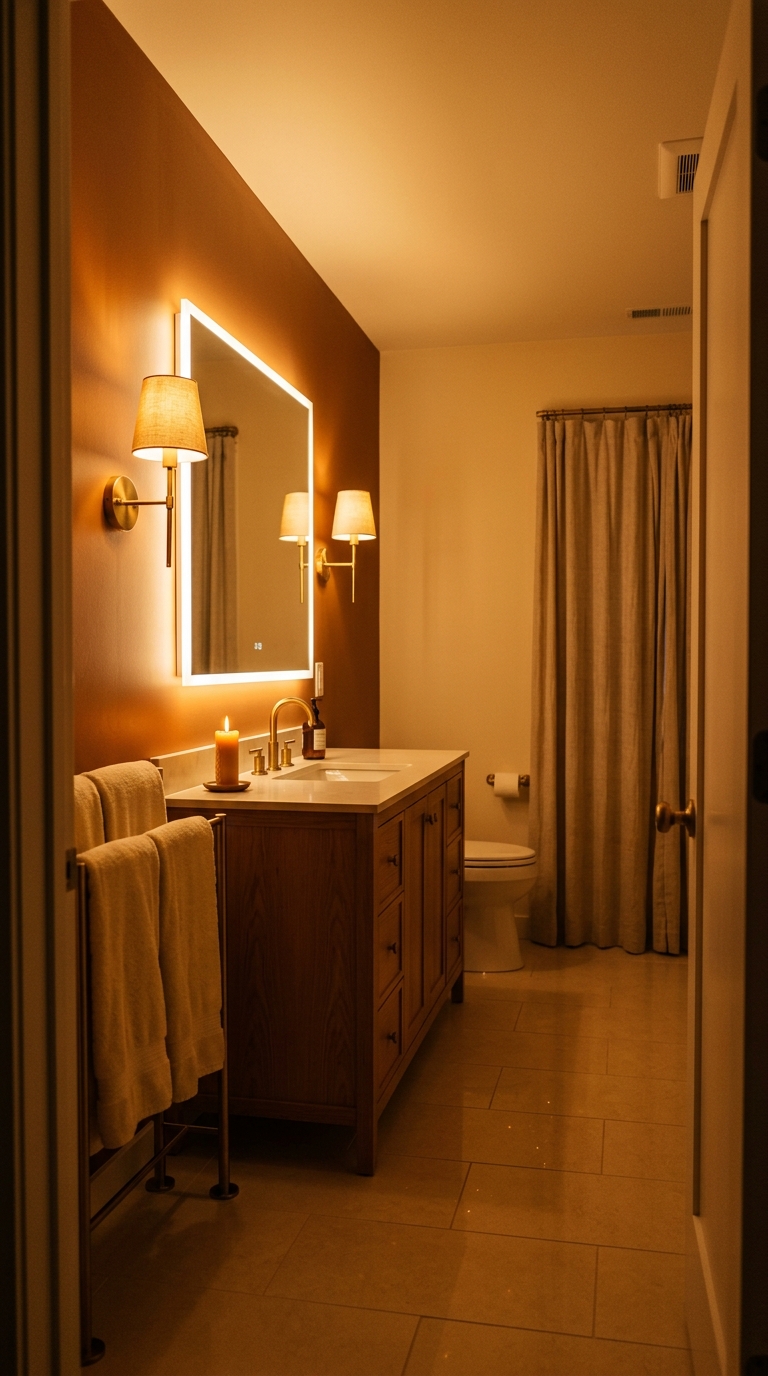
6. Soft Terracotta — The Warmest Accent Wall
A single accent wall in soft terracotta behind the vanity transforms a bathroom from neutral to memorable. Terracotta is one of the warmest colours available — it is literally the colour of baked earth — and its warmth radiates outward into the room.
Soft terracotta as an accent, not all four walls. One wall. The remaining three in warm cream or warm white. The terracotta wall becomes the room’s focal point, the vanity’s backdrop, and the colour that makes your face in the mirror look warmer.
Choose a soft, muted terracotta rather than a bright orange. Think sun-baked clay, not traffic cone. The muted version is sophisticated. The bright version is aggressive.
7. Warm Clay — Deeper and Earthier
Warm clay pushes deeper than terracotta into the brown spectrum. It is the colour of wet earth, of unglazed pottery, of the ground beneath an oak tree. On a bathroom wall, it creates a sense of elemental grounding — the room feels connected to something ancient and natural.
Use warm clay as a full-room colour only in bathrooms with excellent natural light, or as an accent wall in bathrooms with moderate light. The depth of the colour absorbs more light than lighter neutrals, so the room needs sufficient illumination to stay warm rather than becoming dark.
Warm clay paired with a white or warm stone countertop and brass fixtures creates a palette that looks effortlessly expensive.
8. Warm Mushroom — The Sophisticated Middle Ground
Warm mushroom sits between cream and clay — deeper than any white, lighter than any earth tone, with a distinctive grey-pink-brown complexity that reads as quietly sophisticated.
Warm mushroom is the colour for people who want their bathroom to feel designed without being dramatic. It is never the first colour you notice when entering the room. It is the colour that creates the atmosphere you notice — a sense that the room has been considered, that someone thought carefully about what would feel right.
On all four walls with a lighter warm white ceiling, warm mushroom creates a bathroom that feels like a cocoon of sophisticated calm.
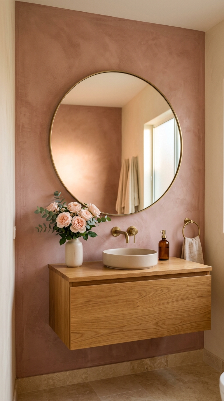
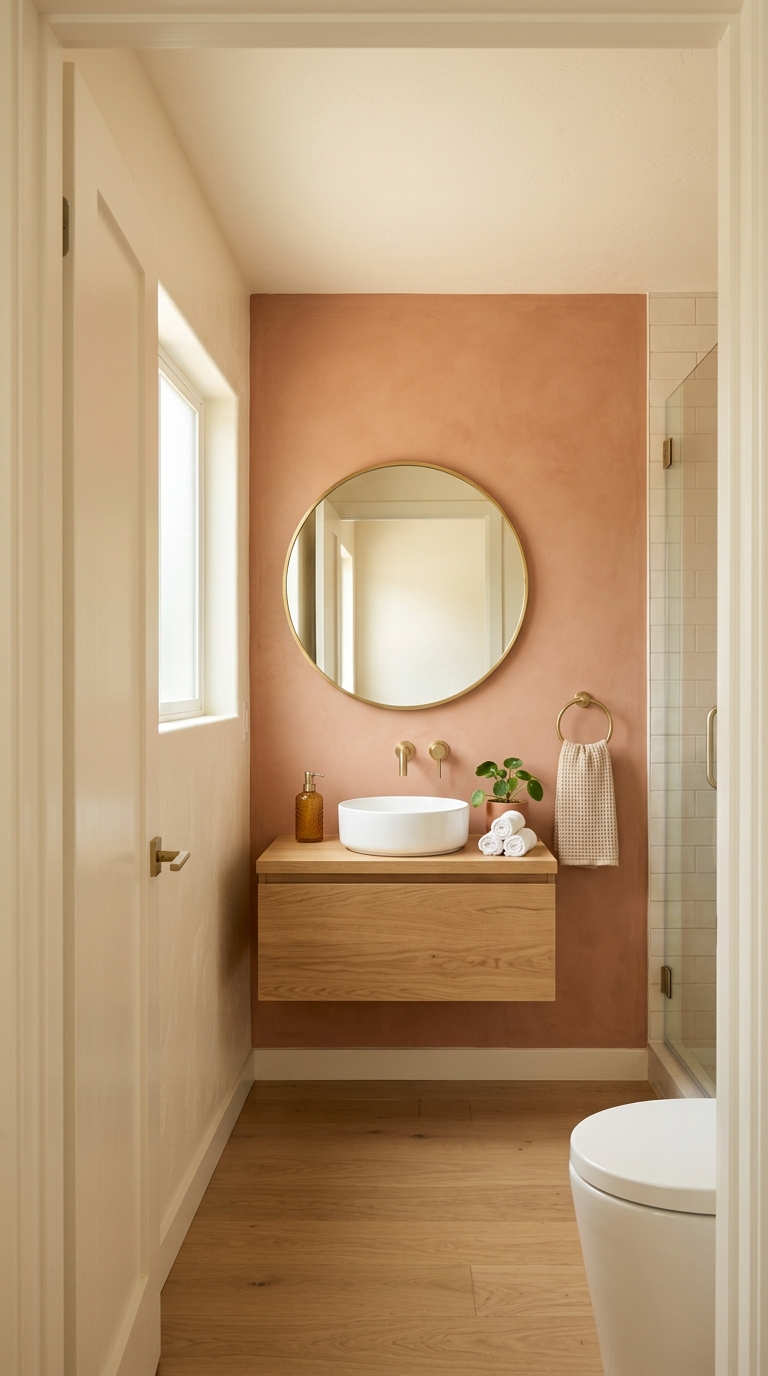
9. Dusty Rose — Unexpected Warmth
Dusty rose in a bathroom is a quietly revolutionary choice. It is warm without being earthy. It is feminine without being gendered. It is the colour of the sky twenty minutes after sunset — a warm pink that has been softened by distance and atmosphere until it reads as neutral to most eyes.
On a single accent wall or as a full-room colour in its most muted form, dusty rose creates a bathroom that flatters skin tones in the mirror more than any other colour. The warm pink undertone counteracts the blue-green cast that overhead lighting often introduces, making the face in the mirror look warmer, healthier, and more rested.
Part 3: Green — The Bathroom’s Natural Companion
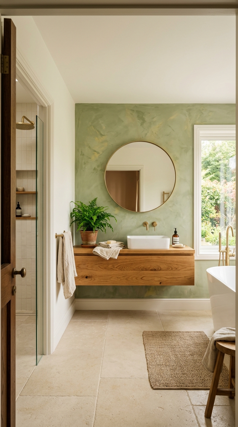
Green is the one colour family that feels completely at home in a bathroom. The association with nature, water, growth, and freshness makes green feel like the bathroom’s natural partner rather than an imposed design choice.
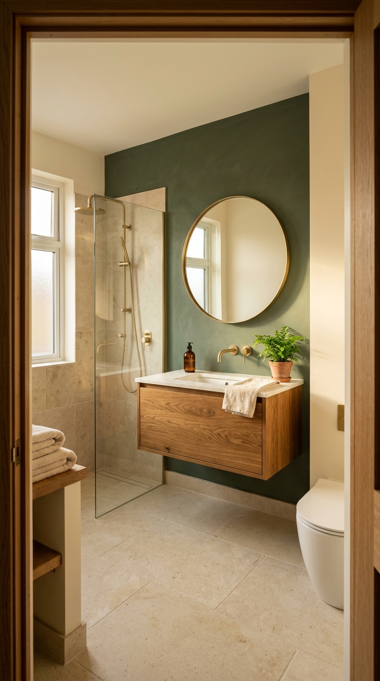
10. Deep Sage — The Designer’s Favourite
Deep sage green has become one of the most specified colours for bathroom accent walls among interior designers — and for good reason. It is warm enough to feel inviting, cool enough to feel fresh, natural enough to feel organic, and sophisticated enough to feel designed.
As an accent wall behind the vanity, deep sage creates a backdrop that makes warm oak vanities look extraordinary, brass fixtures look like jewellery, and the face in the mirror look surrounded by nature.
The key is choosing a sage with warm yellow-green undertones rather than cool blue-green. Warm sage harmonises with oak and brass. Cool sage fights them.
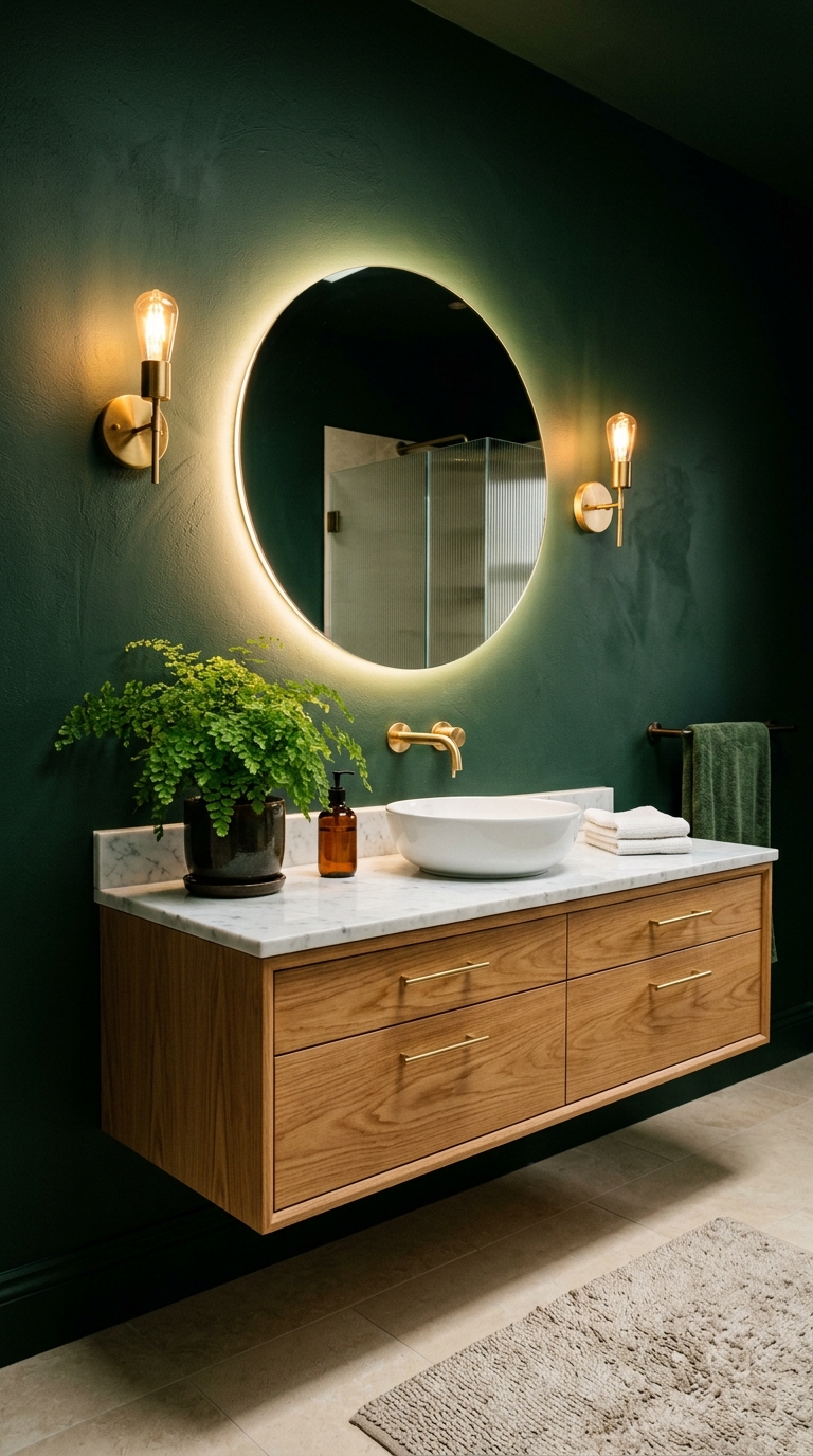
11. Forest Green — For Dramatic Depth
Where sage whispers, forest green speaks. It is deeper, darker, more enveloping — the colour of old-growth trees, of deep ponds, of the richest natural green the eye can find.
Forest green as a full accent wall in a bathroom creates extraordinary drama. The dark colour recedes visually, making the wall appear further away than it is — which in a small bathroom actually makes the room feel deeper. The contrast between the dark green wall and the lighter warm walls creates a visual depth that flat one-colour rooms cannot achieve.
This is the bold choice. The high-impact choice. The choice that makes visitors ask about the bathroom.
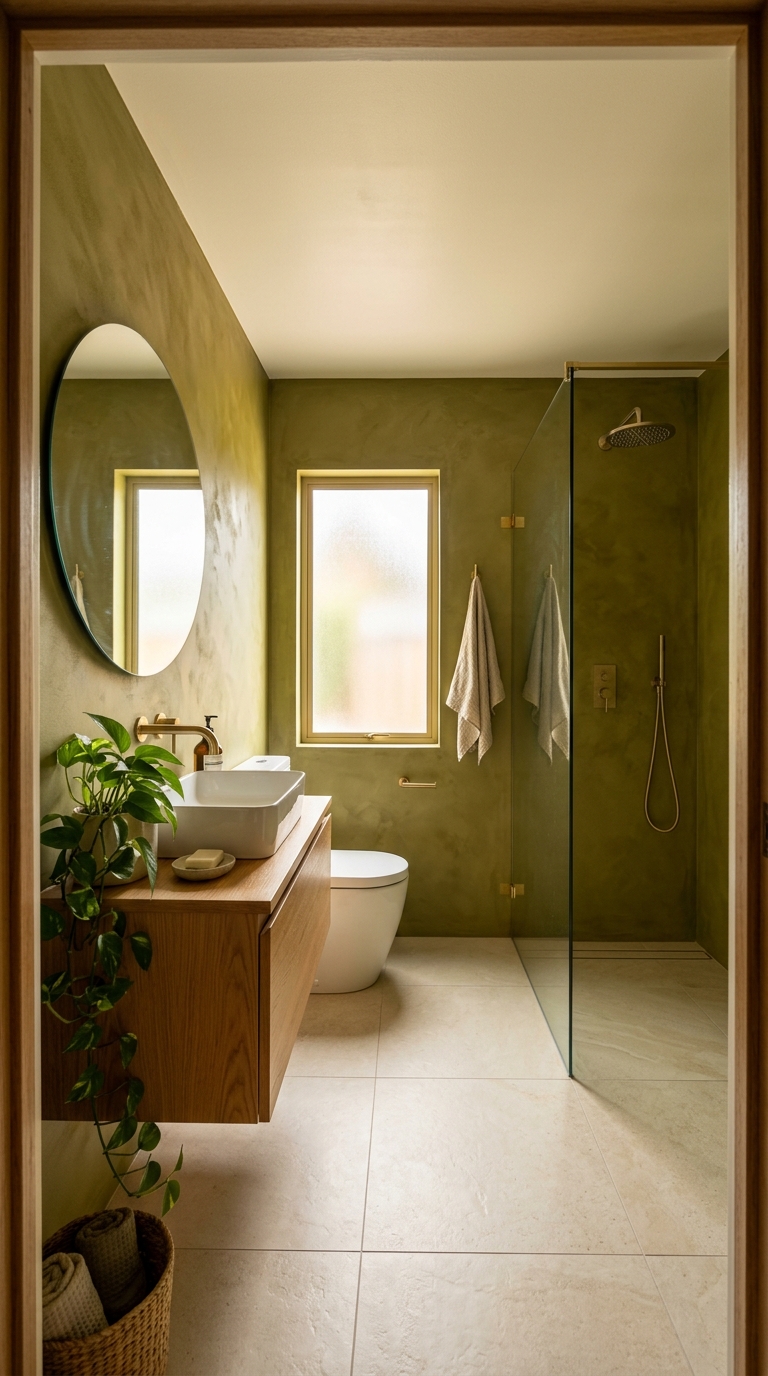
12. Olive — The Warmest Green
Olive green is green’s warmest member. Where sage has cool moments and forest green can lean cool in certain lights, olive is unambiguously warm — its yellow and brown undertones anchor it firmly in the warm spectrum.
Olive on bathroom walls creates a room that feels like a greenhouse or a garden room. It harmonises naturally with every warm material — oak, brass, terracotta, linen, warm stone. Nothing fights. Everything belongs.
In a small bathroom, olive as a full-room colour (all four walls) with a lighter ceiling creates an enveloping quality that is dramatic in photographs and deeply calm in person.
Part 4: Blue — The Riskiest and Most Rewarding
Blue in a bathroom is risky because most blues are cool — and cool colours in a small wet room can feel cold and institutional. But the right blue, with the right warm counterbalance, creates something extraordinary.
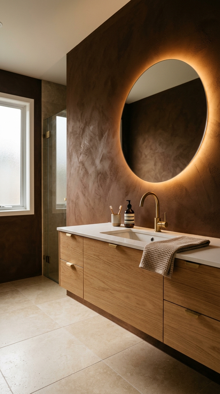
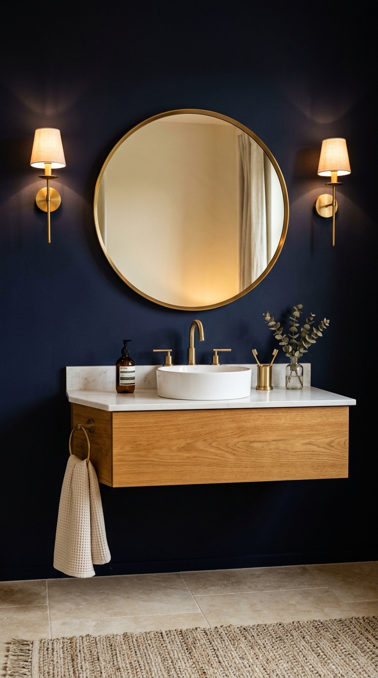
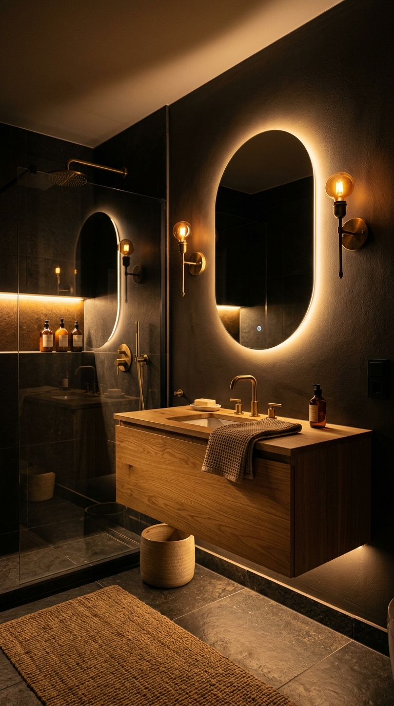
13. Navy as an Accent — Theatrical Depth
Navy blue on a single accent wall creates the deepest, most theatrical bathroom colour experience. The near-black depth of navy makes the wall virtually disappear — the eye reads it as shadow rather than surface — and everything in front of it (the vanity, the mirror, the fixtures) appears to float.
The critical requirement: substantial warm counterbalance. Warm oak vanity. Brass fixtures, not chrome. Warm white remaining walls. Warm lighting. Without these warm elements, navy becomes cold and forbidding. With them, it becomes dramatic and beautiful.
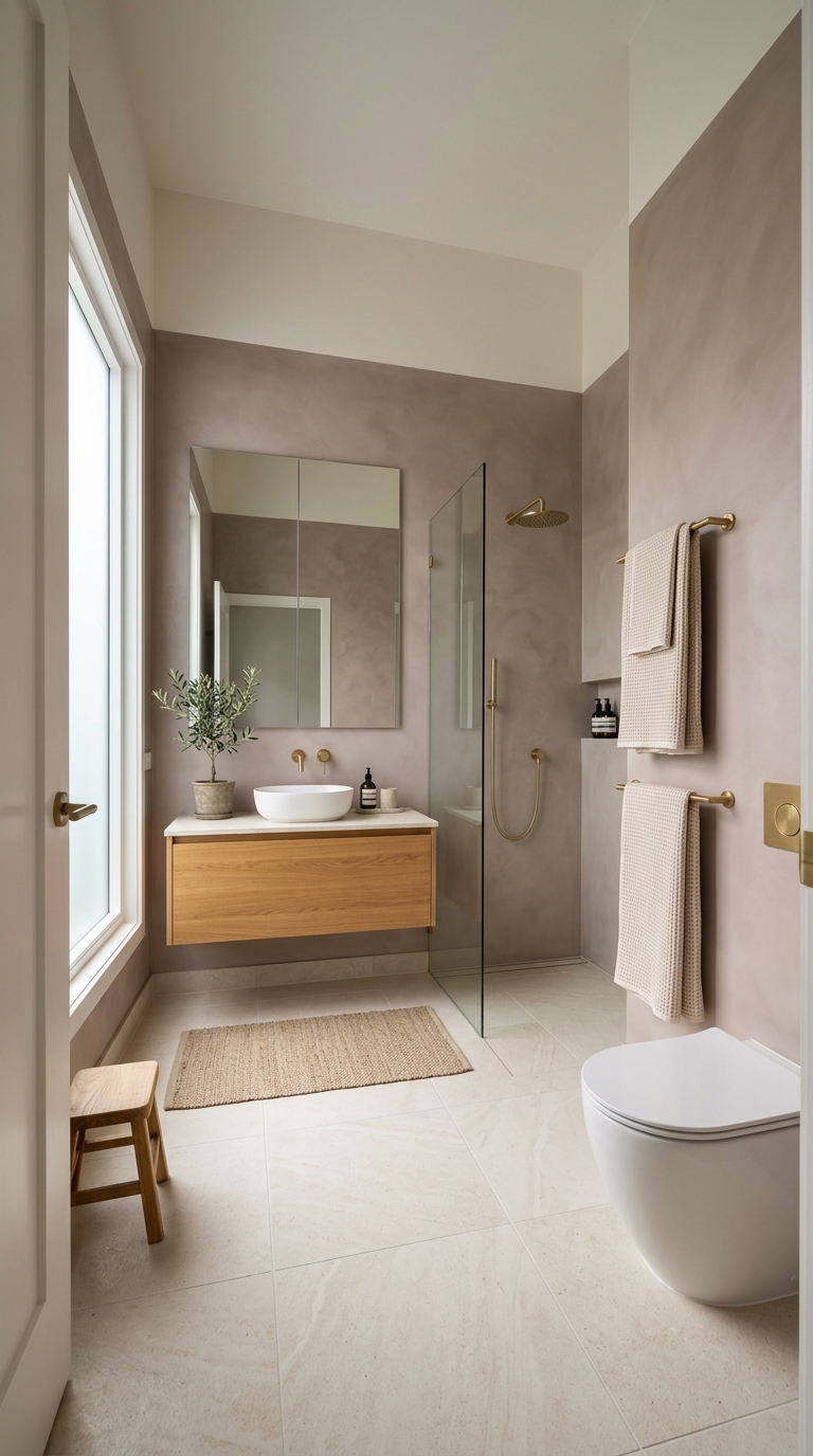
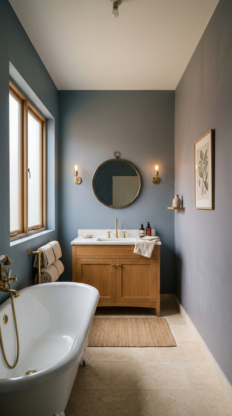
14. Warm Blue-Grey — The Safe Blue
For those drawn to blue but wary of the cold risk, warm blue-grey offers the perception of blue with the safety of grey’s neutrality and a warm undertone that prevents any chill.
Warm blue-grey reads differently depending on the light: slightly blue in bright daylight, slightly grey in overcast light, slightly warm in evening lamplight. This chameleon quality makes it interesting without being demanding — the colour shifts gently throughout the day without ever feeling cold.
On all four walls with warm white ceiling, warm blue-grey creates a bathroom with the calm of blue and the warmth of grey.
Part 5: Tile Colour — The Permanent Decision
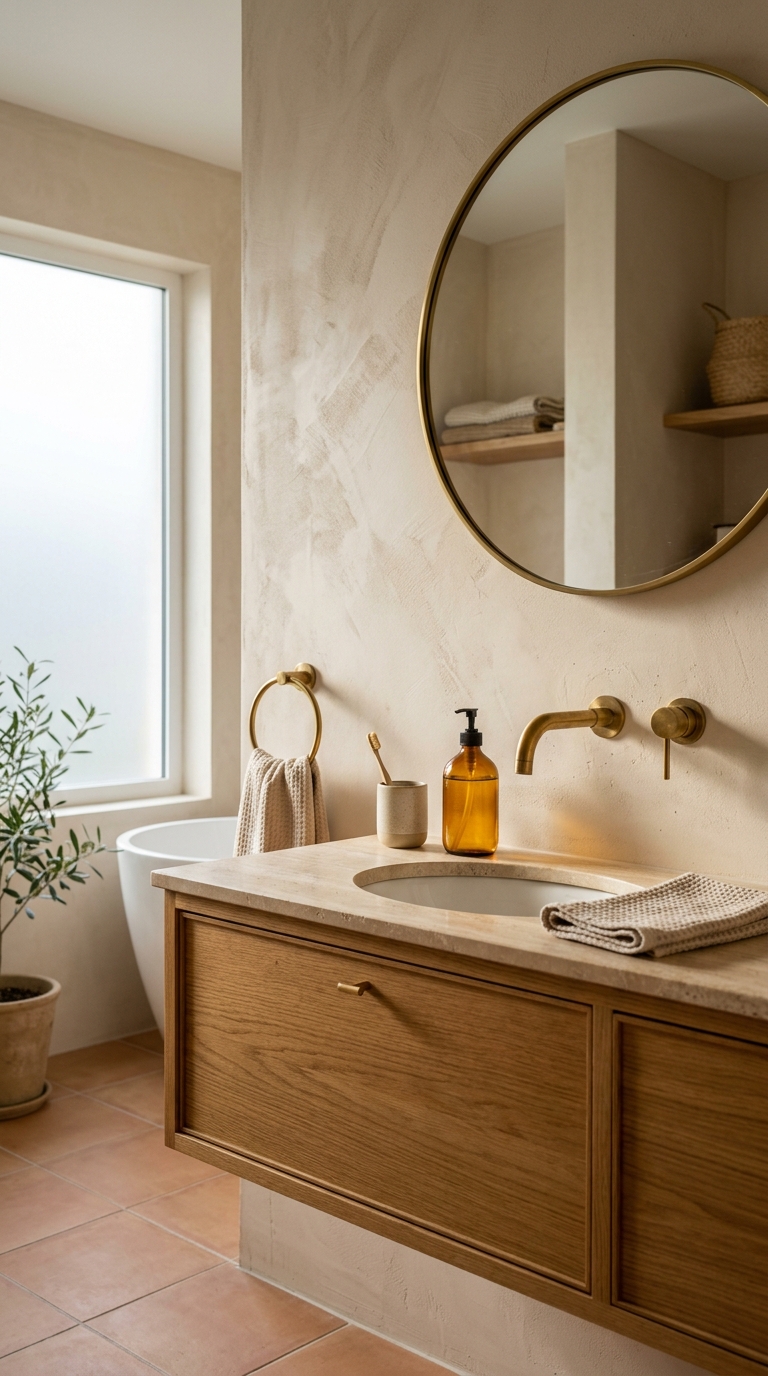
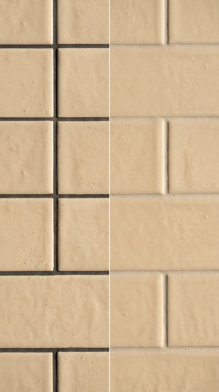
15. Warm Ivory Tiles — The Universal Choice
If there is one tile colour that works in every bathroom regardless of size, style, or light conditions, it is warm ivory. Not bright white (too clinical). Not cold grey (too sterile). Warm ivory — the colour of heavy cream, of natural limestone, of the inside of a perfectly baked meringue.
Warm ivory tiles on floor and walls create a seamless warm envelope that makes small bathrooms feel larger, dark bathrooms feel lighter, and every other material in the room look warmer. They are the universal foundation colour.
Choose tiles with subtle veining or natural variation to prevent the surface from reading as flat. A marble-look porcelain in warm ivory with gentle warm grey veining. A honed limestone-look in warm cream with natural tonal shifts. Even the subtlest variation adds depth.
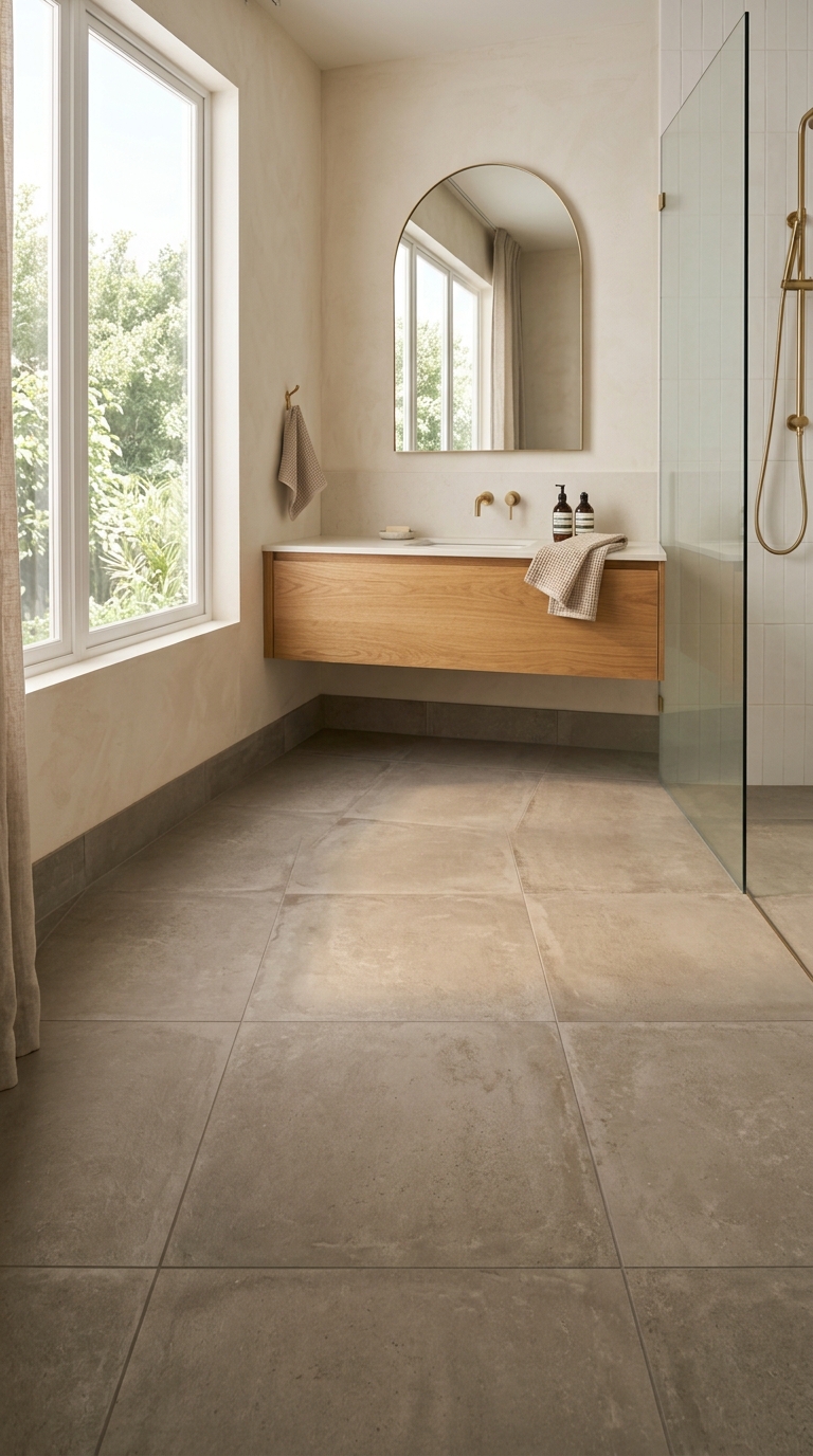
16. Warm Greige Tiles — Depth Without Drama
Warm greige tiles — the blend of warm grey and beige — add more visual weight than ivory while remaining firmly neutral. They create a floor or wall surface with genuine presence that doesn’t demand attention.
Warm greige tiles work particularly well on floors paired with lighter walls. The darker floor grounds the room while the lighter walls reflect light and maintain brightness overhead. This darker-below, lighter-above arrangement mimics natural light distribution and reads as inherently calm.
Choose tiles with a concrete or natural stone texture for additional warmth. Smooth, glossy greige tiles can read as cold. Matte, textured greige tiles read as warm and inviting.
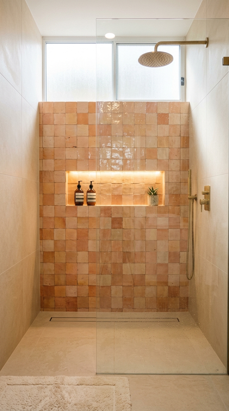
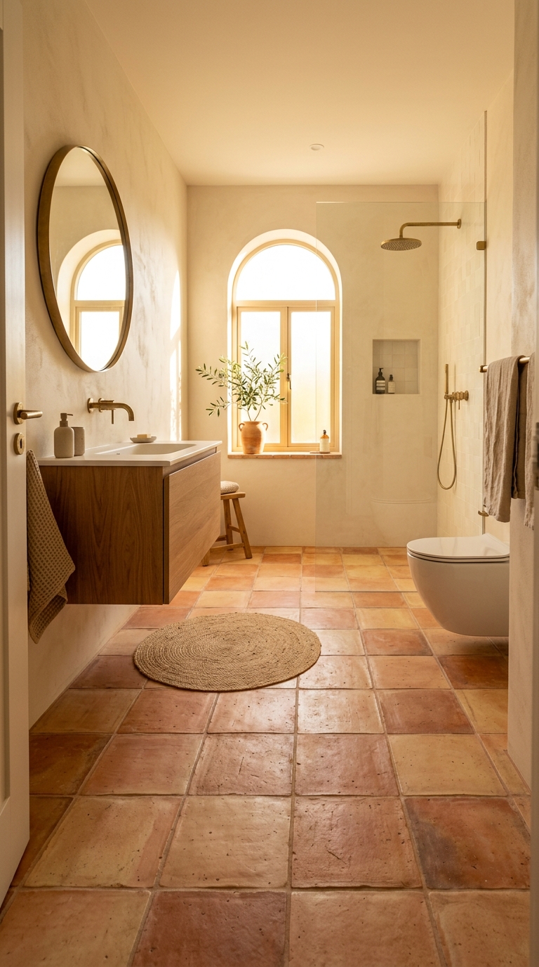
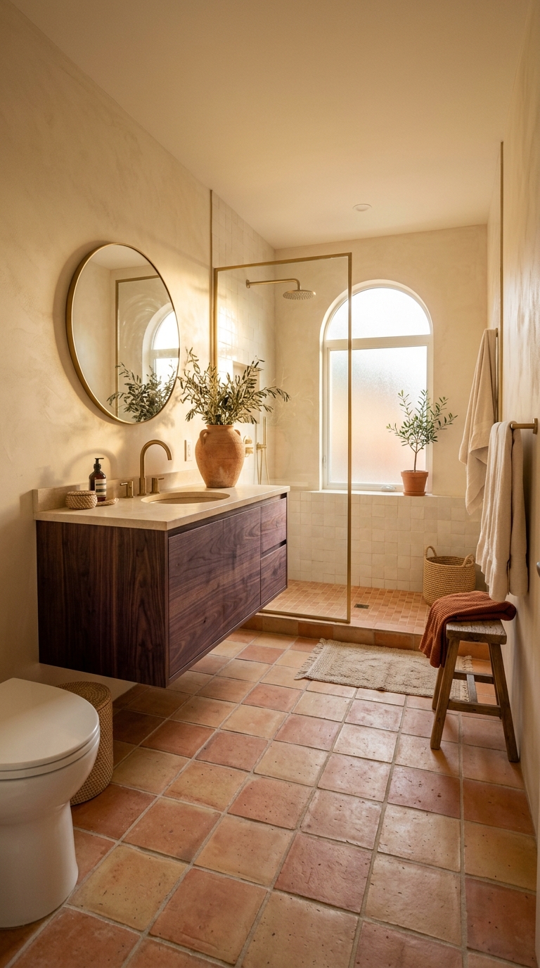
17. Terracotta Tiles — The Warmest Floor
Terracotta floor tiles bring the elemental warmth of baked earth into the bathroom. Nothing else radiates floor-level warmth the way terracotta does — the colour literally comes from fire, and some quality of that heat remains in the visual experience.
Genuine terracotta or terracotta-look porcelain tiles in a bathroom create a Mediterranean quality that transforms the room’s entire emotional register. The morning bathroom becomes warmer. The evening bathroom becomes more intimate. The room feels connected to a tradition of warm earthen floors that spans thousands of years and dozens of cultures.
Pair terracotta floors with warm cream or warm white walls — never cool colours. The cream and terracotta combination is one of the most reliable warm palettes in interior design.
Part 6: Colour Combinations — The Complete Palettes
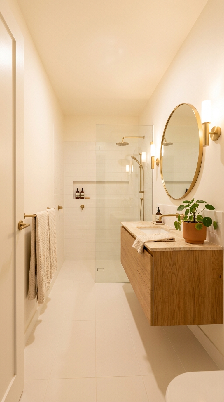
18. Cream + Oak + Brass — The TheNestiora Classic
The combination of warm cream walls, honey oak furniture, and brushed brass fixtures is the foundational TheNestiora bathroom palette. It is reliable, timeless, and beautiful in every light condition.
The three elements create a warm gradient from lightest (cream walls) through mid-tone (oak) to warmest metallic accent (brass). The cream provides brightness and space. The oak provides warmth and material presence. The brass provides points of warm reflection that catch and scatter light throughout the room.
This combination works in bathrooms of every size, with every tile colour from warm ivory to warm greige, and in every lighting condition from bright morning to dim evening.
19. Sage Green + Warm White + Natural Oak
This palette adds one colour to the neutral foundation: warm sage green as an accent wall behind the vanity, warm white on the remaining walls and ceiling, and natural oak on the vanity and accessories.
The sage green introduces the visual quality of nature without the maintenance of actual plants (though adding a plant as well is encouraged). The warm white keeps the room bright and spacious. The oak provides the warm wood element that connects the green to the built environment.
This palette is particularly effective in bathrooms with natural light, where the sage green shifts beautifully from morning to evening.
20. Terracotta + Cream + Dark Oak
This palette uses deeper, earthier materials for a Mediterranean-inspired warmth. Terracotta floor tiles provide the warm ground. Cream walls provide brightness above. Dark oak (walnut-toned) vanity provides the deepest wood accent.
The darker oak against the terracotta creates a richer, more dramatic palette than the lighter oak combinations. The room feels earthier, more grounded, more connected to warm climates and natural materials.
This palette is best in bathrooms with good natural light. The deeper materials absorb more light than the lighter cream-oak combination.
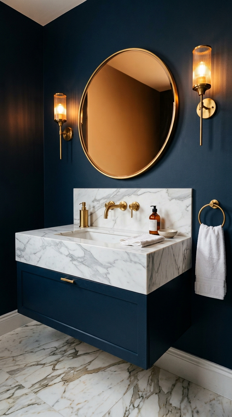
21. Navy + Brass + White Marble
The most dramatic bathroom palette: deep navy as a full accent wall or wainscoting, crisp white marble countertop and floor, and abundant brass fixtures providing warm metallic contrast.
This is the jewel-box bathroom. Dark, warm, precious. The navy absorbs light and creates theatrical depth. The white marble provides crisp brightness that prevents the room from feeling dark. The brass punctuates with warm gold that reads as genuinely luxurious against the navy.
This palette requires commitment and confidence. The reward is a bathroom that looks like it belongs in a boutique hotel.
Part 7: Colour Strategy for Specific Situations
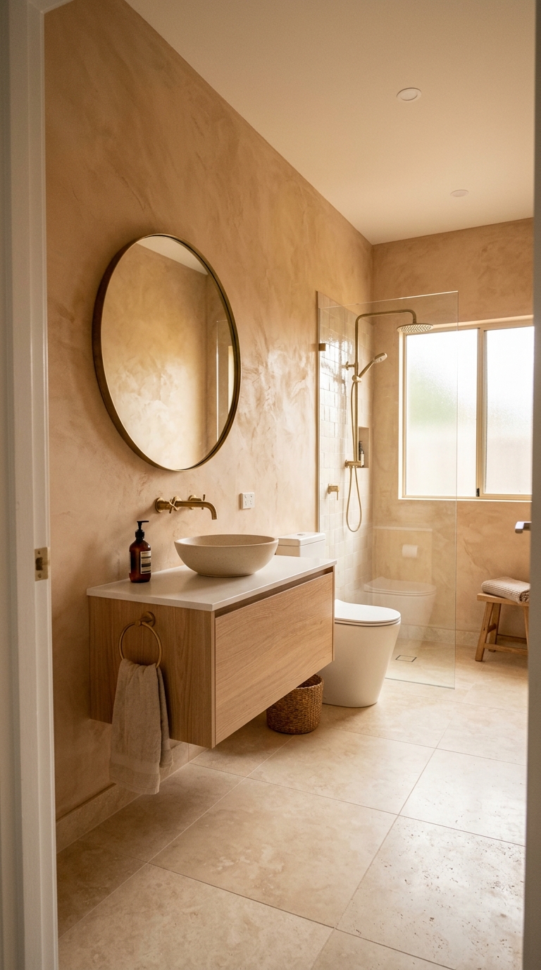
22. Small Bathrooms — Light Walls, One Warm Accent
In a small bathroom, the wall colour strategy should prioritize openness while adding one deliberate warm moment.
Three walls and ceiling in warm white or soft cream. One accent wall — behind the vanity or in the shower — in a warmer or deeper tone: soft terracotta, warm sage, warm sand. The three light walls reflect maximum light and maintain the room’s sense of space. The single accent wall provides depth, focal point, and the impression of deliberate design.
This three-light-one-deep ratio is the most reliable colour strategy for small bathrooms.
23. Dark Bathrooms — Lean Into the Darkness
Bathrooms with no natural light or very limited natural light present a unique colour opportunity: lean into the darkness rather than fighting it.
A dark bathroom painted in warm dark tones — deep warm greige, warm charcoal, dark olive, or deep navy — with excellent warm artificial lighting becomes a moody, cocoon-like space that feels intentionally dramatic rather than accidentally dark.
The key is the artificial lighting. A dark bathroom without good warm lighting is a cave. A dark bathroom with beautiful sconces, backlit mirror, niche lighting, and under-vanity glow is a spa.
24. The All-White Bathroom — Done Warmly
Sometimes an all-white bathroom is the right choice — in very small spaces where maximum light reflection matters, in rental bathrooms where painting is not possible, or simply as a personal aesthetic preference.
The all-white bathroom succeeds when it is warm white rather than cool white, when it includes warm material accents (oak, brass, warm stone), and when the lighting is warm enough to make every white surface glow amber rather than blue.
The trick: an all-warm-white bathroom with warm oak vanity, brass fixtures, and cream linen towels feels completely different from an all-cool-white bathroom with a white vanity, chrome fixtures, and white cotton towels. Same colour scheme. Completely different emotional experience.
Part 8: The Finishing Details of Colour
25. Grout Colour Matters More Than You Think
In a tiled bathroom, grout occupies a surprisingly large percentage of the visual surface. Bright white grout against warm tiles creates a harsh grid pattern that fragments the surface. Warm-toned grout that closely matches the tile colour minimises the grid and allows the tiles to read as a single continuous surface.
Choose grout one shade warmer than the tile. Warm grey grout with warm ivory tiles. Warm sand grout with warm greige tiles. Warm terracotta-matching grout with terracotta tiles. The closer the grout matches the tile, the more seamless and spacious the tiled surface appears.
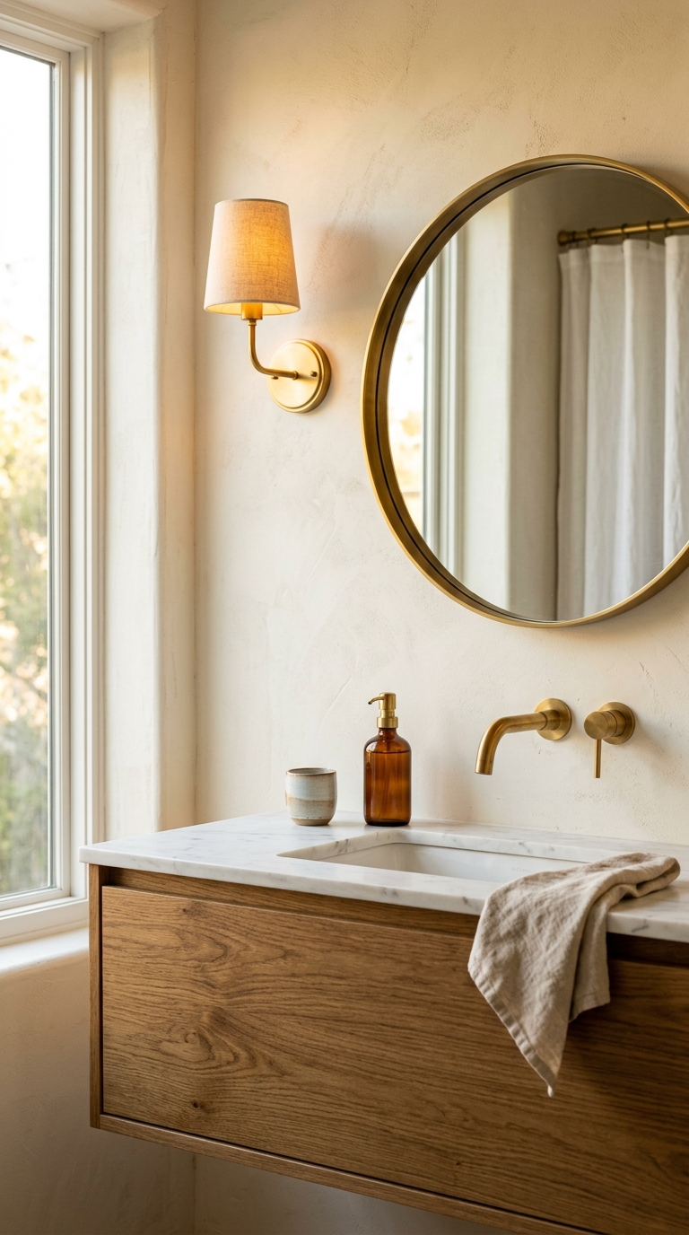
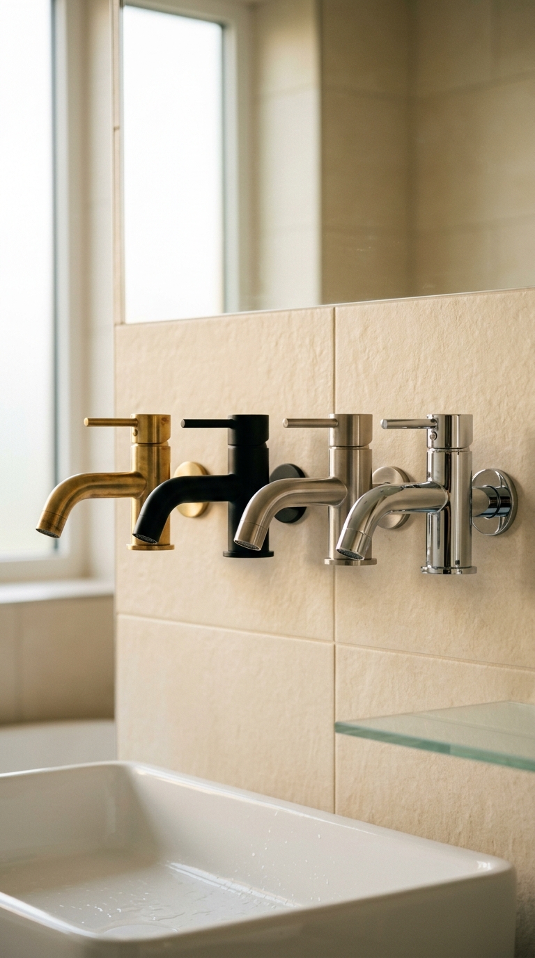
26. Hardware Finish as Colour Element
The finish of bathroom hardware — taps, towel rails, toilet paper holders, shower fixtures, cabinet handles — is a colour decision as much as a material one. The metallic finish creates a consistent accent colour that appears at dozens of points throughout the room.
Brushed brass creates warm gold accents. Matte black creates crisp dark accents. Brushed nickel creates cool silver accents. Polished chrome creates bright reflective accents.
In a warm bathroom, brushed brass is the ideal choice. Its warm gold tone harmonises with warm whites, creams, warm greens, and warm earth tones. It adds warmth at every point it appears. And it develops a beautiful natural patina over time.
Consistency is essential. All hardware in the same finish. Mixing finishes creates visual chaos.
27. The Bathroom at Evening — When Colour Becomes Mood
Every bathroom colour looks different under evening lamp light than under daytime natural light. The final test of any bathroom colour scheme is how it performs at 10pm under warm 2800K artificial light with no natural light contribution.
Warm whites deepen to amber. Creams glow with honey warmth. Sage green softens to a warm olive. Terracotta becomes rich and enveloping. Navy becomes the deepest warm velvet.
The evening bathroom is when colour transitions from visual to emotional — from something you see to something you feel. The warm lamp light brings out the warmth in every colour choice, and the absence of daylight’s cooler influence lets the room’s warm palette express itself fully.
Your Bathroom’s Colour Is Waiting for You to Choose It
The colour your bathroom needs is probably not the one you think. It is probably not white. It is probably warmer than you imagine. It is probably one shade more committed than what feels safe.
The safe choice — the builder-grade cool white, the noncommittal neutral, the “we’ll get to it” default — is actually the riskiest choice of all. Because it guarantees that every morning and every evening, you will stand in a room that asks nothing of you and gives nothing back.
Choose warmth. Choose a tone that makes you feel something when you walk in. Test it, live with the sample for a week, and trust the feeling that tells you: this is the one.
The bathroom you stand in every morning is colouring the beginning of every single day. Make it warm.
Explore more on TheNestiora:
→ Small Bathroom Ideas · → Bathroom Storage Ideas · → Bathroom Tile Ideas · → Bathroom Lighting Ideas
If this story was useful, share it with someone you'd like to read it too.