10 Bathroom Tile Ideas: Stone-Look Fails on One Hidden Spec

Add us as a preferred source to see more stories on Google.
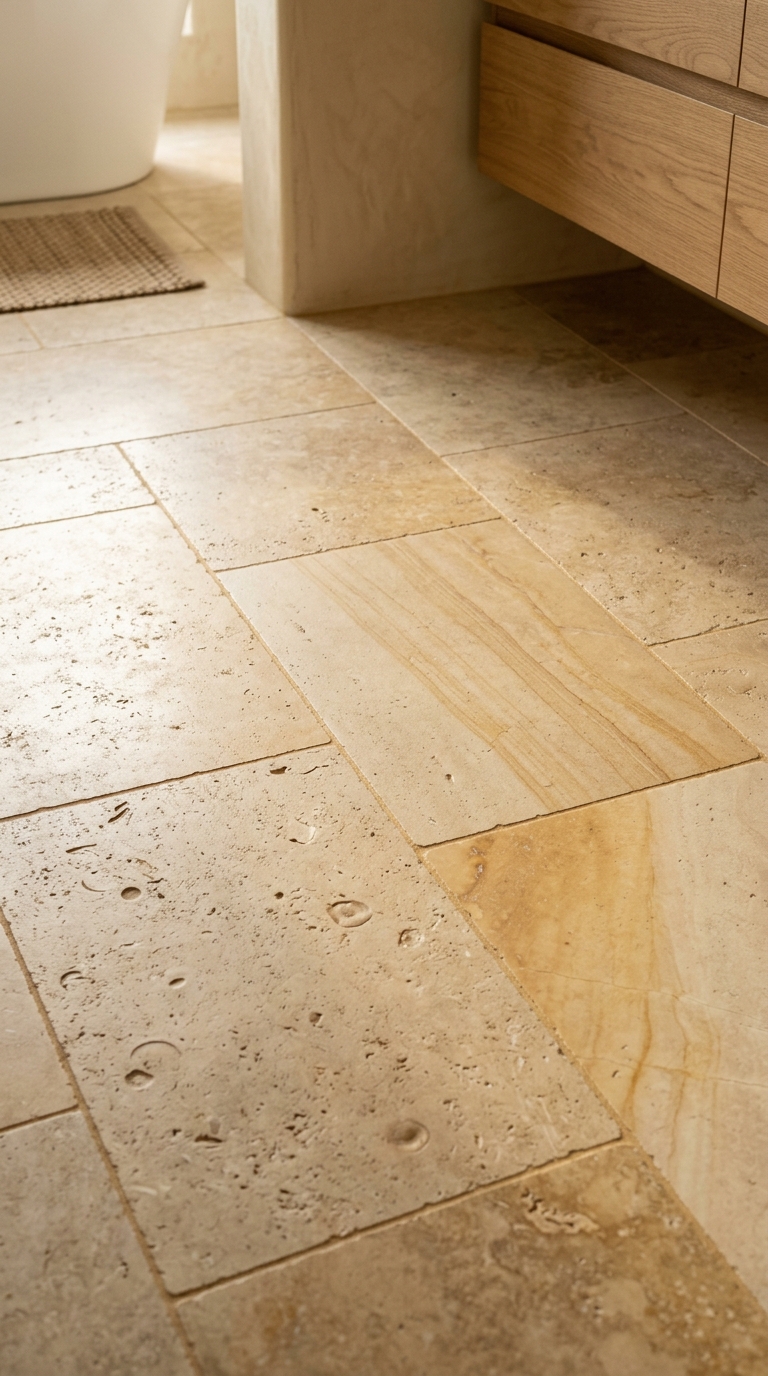
Look at that floor for a moment and notice what it is not doing.
No two tiles match. One is creamier, the next is gold, one is heavily pitted and the one beside it is almost plain. The pitting falls in different places on each. That is what real stone does, and the entire convincingness of the floor rests on it.
Most stone-look bathrooms fail here, and the reason is printed on the box.
The two numbers to ask for
| Rating | What it means | Suits |
|---|---|---|
| V1 | Uniform; tiles almost identical | Plain colours, deliberate uniformity |
| V2 | Slight variation | Subtle stone, quiet floors |
| V3 | Moderate variation | Most convincing stone looks |
| V4 | Substantial, random variation | Reclaimed, terracotta, heavy stone |
V3 is the safe answer for limestone and travertine looks.
V4 is dramatic, and worth it for reclaimed and terracotta effects. It does need laying out carefully. Open several boxes at once and work across them, or you end up with a clump of dark tiles in one corner and a pale patch in another, which is worse than no variation at all.
Face count is the one nobody volunteers. A range with six faces will repeat every six tiles, and once you have noticed it you cannot unsee it. Good ranges carry twenty to fifty; the best carry more. Ask the supplier directly, because it is rarely on the website.
Grout is half the finish
Look at the joints in that photograph. They are narrow and almost exactly the colour of the tile, which is why the floor reads as a stone surface rather than as a grid.
Match grout to the tile, going a shade darker rather than lighter, because grout lightens as it cures and pale grout in a bathroom does not stay pale. Mapei Ultracolor Plus and Fila Fugalite are the two most commonly specified; expect around £20 to £35 for a bag that covers a small bathroom in 2026.
White grout with a beige tile is the single most common way to undo an expensive floor. It draws a graph over the whole thing.
Joint width matters too. For rectified porcelain, 2 to 3mm is normal and keeps the joint quiet. Wider joints suit tumbled and handmade-look tiles, where a crisp line would look wrong anyway.
Porcelain or the real thing
Real travertine and limestone are beautiful and are a commitment.
They are porous, so they need sealing on installation and resealing every few years. Travertine’s natural holes are usually factory-filled, and that filler pops out over time, particularly in a wet room. Both etch on contact with anything acidic, and limescale remover is acidic.
Porcelain does none of that. It does not seal, does not etch, and does not care what you clean it with. What it cannot do is age, which is the one thing real stone does beautifully.
For a bathroom floor, porcelain is the sensible answer for most people. For a hall or a boot room where genuine wear is part of the appeal, real stone earns its maintenance.
Finish and slip
Check the R rating on the box for anything going on a bathroom floor. R10 is the usual minimum for a domestic bathroom; R11 is better where the floor gets genuinely wet, such as a walk-in shower.
Polished stone-look porcelain in a bathroom is a bad idea however good it looks in the showroom. Matt or lightly textured finishes are both safer and more convincing, since real limestone is not shiny.
Where this does not apply
Small bathrooms where you want a quiet floor rather than a feature. High variation in a two-metre-square room reads busy, and the tile fights everything else in the space.
There, a V2 tile in a single soft tone, laid with matching grout, gives you calm rather than character. It is a different aim, and a legitimate one.
Chevron boards leave almost no room for grout
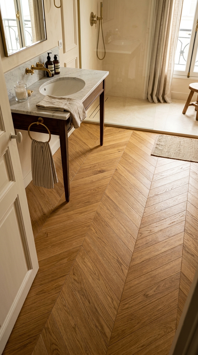
The floor beyond the vanity table moves in one continuous drift. The chevron points run toward the far wall and nothing interrupts them, because the joints are rectified and narrow, filled with a grout matched to the oak tone. The realism of wood-look porcelain comes less from the printed grain than from this refusal to draw lines across it.
In this photo the doorway is doing quiet work as well. A slim brass threshold strip divides the chevron from the dark timber beyond, so the two floors never argue about which one is wood. Strips of that kind run £12 to £28 a length in 2026, and fitters who lay much wood-look flooring keep them on the van.
At Topps Tiles or Porcelanosa, chevron wood-look porcelain is priced £30 to £55 per square metre in 2026, with laying on top. Chevron wastes more than straight plank, so order the extra the supplier suggests and keep two spare boxes. Ranges get discontinued, and one cracked board then becomes a patch.
A dark floor and pale walls need two different grouts
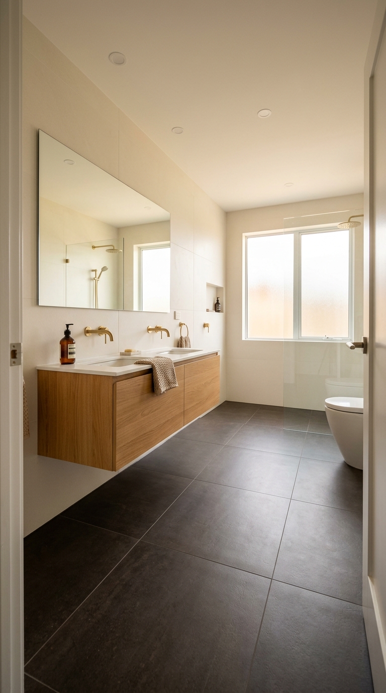
The calm in this room comes from weight sitting where the eye expects it. A charcoal floor holds the bottom of the picture while pale walls and a long mirror lift the top, and the floating oak vanity leaves a shadow gap so the heavy floor never touches the cabinetry. None of that settles if one grout is asked to serve both surfaces.
In this photo each field has the grout it needs. The floor joints are dark and close to the tile, so drying marks and daily wear disappear into them, while the wall joints are pale against their own ground. Mapei Ultracolor Plus or BAL Micromax2, the two most specified cement grouts, run £18 to £30 a bag in 2026, which makes buying two bags the cheapest decision in the room. Charcoal porcelain along these lines costs £25 to £45 per square metre in 2026.
Pale grout on that floor would photograph as a grid within a month. Keep each field matched to itself and the contrast does the organising.
Stacked joints lengthen the wall when the grout stays quiet
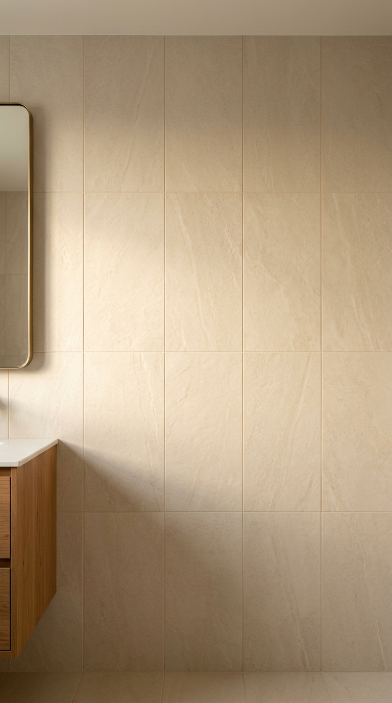
Notice how tall this wall feels under a standard ceiling. The tiles are set portrait and stacked directly, so every joint runs floor to ceiling without a step, and the eye follows those lines upward. That is the governing principle of a stacked bond. The layout does the lengthening, and the grout decides whether the lines whisper or shout.
Here they whisper, because the joints are narrow and tinted to the tile. The same arrangement with a charcoal joint would read as stripes, which suits a cloakroom and unsettles a bathroom that wants calm. Large-format ivory at this scale is £35 to £70 per square metre in 2026, while the grout keeping it quiet costs a fraction of that.
The restraint around the mirror is the detail to steal. A slim brass frame and nothing else competes, so the tiled wall keeps the whole picture.
Herringbone wants a grout that keeps quiet
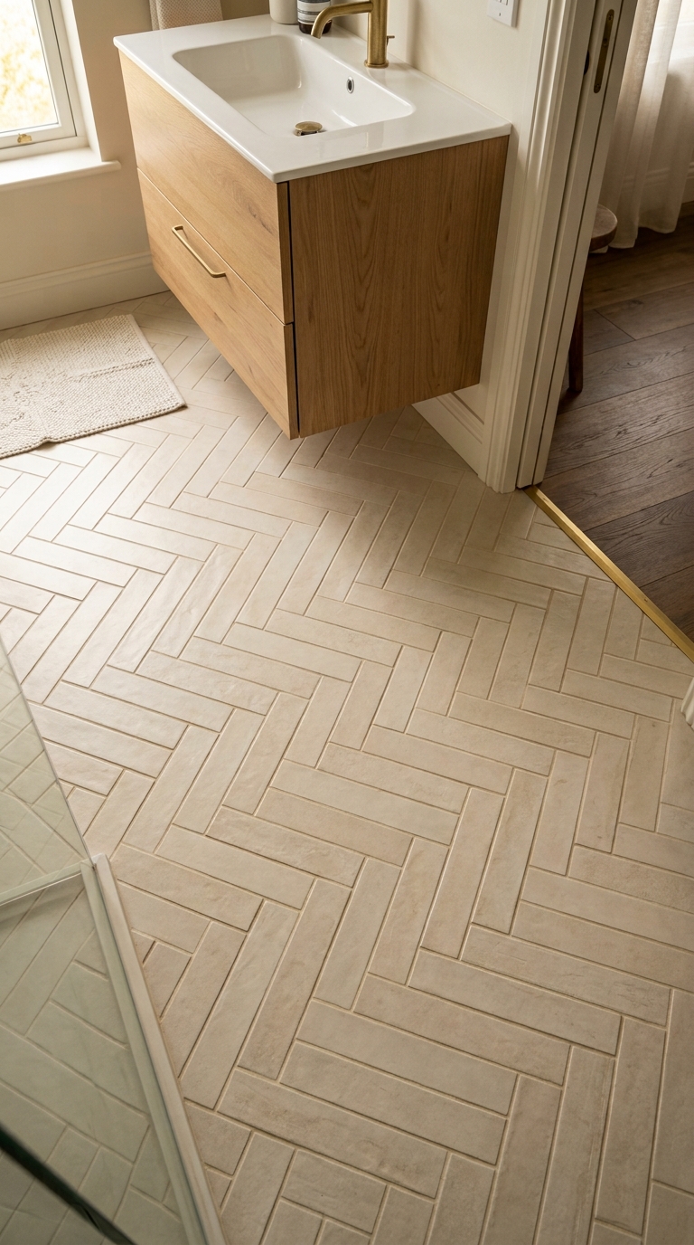
That floor is the busiest pattern in this article laid in the calmest way. Hundreds of small cream fingers change direction at every turn, which should read as noise, and it does not, because every joint between them is filled to match. The pattern carries the interest and the grout carries nothing, which is exactly the division of labour a herringbone needs.
See what happens at the edges and the doorway. Full pieces meet the walls without slivers, and a brass strip parts the bathroom tile from the timber hall floor, because the layout was set out from the centre of the room so cuts land evenly at the sides. Small-format herringbone for floors is typically £40 to £65 per square metre in 2026, with brass thresholds at £12 to £28 a length in 2026.
Dark joints here would turn the floor into a maze. Anyone tempted by them should lay a full square metre first and live with it for a week, since the maze either delights or exhausts and there is no middle answer.
A penny mosaic is mostly grout, so choose it like one
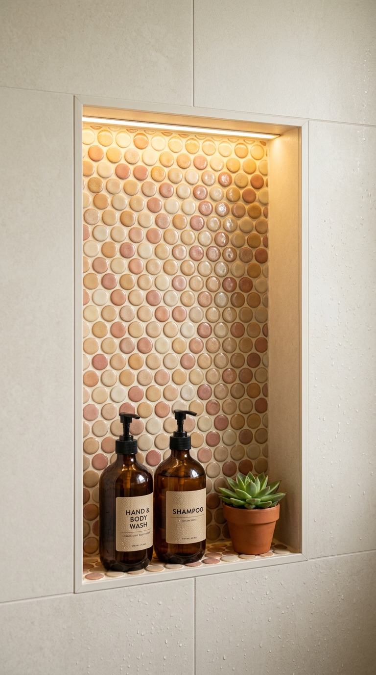
In this photo the dots get the attention and the joints do the work. Penny rounds leave more grout visible than tile, so the colour between the circles sets the temperature of the whole niche. Here a warm putty tone lets the pink and cream discs glow under the strip light, where a bright white would have turned the same niche clinical and a dark one would have dotted it.
That concentration of joints is also why a niche deserves better than standard cement. Shampoo and conditioner sit on these joints daily, mixed with steam, and cement grout drinks all of it in. Mapei Kerapoxy or a similar epoxy resists the staining where cement discolours, and it costs more to buy and to lay, which is money spent exactly where the room is wettest. Expect £15 to £30 a sheet for penny mosaics in 2026, and £45 to £75 for an epoxy kit in 2026.
Seal any cement used nearby, and plan to do it again. The strip light above shows every patch the daylight misses, so wipe the round joints down after showers and they stay bright.
Hexagons earn their grey joints in the shower
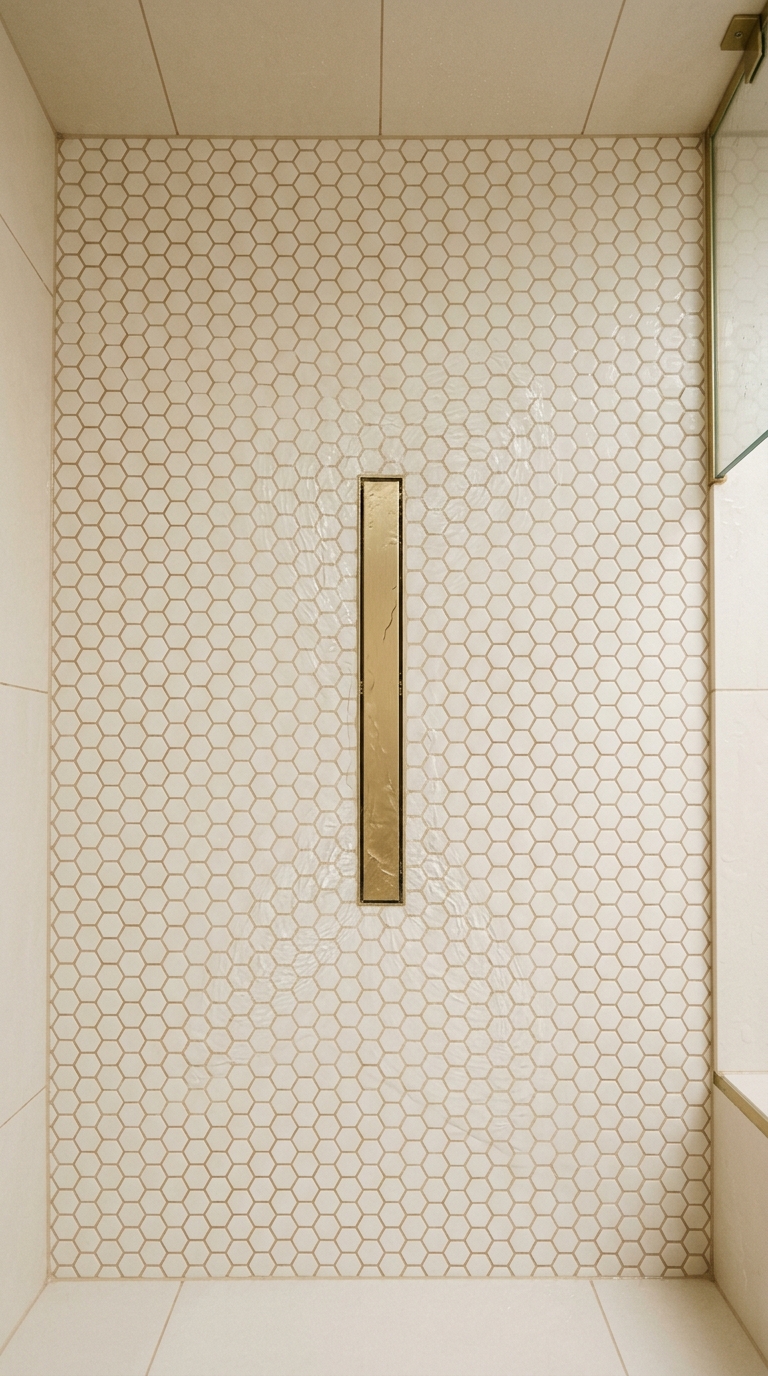
The one detail that explains this surface is the drain. A long brass slot sits in a field of small white hexagons, and the field falls toward it from every side, which small tiles can do and large ones cannot. The many joints give the floor its grip and its falls in the same gesture, and that is why showers keep returning to this shape whatever the fashion.
Those joints are mid grey instead of matched, and here the contrast is deliberate. White grout in a shower yellows first where the water runs, so a grey chosen at the start hides the ageing the room will do anyway. Hexagon sheets from Original Style or Johnson Tiles are £12 to £25 a sheet in 2026, and the grout between them wants sealing on installation with a repeat when water stops beading, using LTP MPG bought in 2026.
The walls around it show the opposite answer. Large pale tiles with joints tinted to disappear, so the busy floor gets a quiet frame.
Big slabs mean fewer joints and nowhere to hide
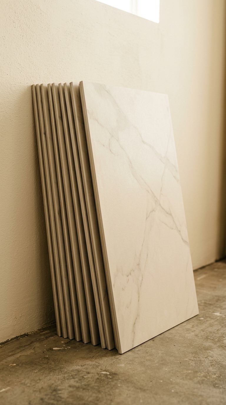
Pictured before a single one is fixed, these marble-look slabs show why large format forgives and why it punishes. Each slab covers ground that would take a dozen small tiles, so a wall needs only a handful of joints, and every joint lands exactly where the eye rests. Fewer decisions, and each one louder.
That is why the two numbers from the top of this article matter most here. Check the shade variation rating on the box and ask for the face count of the range, because one repeated vein across three slabs reads as wallpaper at this scale. Open every box and shuffle the slabs across the wall before the adhesive comes out. Marble-look large format at this size typically costs £35 to £70 per square metre in 2026.
Grout for slabs this size stays narrow and close to the stone tone. Anything darker draws a frame around each slab, which shrinks the very expanse the format was bought to create.
One grout through the whole room is the calmest answer
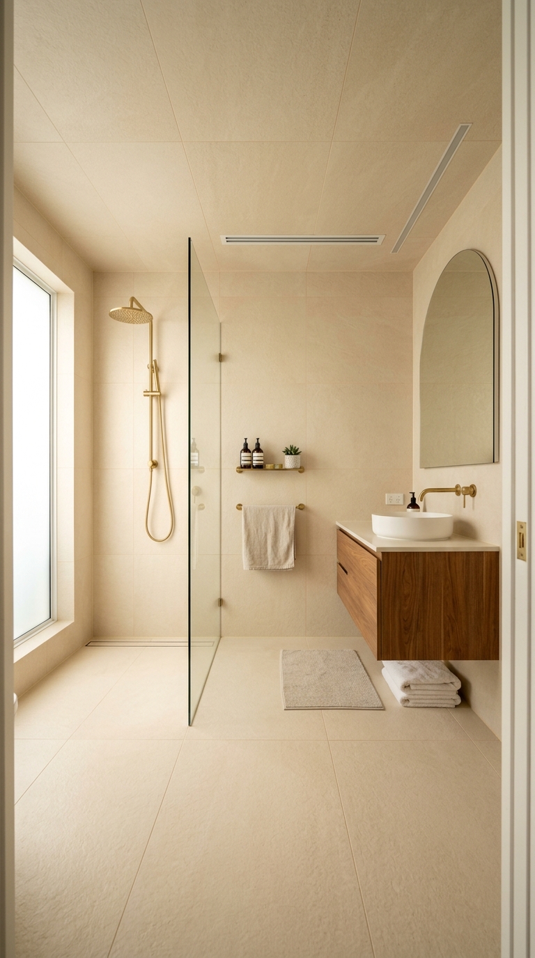
The same tile continues across the ceiling instead of stopping at the wall. This room is tiled on the floor and up the walls in a single warm ivory, and the serenity comes from the joints refusing to participate. Every grout line is tinted to the tile and kept narrow, so the surfaces join into one envelope, and the brass tap with the oak vanity does all the talking.
That tile is doing quiet work behind the serenity. Subtle variation from cream toward sand stops the envelope reading flat under the ceiling spots, which a dead uniform tile would not survive. Ivory porcelain in this tone is £25 to £50 per square metre in 2026, and one grout colour through the whole room means one bag and one mix, with no half-used sacks drying in the hall.
Skip this approach where the bathroom needs a focal point. An all-over envelope calms, and on its own it never excites, so a room that wants character should give one surface stronger pattern or deeper colour.
The same tile with two grouts proves the argument
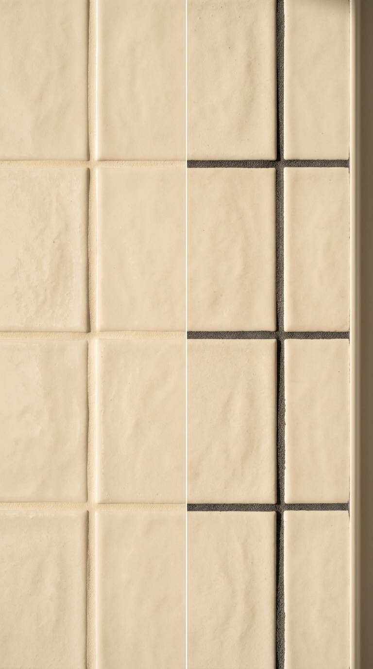
That tile never changes in this photograph, which is the point of it. The same cream squares carry a matching pale joint on one side and a charcoal joint on the other, and they read as two different rooms. Matching grout lets the surface settle into one plane, while contrasting grout turns the layout into the feature. Grout occupies enough of any tiled wall to decide which of those two rooms get built.
The practical moral is cheap. A bag of Mapei Ultracolor Plus or BAL Micromax2 runs £18 to £30 in 2026, so the most consequential choice in the bathroom costs less than the towel rail. Choose the match a shade darker than the tile, since grout lightens as it cures, and trial a full board of each option against the tile under the bathroom bulbs before committing.
Fifteen years is a long time to look at a grid chosen in seconds. The tile gets the weeks of deliberation, so lend the grout an afternoon.
Frequently asked
Frequently Asked Questions
What colour grout makes a small bathroom feel larger?
A joint filler one tone deeper than the tile field, in warm mid grey or sand. It lets the walls read as a continuous surface instead of a grid, hides the first year of wear, and costs no more than the white tube most people reach for by default.
Should I pay extra for epoxy grout around the shower?
Where shampoo and hot water sit every day, yes. Resin-based joints shrug off the staining that turns cement joints blotchy, and the premium is small beside the price of the screen and the brassware. Spend the epoxy money around the shower and use cement everywhere else.
Can pale tiles take a dark joint, or will I regret it?
They can where the layout is meant to star, as with herringbone or small hexagons, since the dark network turns the pattern up. They should not where calm is the brief. Trial a full board under the room bulbs across several evenings before deciding.
How do I know when shower joints need resealing?
The calendar is no guide; watch the water. Fresh sealer makes it bead and run, while tired sealer lets it soak in and darken the joint. When beading stops, scrub the joints hard, let them dry fully, then apply a fresh coat.
My joints have yellowed. Is retiling the only fix?
No. A fitter can rake out the old filler and press in fresh joints without touching the tiles, which renews the room for a fraction of a refit. It is priced as labour instead of materials, so ask for a regrouting quote, not a retiling one.
Which joint suits a wood-effect floor?
The narrowest the fitter will guarantee, filled to the oak tone so the boards run unbroken. Anything pale draws lines where no boards exist. Carry a brass or oak threshold where the tiling meets the hall floor.
Before ordering
- Ask for the V rating and aim for V3 on stone looks.
- Ask how many faces the range carries; under ten will repeat visibly.
- Lay ten tiles out before the fitter starts and look for duplicates.
- Match grout to the tile, a shade darker, in a narrow joint.
- Check the R rating; R10 minimum for a bathroom floor, and avoid polished.
This article may contain affiliate links. We may earn a commission at no extra cost to you.