Add the Warm Note Your Blue and White Room Needs

Add us as a preferred source to see more stories on Google.
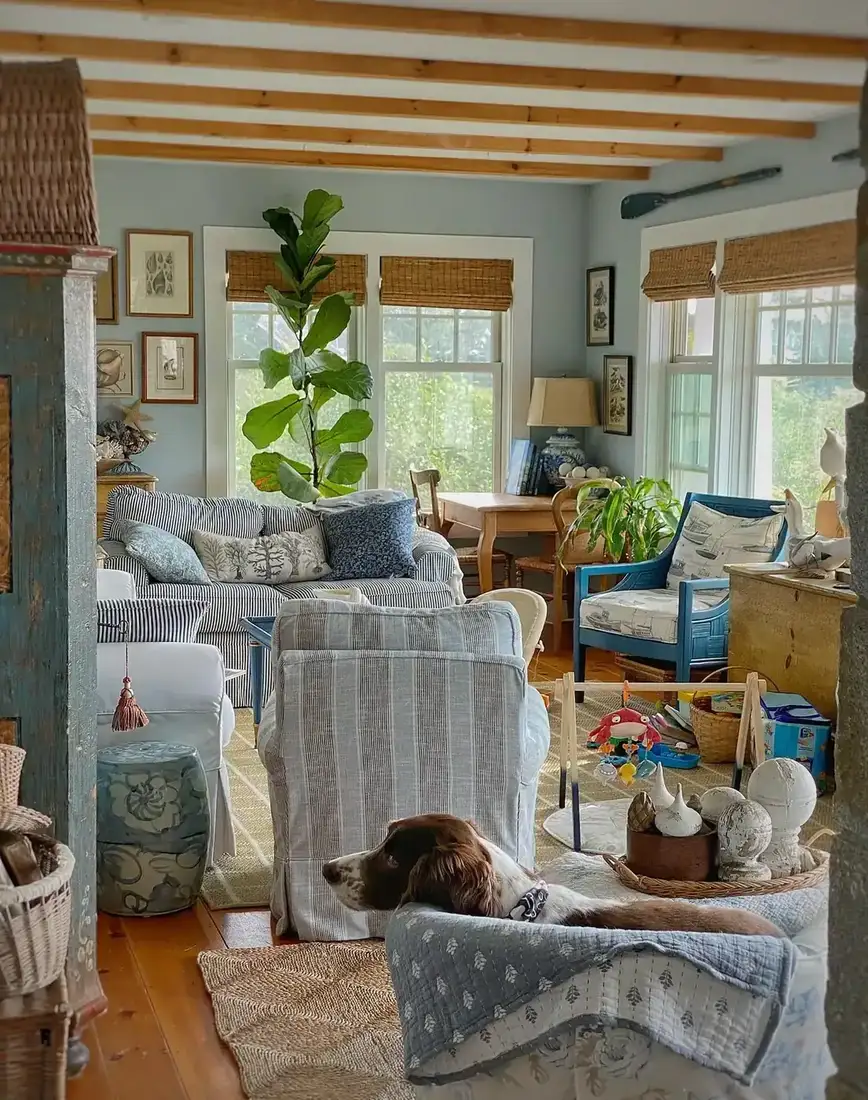
Blue and white is the easiest scheme to start and the easiest to get cold. You pick a crisp navy, a clean white, and the room looks fresh for a week, then it feels flat, a little distant, and oddly like a bathroom.
The fix is not more blue or a warmer white. It is a third colour, in a small amount, that most people never add. One warm accent gives the whole palette somewhere to sit.
These ten rooms show you how that third colour works.
You will see the room warm the moment that third colour lands. When you keep the warm note small and you repeat it twice, you give blue and white a place to rest. You keep the palette quiet and you let texture do the work for you.
Give blue and white somewhere to sit
A third colour, small and warm, is what keeps the classic duo from going flat.
Anchor the palette with one warm accent
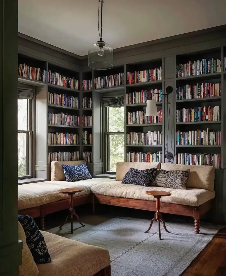
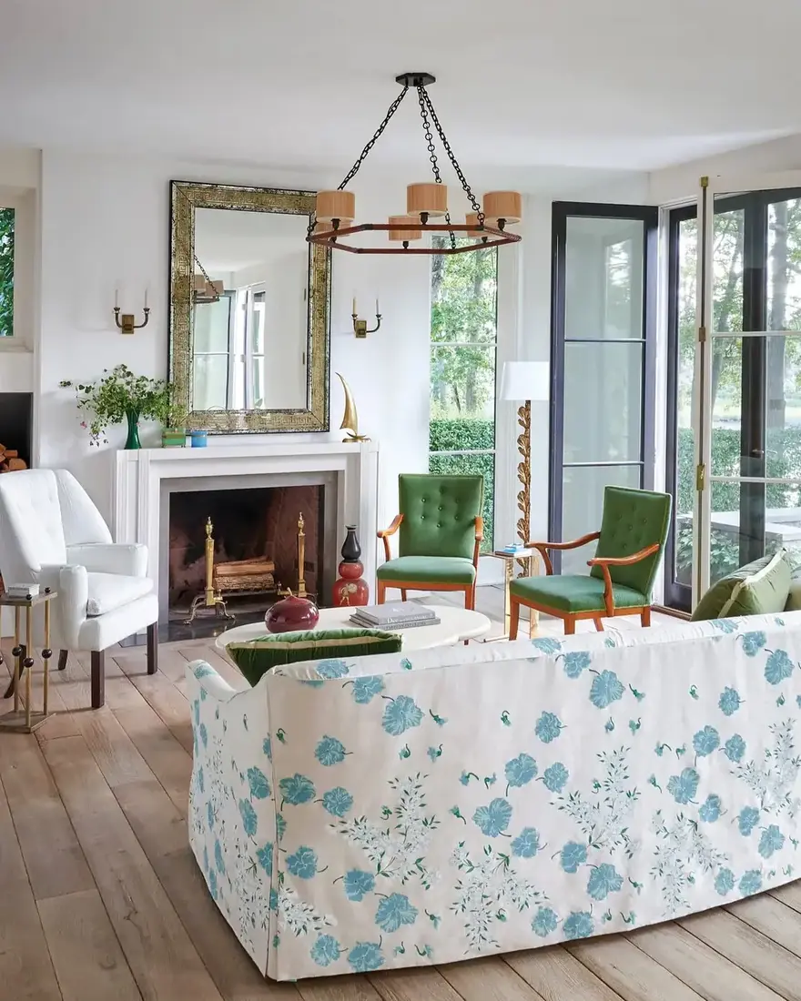
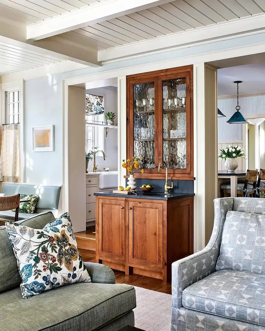
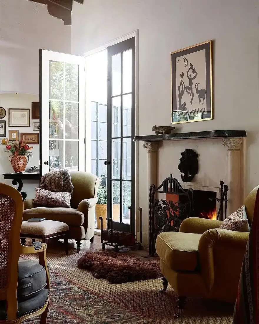
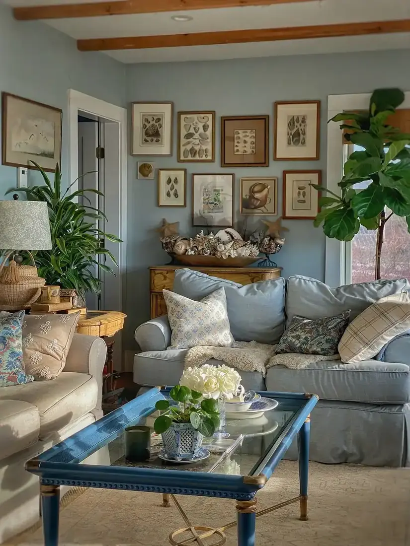
Blue and white alone has no warmth to lean against. Add one warm note, a timber side table, a brass lamp, a rattan chair or a leather stool, and the whole scheme finds its footing. Keep that accent to one material and repeat it twice, once low and once at eye level, so the warmth feels structural. You register the room soften the moment that warm touch lands, and you can keep the blue and white exactly as it was for you. You read the room soften the moment that warm touch lands, and you can keep the blue and white exactly as it was.
Keep the white warm beside blue
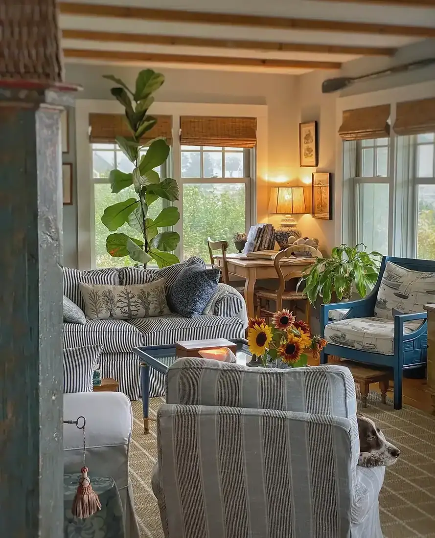
Warm whites hold up next to blue. Cool whites push the whole room grey, especially on an overcast day. Hold your white chip beside printer paper; if it looks creamy or a little dusty, it is warm enough to sit beside navy without chilling. When you keep that warmth, the blue reads as crisp rather than cold. You keep that warmth in the rug and the lamp, and you let the walls stay quiet for you. The wicker sunroom version of this palette gets its own treatment in our sunroom and sitting room ideas. For more on keeping a quiet base rich, see our neutral living room ideas.
Vary blues by depth, not by hue
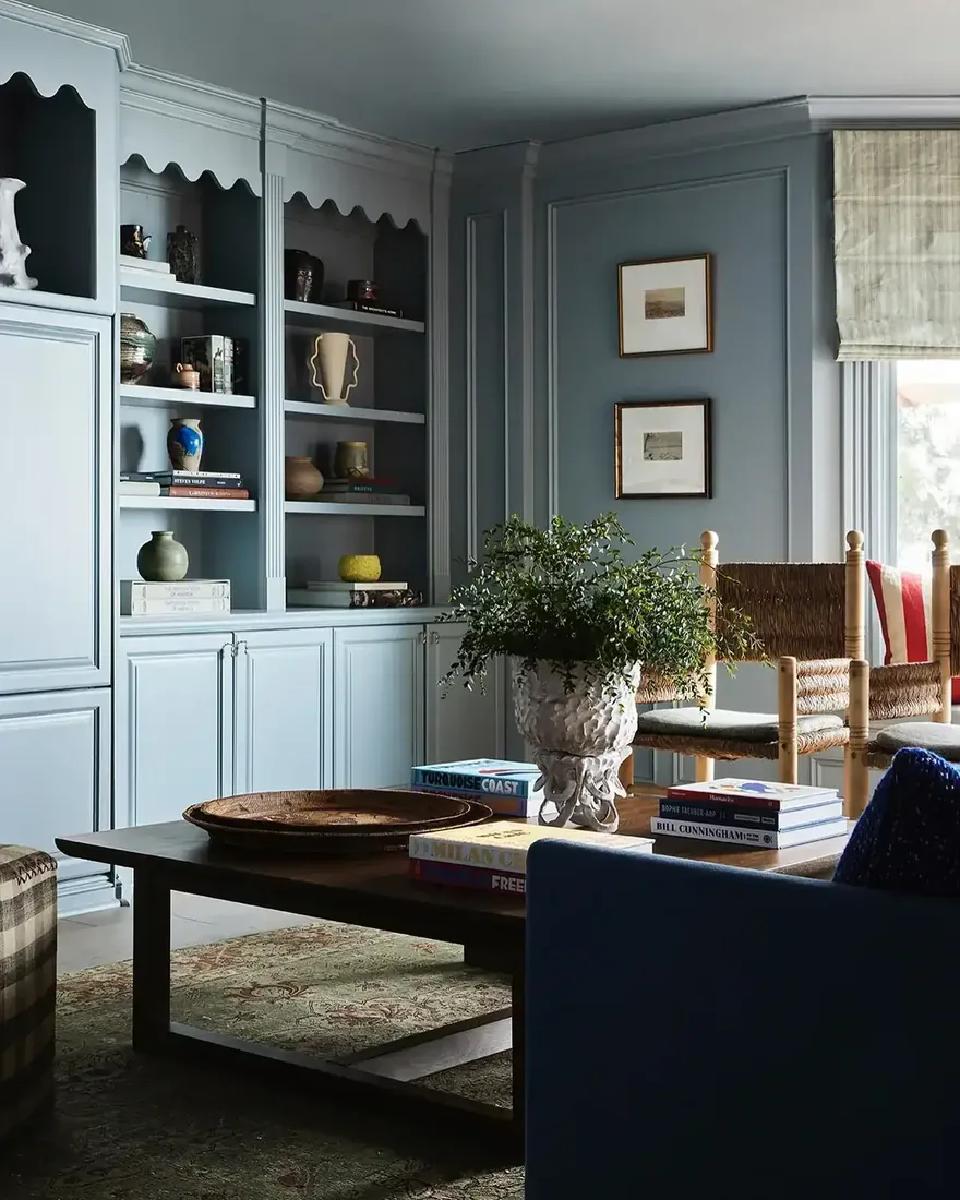
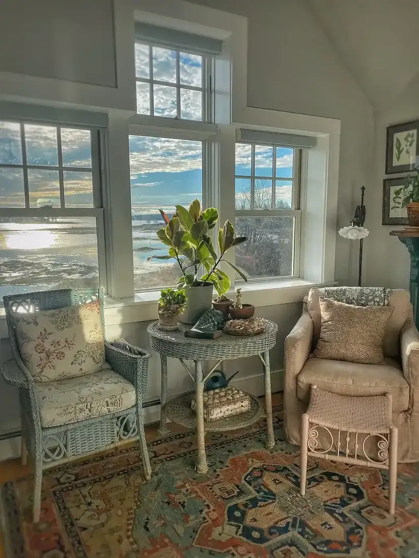
Navy with pale blue reads as one family at different depths, so the eye moves easily. Navy with turquoise fights because the hue jumps sideways. Keep your blues in the same family and change how light or dark they are, not how green or purple they lean. When you vary by depth, the stripe or solid you choose reads as layered, not competing. For the full blue-room discipline beyond blue-and-white, see our blue living room ideas.
Pattern and texture that keep blue from feeling flat
Blue wants texture around it more than it wants more blue.
Let pattern carry blue, not solid blocks
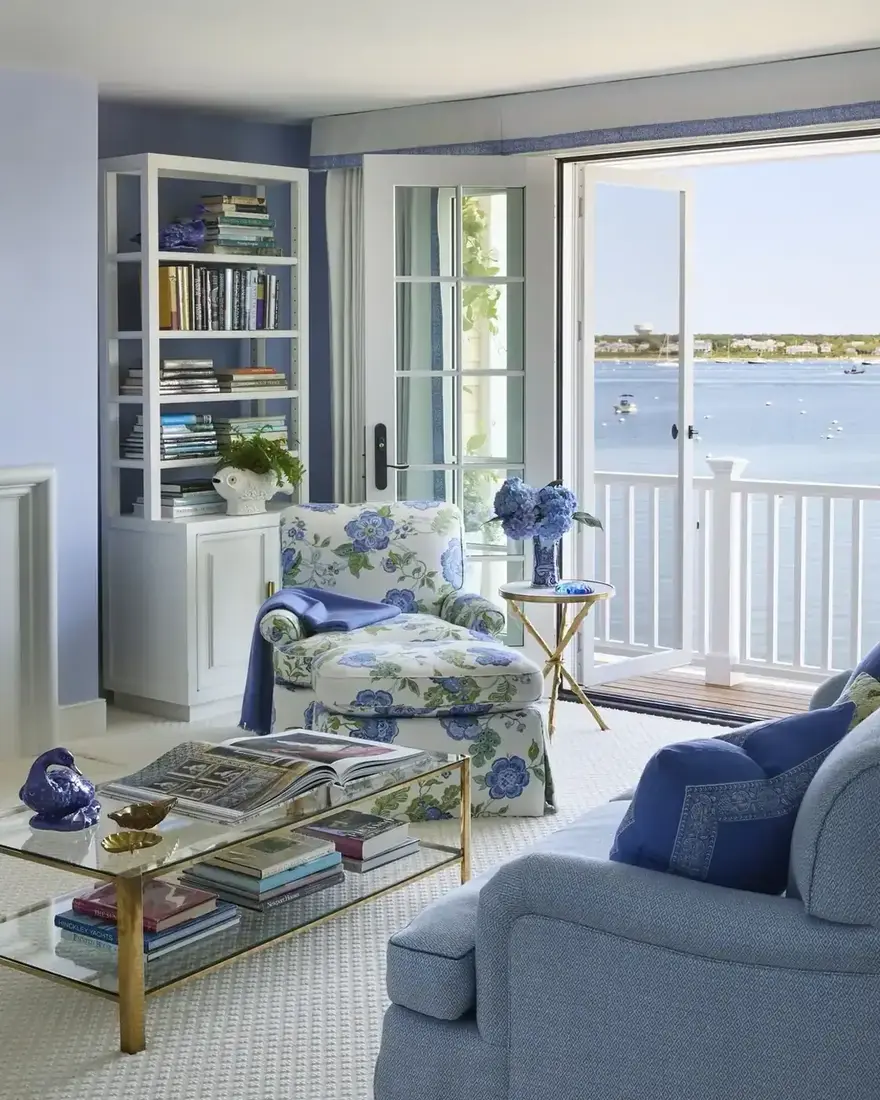
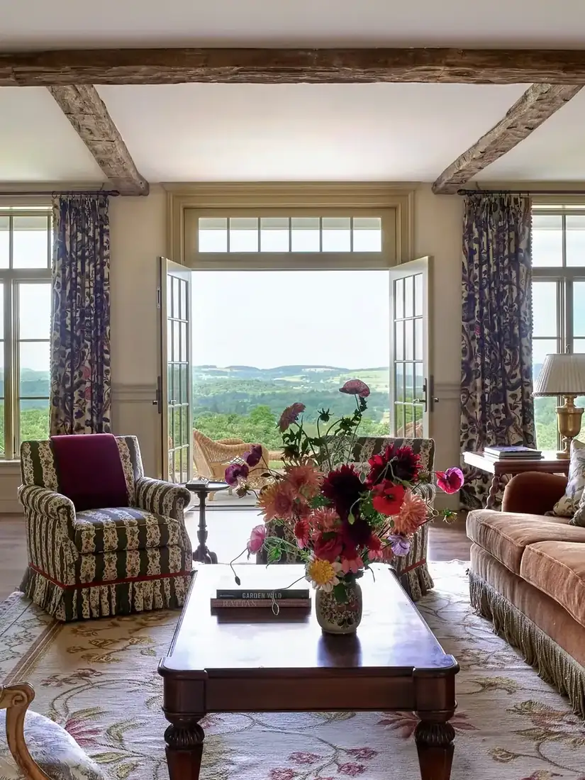
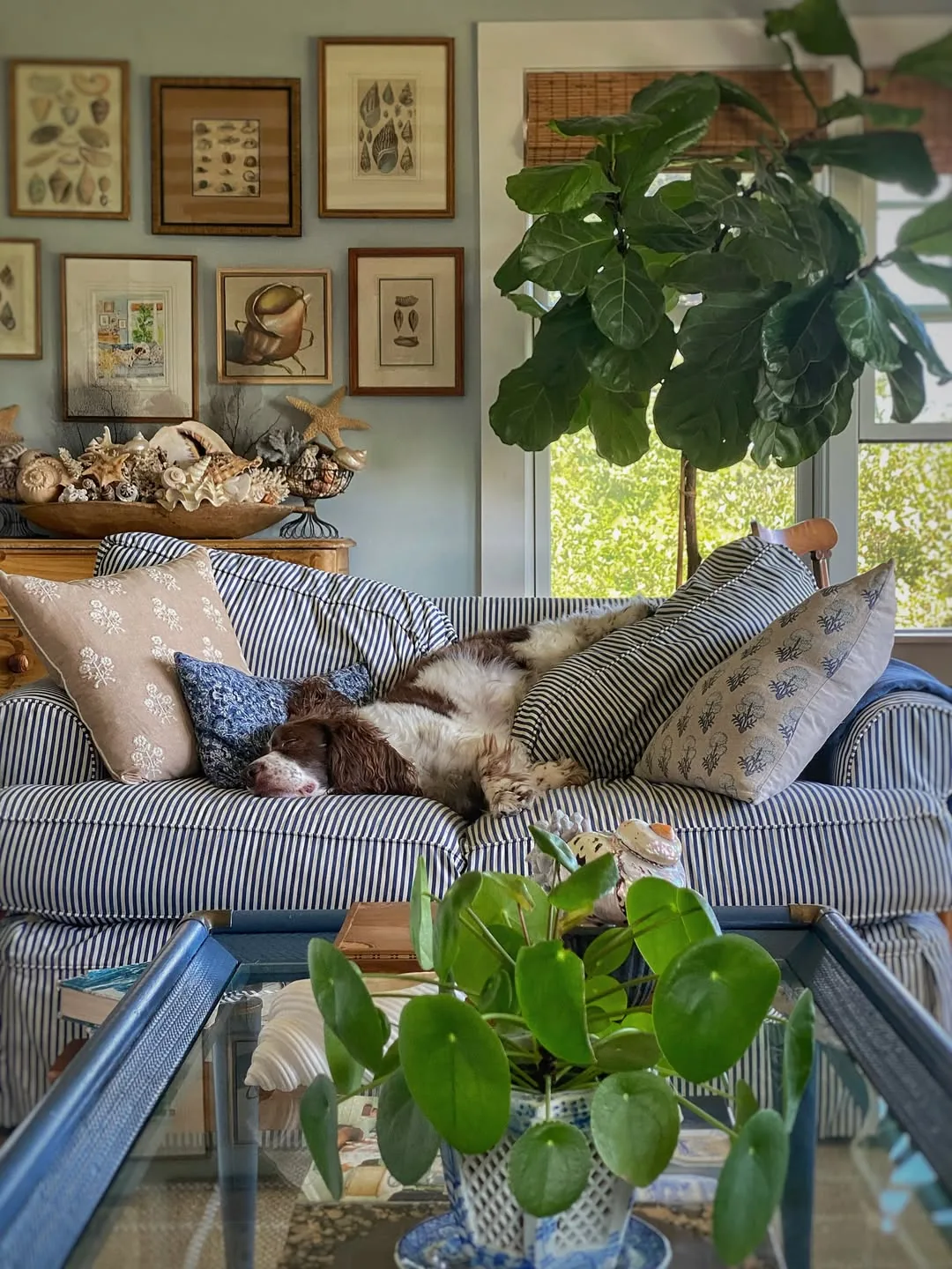
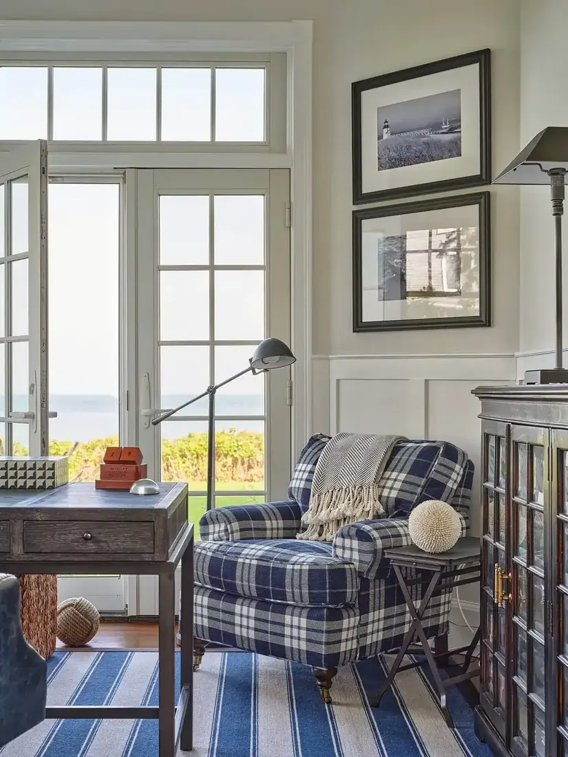
Solid blocks of blue feel heavy and a little flat. Pattern carries the colour more lightly. Stripes and small prints break blue into rhythm, so the eye moves. A striped sofa, a ticking cushion or a soft blue print on a chair gives you blue without a slab. Keep that pattern to one scale at a time, and let solids be the warm whites around it. The lake house version of this balance, steel windows and all, is worked through in our lake house living room ideas. You keep the stripe as the star and you let the solid do the quiet work for you.
Add natural texture so the room does not read as a bathroom
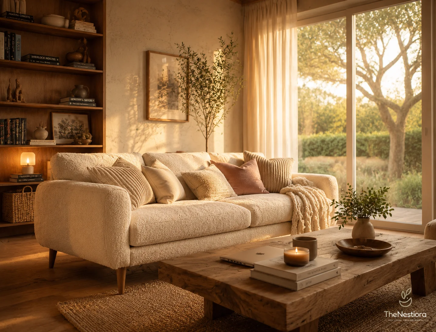
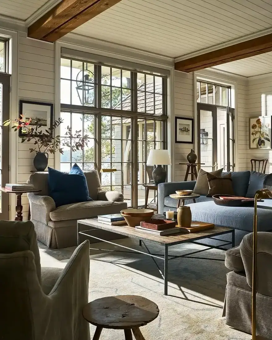
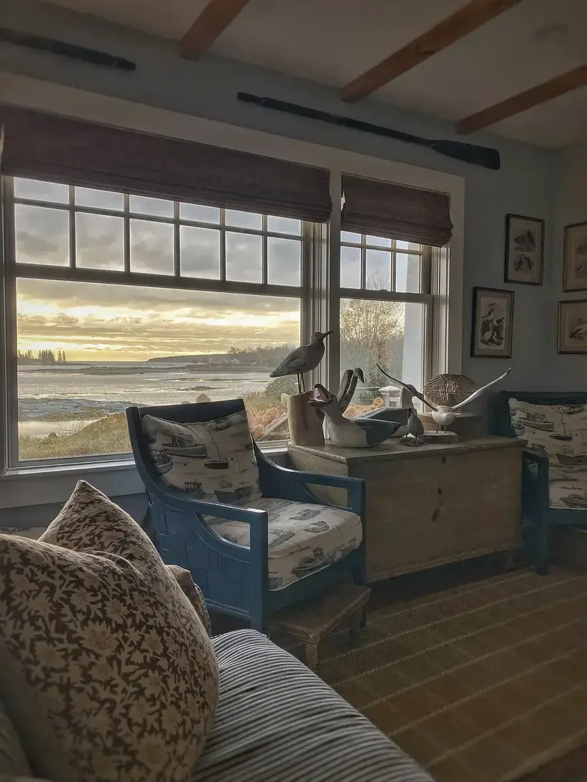
Natural texture is what stops blue and white looking like a bathroom. Jute, linen, unfinished timber and rattan bring the organic warmth that tile cannot. Place a jute rug underfoot, a linen curtain at the window, and a timber table within reach. Those three textures give blue and white a place to sit that feels like a living room for you. Those three textures give blue and white a place to sit that feels like a living room. For the green-water-light version of this room, see our lake house living room ideas. You will notice the palette feels softer even though you added no new colour.
Keep the coastal hint to blue, not to theme
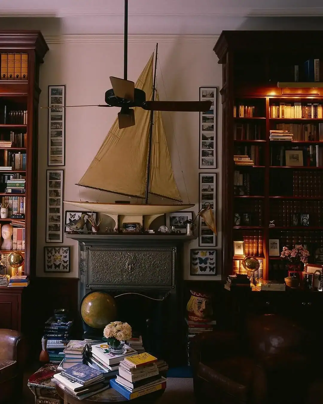
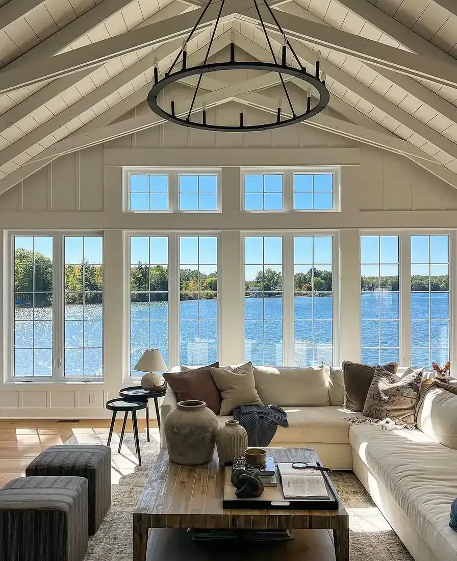
Blue and white already hints at coast, so you do not need to add coastal objects to make it read. Keep the room plain, let the blue do the hinting, and keep any nautical reference to a single stripe rather than a collection. That restraint keeps the living room calm and lets the blue and white feel like a palette for you. That restraint keeps the living room calm and lets the blue and white feel like a palette, not a costume. For more on keeping a single note calm, see our coastal living room ideas.
Scale and the quiet that lets blue breathe
The last choices are about how much blue you show at once.
Keep large pieces in large-scale blue, small pieces in small
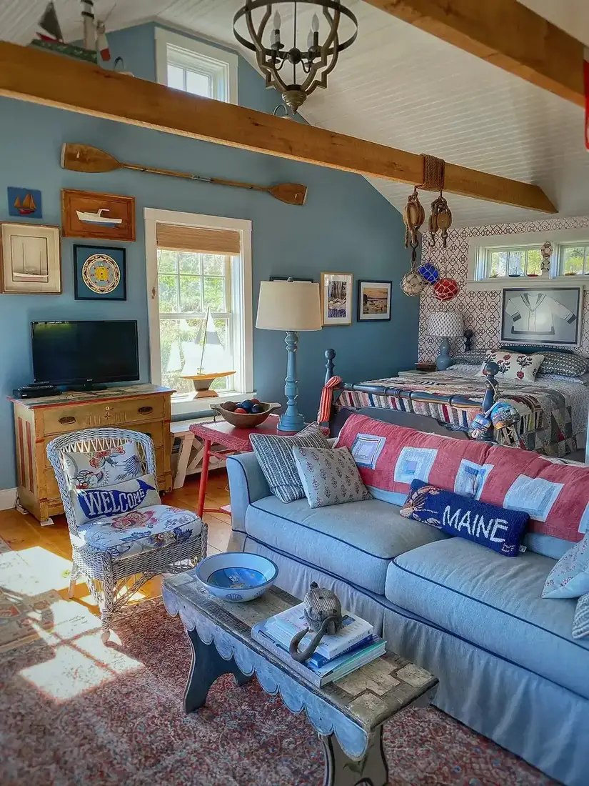
A large-scale print suits a sofa or curtains, where you see the full repeat. A small-scale suits cushions and lampshades, where the repeat stays legible up close. When you keep that scale discipline, one blue reads as confident rather than busy. The room feels collected because each blue has the right amount of space to show its pattern.
Pull plain colours from the background of the print
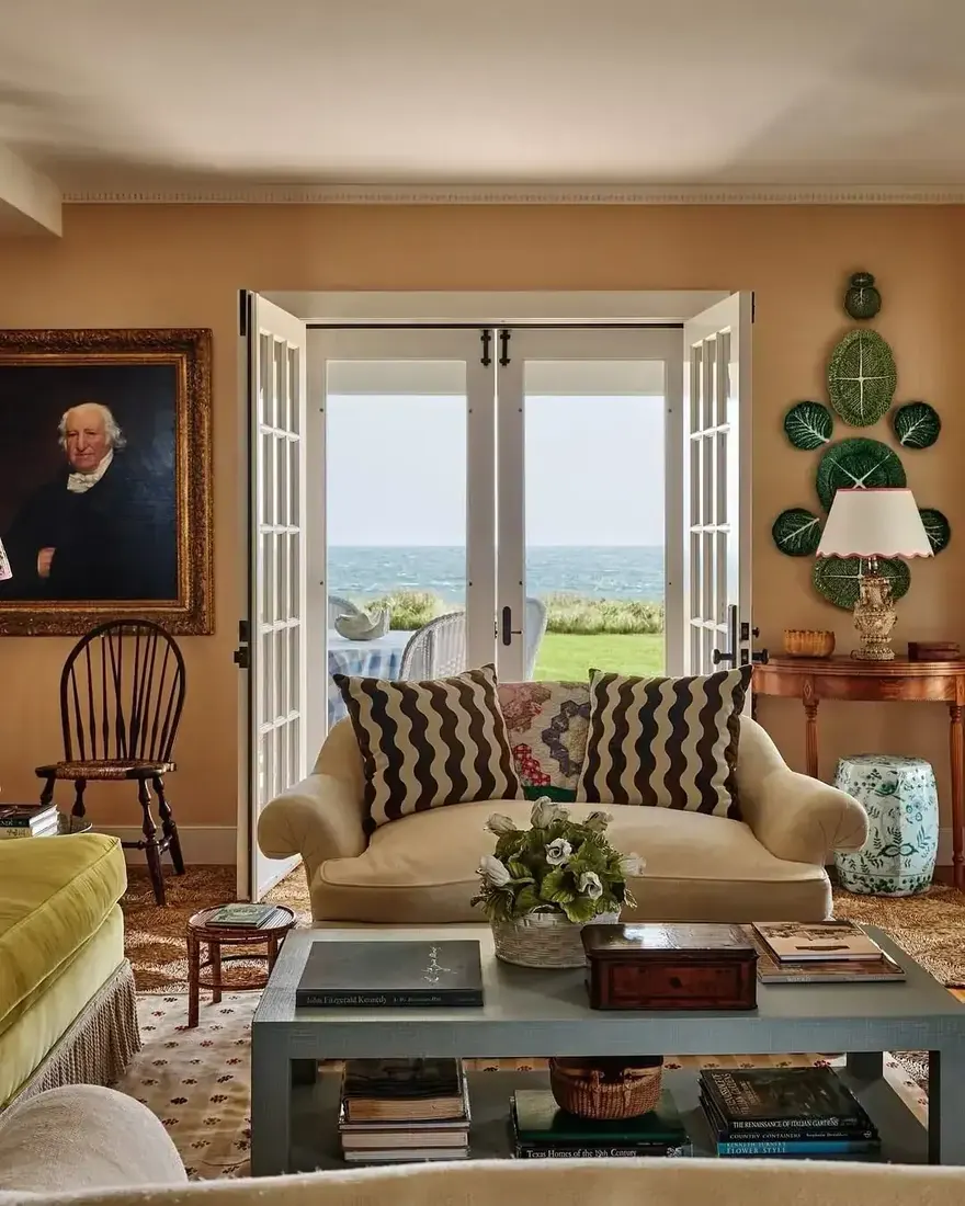
The plain colours that calm a blue print come from the background, not the flowers or motifs. If your blue floral sits on a warm putty ground, pull putty for the sofa and walls. When you pull from the background, the room reads as one fabric family even though only one piece holds the pattern. That quiet echo keeps the blue from floating.
Paint woodwork from the print to ground it
Painting woodwork a colour taken from the print stops the pattern floating away from the architecture. A soft putty or warm white from the print’s ground on the skirting or mantel ties the blue back to the house. Keep the colour a little deeper than the walls so the woodwork reads as a frame, not as wall. You will see the blue settle when the woodwork belongs to the same family.
Blue and white choices that settle
| Choice | How it reads | When you use it |
|---|---|---|
| One warm accent | Gives palette a place to sit | Blue and white feels flat |
| Warm white | Holds beside blue | White looks grey |
| Depth, not hue | Layered, calm | Blues fight |
| Pattern, not solid | Light, rhythmic | Solids feel heavy |
| Jute, linen, timber | Living room, not bathroom | Room feels cold or tiled |
The Blue and White Living Room Formula
- Add one warm accent. Wood, brass, rattan or leather, small and repeated twice.
- Keep whites warm beside blue. Creamy beside paper, not bright.
- Vary blue by depth. Navy with pale blue, not navy with turquoise.
- Let pattern carry blue. Stripes and prints over solid blocks.
- Bring natural texture. Jute, linen, unfinished timber around the blue.
- Pull plain tones from the print’s background. Keep the room as one family.
Hold those six and your blue and white will feel warm without adding more blue.
Frequently Asked Questions
Why does my blue and white room feel cold?
Blue and white alone has no warmth to sit on. Add one warm accent in wood, brass, rattan or leather, keep whites warm, and the palette settles.
Which white goes best with blue?
A warm white that looks creamy beside printer paper. Cool whites push the whole room grey, especially next to navy.
How do I mix blues without clashing?
Vary by how light or dark the blue is, not by how green or purple it leans. Navy with pale blue feels layered, navy with turquoise fights.
Should I use solid blue or patterned blue?
Pattern carries blue more lightly than solid blocks. A stripe or soft print breaks the colour into rhythm.
How do I keep blue and white from looking like a bathroom?
Add natural texture like jute, linen and unfinished timber. Those warm, organic touches make the palette feel like a living room.
Where should the plain colours come from?
From the background of your main print, not from its motifs. That keeps the room as one fabric family.
This article may contain affiliate links. We may earn a commission at no extra cost to you.