10 Neutral Bedroom Ideas: Limewash Keeps Cream Walls Alive

Add us as a preferred source to see more stories on Google.
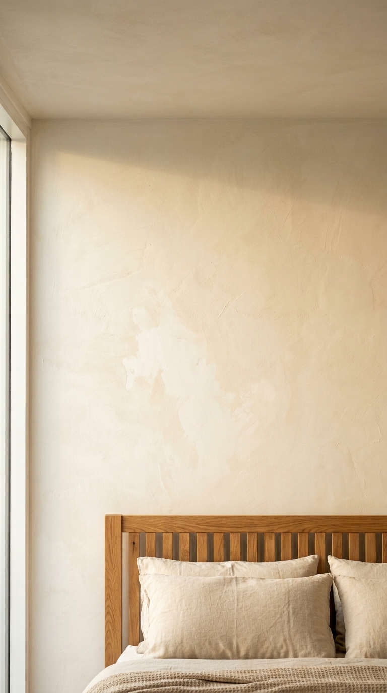
There is nothing on that wall. No art, no headboard above the slats, no shelf. It still holds attention, and the reason is the finish rather than the colour.
Look at how the surface moves. It is cloudier in some places than others, slightly deeper where the ceiling casts a shadow, and there is a faint drift of brushwork across the middle. The same cream in flat emulsion would be one even plane and would read as blank.
That variation is the whole point of limewash, and it is why a completely bare neutral room can still feel like something.
What it is, and what is being sold as it
Real limewash is slaked lime and pigment, thinned with water. It soaks into the surface instead of sitting on it as a film, and it cures by carbonating with the air, which is why it goes on translucent and lightens dramatically as it dries.
A lot of what is sold as limewash is emulsion with texture in it. That gives a mottled look on day one and then behaves like paint, which for most people is a perfectly reasonable compromise. It is simply a different product, and it is worth knowing which one is being bought before the brush is loaded.
| Budget | Product | Note |
|---|---|---|
| Premium | Bauwerk Colour | Genuine limewash; strong colour range |
| Premium | Pure & Original Classico | Chalk-based, very close in feel |
| Mid | Little Greene Limewash | Real lime, limited palette |
| Mid | Atelier Ellis | Lime-based, very quiet colours |
| Budget | Rust-Oleum or Valspar limewash effect | Emulsion with texture; easier, less depth |
It needs the right wall
This is the part that catches people, and it is not a matter of preference.
Limewash wants a porous, mineral surface: bare plaster, lime plaster, brick, stone, or an existing limewash. On those it soaks in and bonds.
It will not bond to modern vinyl or acrylic emulsion, which is what almost every wall in a modern house is painted with. On that, it either sits on the surface and rubs off, or it flakes within months. The fix is a mineral primer designed for the purpose, which most of the brands above sell alongside their paint, and it is not optional.
If the wall has been skimmed recently, let it dry fully first. New plaster holds moisture for weeks and limewash over damp plaster goes patchy in a way that cannot be corrected later.
How it goes on
Two thin coats, sometimes three, with a wide flat brush. A roller will not do, because the pattern is made by the brushwork.
Work in loose crossing strokes instead of straight lines, and keep a wet edge. Where one section dries before the next is reached, the join shows, and unlike emulsion it cannot simply be gone over.
It will look alarming while wet: streaky, patchy, far too dark. That is normal, and the second coat evens it out considerably. Judge the wall after a full day, not after an hour.
Expect the finish to keep settling for a week or two as it cures.
Living with it
Limewash chalks. Rub a hand along it and a little comes off on the palm, and that is how it is supposed to behave.
This makes it wrong for hallways where people brush past, for kitchens, and for anywhere with sticky hands at waist height. It makes it excellent for bedrooms, where the wall is looked at instead of touched.
It cannot be spot-repaired convincingly. A scuff is fixed by rewashing the whole wall, which is a couple of hours instead of a disaster, but it is not a wipe with a cloth.
What goes with it
Almost nothing, which is the appeal.
The room above has an oak slatted headboard, washed linen in a slightly warmer cream, and a waffle-weave blanket. Three materials, one colour family, and the wall doing the rest.
Linen is the right bedding here specifically because it rumples. Crisp cotton percale against a mottled wall reads as a mismatch of intentions: one surface trying to be perfect, one trying not to be.
The whole room holds one temperature
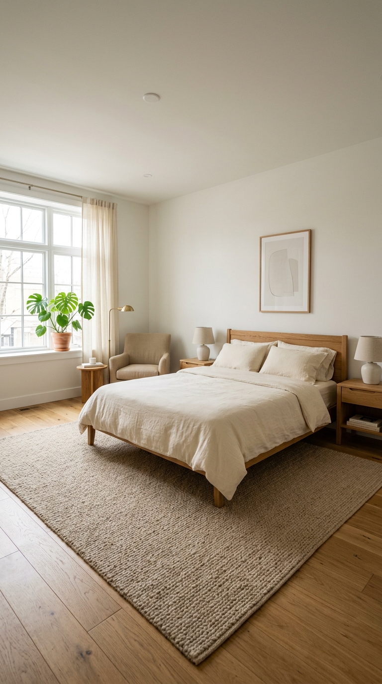
The rug shows the principle most clearly, because it sits between two larger surfaces and has to agree with both. Its weave is a beige with yellow in it, which places it on the warm side, and the honey oak floor beneath carries the same yellow. The wall above is a warm white instead of a brilliant one, so the three read as steps on one ladder.
Neutral fails in bedrooms when that ladder splits. A grey rug on honey oak makes the floor look orange; a blue-white wall beside cream bedding makes the bedding look dirty. The eye compares constantly, which is why a room can feel wrong without any single object being wrong.
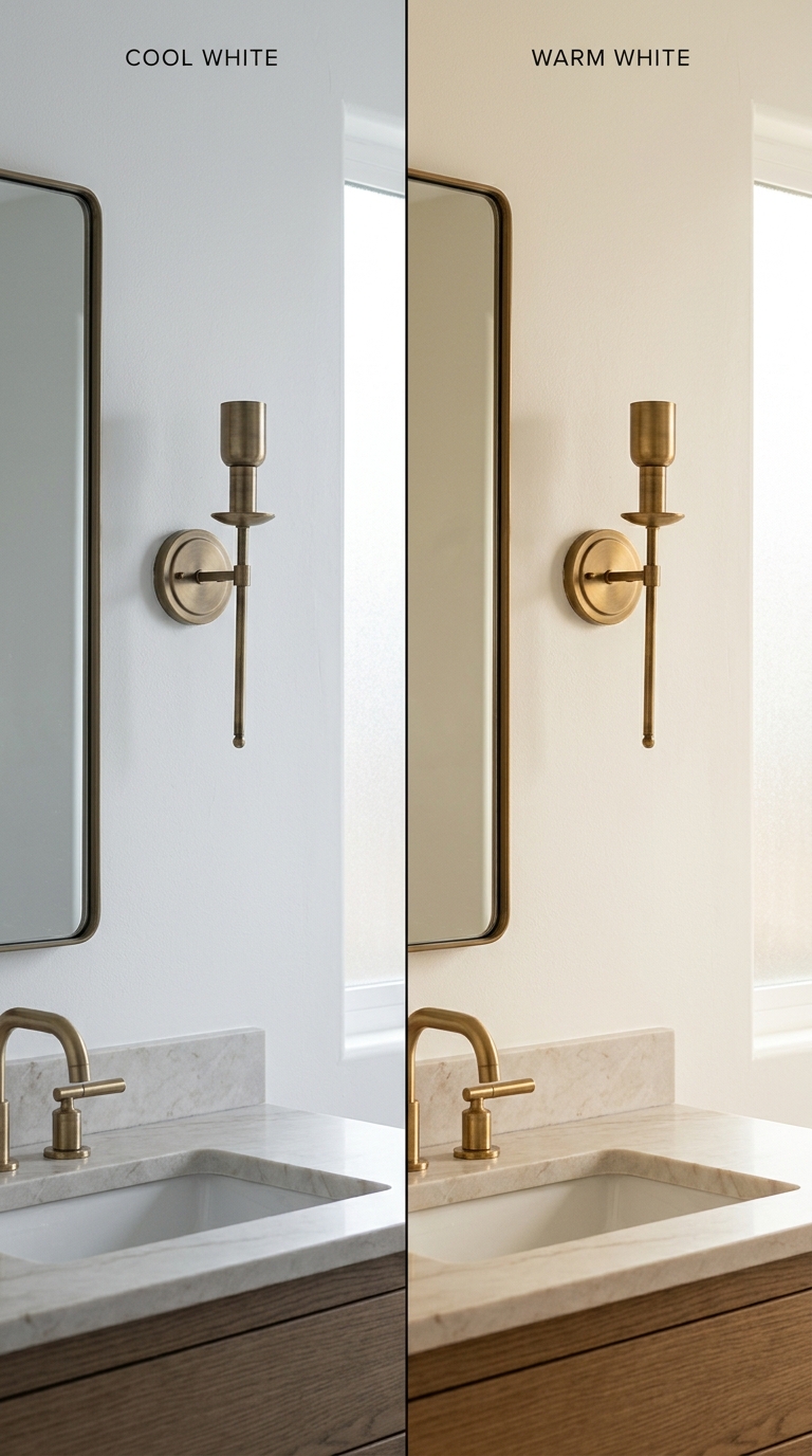
Every white has an undertone, and the undertone decides whether calm or clinical follows. Farrow and Ball Pointing No.2003 carries a trace of yellow and stays warm after dark; Benjamin Moore White Dove OC-17 does similar work with a soft grey veil that stops it going buttery. Anything described as stone, cloud or dove with grey or blue in the description is a cool white wearing a friendly name, and it will sit apart from oak.
Test on A2 boards, not on shop cards, and look at eight in the morning, at two in the afternoon, and at nine at night under a 2700K lamp with a colour rendering index of 90 or above. Philips WarmGlow manages that at roughly £4 to £9 a bulb in 2026. An undyed wool rug in this scale runs £200 to £500 in 2026, with IKEA LOHALS jute around £60 to £120 doing honest service underneath.
Linen shows the undertone first
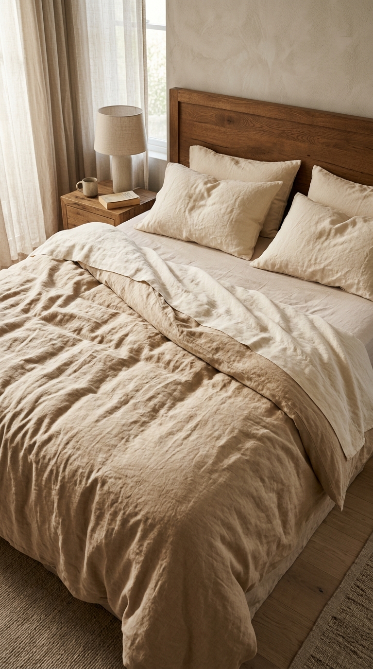
The folded duvet does the teaching here. The underside is a pale cream, the top is a deeper sand beige, and both sit against an oak headboard that is frankly honeyed. Because the linen carries yellow and the timber carries yellow, the bed looks settled instead of assembled.
Undyed linen varies, which is the part to respect. Some batches pull green grey, some pull pink, and a grey-cast set beside honey oak will always look slightly off, however good the weave. The fix is to compare the fabric with the timber in evening lamplight before committing, since morning daylight flatters almost everything.
Piglet in Bed and the Secret Linen Store both sell the washed European flax that gives this rumple, with a king duvet set typically £140 to £280 in 2026 and a matching throw £60 to £120. The bedside details follow the same temperature: a ceramic lamp with a linen shade, a small oak table, a book left open. Skip optic white sheets here, because a blue-white cotton beside sand linen reads as a shirt tucked into a blanket.
One warm accent still counts as neutral
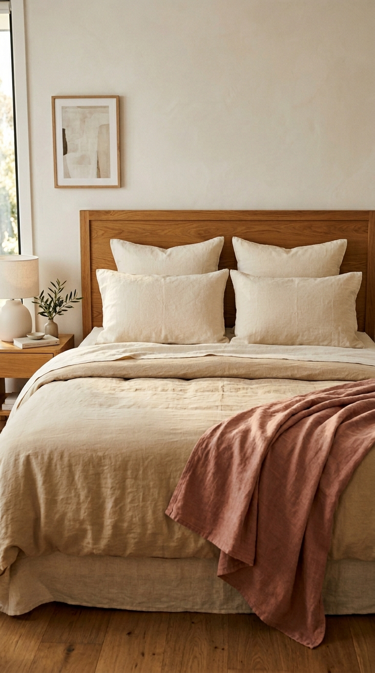
Count where the colour sits. One washed linen throw, folded once across the foot, in a dusty rose that has brown underneath it. The pillows stay cream, the wall stays warm white, the floor stays honeyed. A single generous fold reads as intentional because its scale matches the bed.
The principle is that an accent belongs when its base matches the room base. Dusty rose works beside oak and sand linen because all three share warmth; a cool blush with blue in it would sit apart and read as a separate decision. Sage behaves the same way when it is muted and warm, and terracotta when it is sunbaked instead of bright.
Keep the accent to the textiles, and keep it to one or two generous pieces instead of several small ones. A washed linen throw in this weight runs £60 to £140 in 2026 from Dunelm, John Lewis, or Piglet in Bed. Skip this move in a room lit only by cool daylight through a north window, because even a warm rose turns flat without a warm lamp to hold it.
Closeness reveals whether whites match
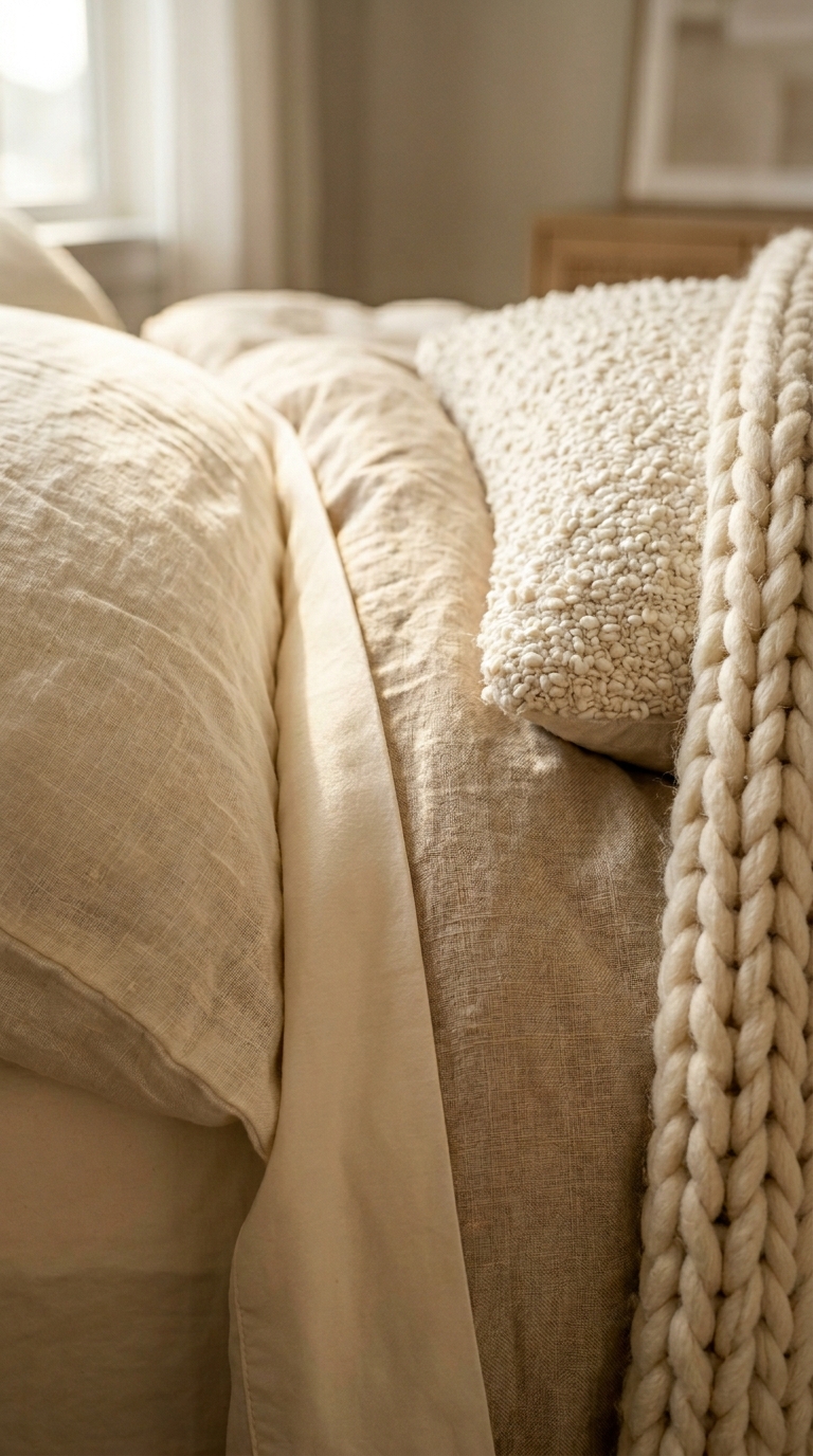
At this distance the differences stop hiding. The sateen fold is smoother and slightly cooler, the washed linen is matte and sandy, the boucle cushion is looped and pale, while the knit at the edge is thick and creamy. Each fibre takes light differently, which is why four near-whites can still disagree.
Cotton sateen reflects more directly and therefore reads cooler; wool and boucle scatter light and read warmer. That is the whole mechanism, and it explains why a sateen sheet that looked cream in the shop turns pale beside a wool throw at home. The remedy is to gather swatches and look at them touching, in the evening, under the actual bedside lamp.
Stay inside cream with yellow in it and avoid anything sold as bright or optic white. A boucle cushion in undyed wool runs £30 to £70 in 2026, a chunky knit throw £70 to £150, and both earn their place because they add depth without adding temperature. The frame behind stays blurred for a reason: at this range the textiles decide, and the timber only needs to stay out of the argument.
The window is the coolest surface
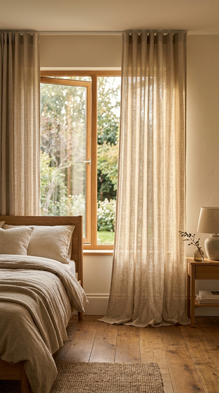
Daylight is cool, even on a pleasant afternoon, and glass adds its own faint green chill. The oak window frame here does quiet work by edging that cool opening in honey, where white plastic would edge it in cold. The sheer linen then filters what comes through, so the light lands on the floor already warmed.
The curtain fabric matters more than the heading. A medium-weight washed linen in natural or warm ivory dims glare enough for sleep yet stays translucent, and the weave shows in silhouette when the sun sits behind it. Hang the rod high and let the length pool slightly, because linen that just kisses the floor reads as careful while linen that stops short reads as waiting to be hemmed.
Made-to-measure washed linen curtains run £150 to £400 per pair in 2026, with IKEA RITVA in natural around £40 to £80 doing the same filtering job more thinly. The jute rug beneath repeats the trick at floor level: a shade deeper than the boards and considerably rougher, so the tonal step is small and the textural step is large.
A deeper wall still belongs to the same family
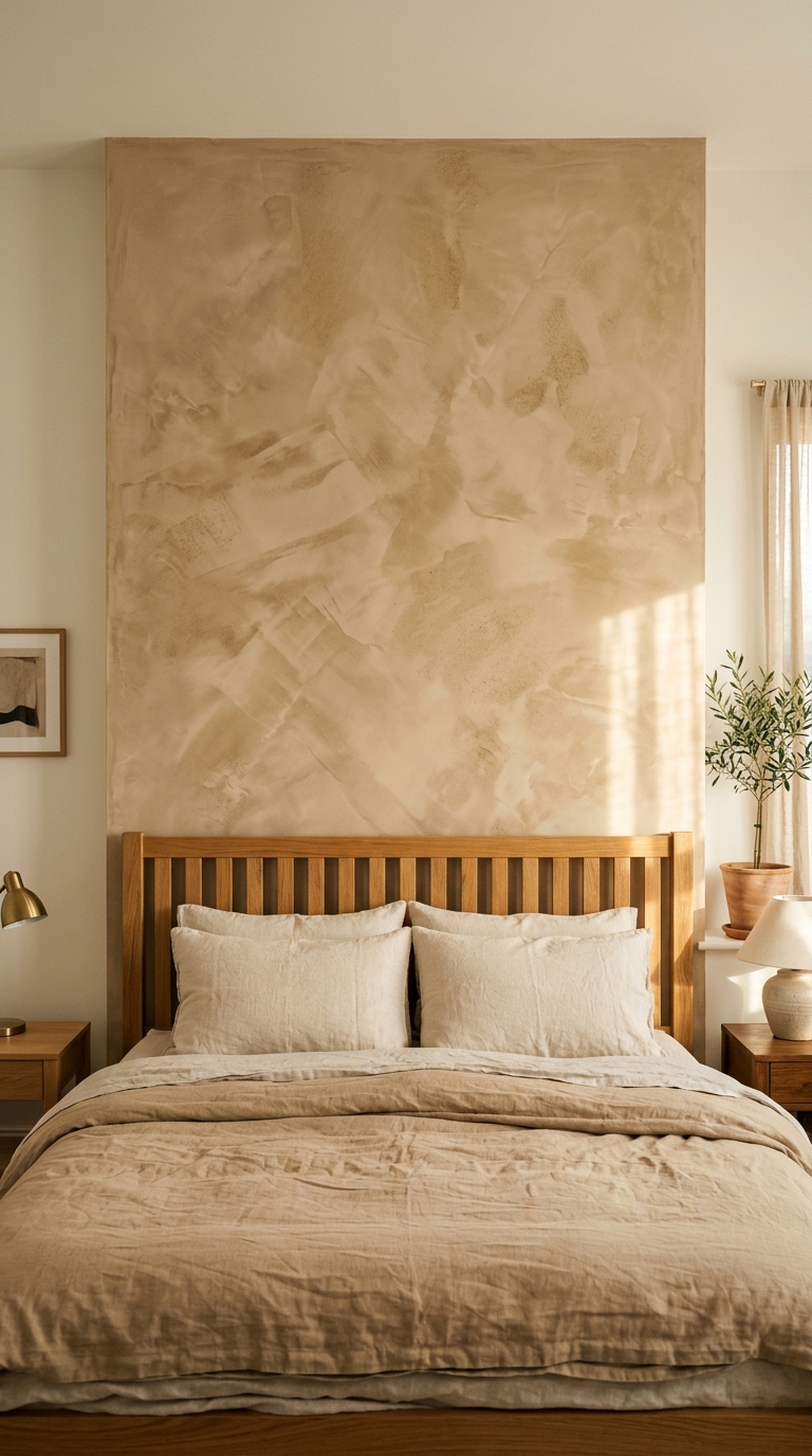
The panel is deeper than the walls around it, unmistakably, yet it does not read as a different colour. That is because its undertone matches: warm sand on warm white, both with yellow beneath the pigment. A grey sand on a cream wall would split the room in two, however similar their depth.
Trowel marks carry this panel, since they catch the bedside lamps and throw small shadows that move through the evening. The slatted oak headboard repeats the same warmth at a deeper value, and the two bedside lamps, one brass and one ceramic with a linen shade, both pool at 2700K. An olive in a terracotta pot at the edge extends the family without adding a new one.
Limewash in these sand tones runs £25 to £45 per litre in 2026 from Bauwerk Colour or Pure and Original, plus a mineral primer where emulsion sits beneath. Test the panel beside the existing white at three times of day, because a sand that matches at noon can still part company after dark. Skip a deep panel where the only light is cool and overhead, since texture without warmth reads as stain.
Small ceramics set the temperature of timber
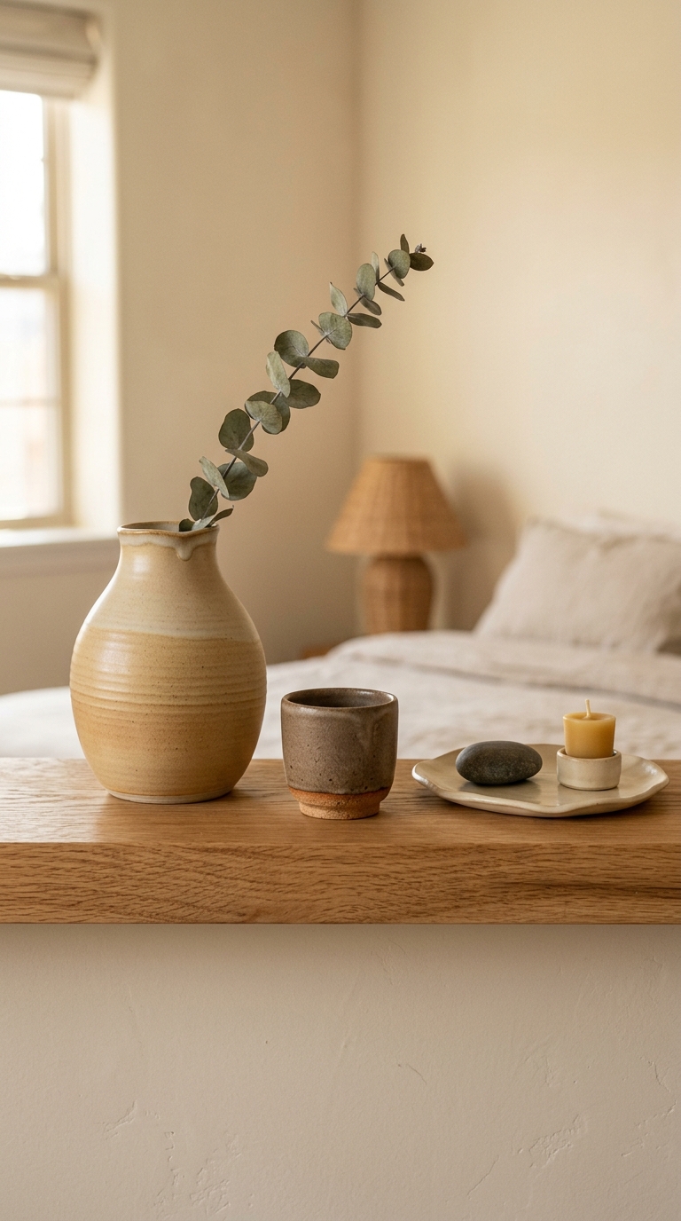
The shelf is oak, plainly honeyed, and everything on it has been chosen inside that warmth. A sand-glazed vase with visible throwing rings, a dark stoneware cup with a clay foot, a pale tray holding a smooth pebble and a block of beeswax, a single stem of eucalyptus leaning across. The rattan shade behind glows softly out of focus, which confirms the lamps run warm.
Small objects calibrate the eye, which is why they deserve more care than their size suggests. Clay, beeswax, and unglazed stone all sit naturally on the warm side, while a large cool grey object at this height would chill the whole shelf. The single pebble gets away with its coolness because it is tiny; enlarge it to a vase and the shelf would split.
Studio vases of this kind run £20 to £60 in 2026, small stoneware cups £12 to £28, beeswax block candles £8 to £15. Eucalyptus suits because its grey green is muted enough to behave as a neutral, though fresh stems drop. Polished chrome or blackened steel does not belong at this spot, since either metal would read colder than everything around it.
Oak is warm until the finish cools it
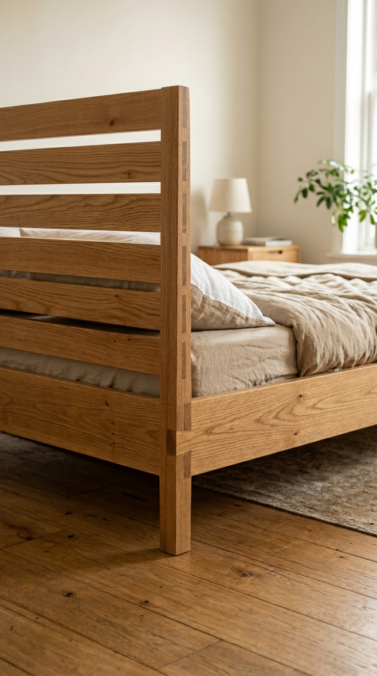
The joints give it away as solid timber: interlocking fingers at the corner, grain running continuously, edges left square so the thickness shows. Veneer cannot do that corner, which is precisely how the eye knows, even without looking for it.
Species and finish decide the temperature separately. Oak, walnut, and iroko are warm timbers; ash, maple, and birch run cooler and greyer, which is why a pale ash frame can feel Scandinavian and slightly cold inside an otherwise warm room. On top of that, a clear hard wax oil keeps oak honeyed, while a whitewash or grey stain pushes the same boards towards grey in an afternoon.
Osmo Polyx-Oil 3032 Clear Satin and Fiddes Hard Wax Oil both preserve the honey for around £20 to £40 per litre in 2026. A solid oak bed of this simplicity runs £800 to £1800 in 2026 depending on size and maker. The patterned rug beneath sits mostly under the bed, which is the right place for the coolest textile in the room, since the timber surrounds it on every visible side.
Art can stay neutral when its base is warm
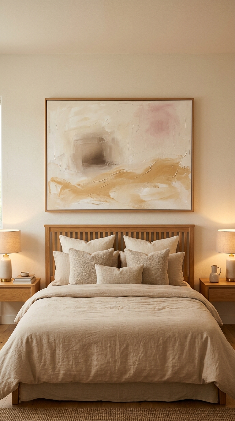
This canvas is the largest single object on any wall in the room, and its base colour sets the wall temperature. The ground is a warm white with sand, blush, and pale umber drifting across it, so the wall behind reads as continuous with the frame. A canvas grounded in gallery white would chill the same wall, however quiet the brushwork.
Scale does the anchoring. The frame spans most of the headboard width in thin oak that matches the bed, and the symmetry below, two linen-shaded lamps with warm pools and two oak chests, keeps the eye from wandering. Boucle cushions in front pick up the pale passages of the painting, which ties the bed to the wall without introducing anything new.
A large giclee in these tones runs £150 to £400 in 2026, an original canvas £400 to £900, thin oak framing £80 to £200. Hang the centre roughly at standing eye level and keep the width inside the headboard, because a neutral canvas that overhangs its bed reads as a separate picture instead of a headboard wall.
Warm or cool, bedroom surface by surface
| Surface | Warm choice | Cool choice |
|---|---|---|
| Wall paint | Farrow and Ball Pointing No.2003 | Farrow and Ball Wevet No.273 |
| Bedding | Sand or natural washed linen | Bright white cotton sateen |
| Curtains | Natural washed linen, translucent | White blackout roller |
| Rug | Jute, sisal, undyed wool | Grey polypropylene |
| Timber | Honey oak, oiled | Grey stained or whitewashed oak |
| Bulb | 2700K, CRI 90 or above | 4000K cool white |
| Lampshade | Linen or pleated cotton | Grey paper |
| Art base | Warm white canvas, oak frame | Gallery white canvas, black frame |
Read that table as decisions made once and then left alone. The failure mode is choosing from both columns across one room and wondering why the bed looks right in the shop and slightly off at home.
Frequently asked
Frequently Asked Questions
Do cream walls and a grey rug ever sit happily together?
Rarely, because the rug makes the paint look grubby and the paint makes the rug look cold. Where the floor is honeyed, a jute or undyed wool layer keeps the whole base on one side.
How do I tell if a white paint will turn chilly after dark?
Brush it onto a large board and view it beside the duvet at morning, afternoon, and lamplight. Anything with grey or blue beneath the name usually hardens at night, while yellow-based shades stay soft.
My oak bed looks orange beside new sheets. What went wrong?
The sheets are probably a brighter, cooler white than the timber. Swap them for a natural or sand linen so the fabric shares the yellow sitting in the frame.
Can I add a colour without breaking the calm?
One generous textile in a warmed shade, such as dusty rose or muted clay, keeps the peace. Keep it to the bed, keep it large, and leave everything else plain.
Why does the room look fine by day and flat at night?
Overhead cool lighting is usually undoing warm surfaces. Run linen-shaded bedside lamps at 2700K, switch the ceiling off, and judge again before buying paint.
Does wall art need to match the bedding exactly?
No, but its background should share the same base warmth. A canvas grounded in soft white with sand and blush passages will rest easily above cream pillows, while a stark white ground will stand apart.
Before you start
- Check whether the wall is emulsion; if so, buy the mineral primer too.
- Use a wide flat brush in crossing strokes, never a roller.
- Let the first coat dry fully before judging the colour.
- Keep it out of kitchens and hallways, since it cannot be wiped.
- Pair it with materials that rumple, such as linen, instead of crisp ones.
This article may contain affiliate links. We may earn a commission at no extra cost to you.