9 Neutral Living Room Ideas Built on One Temperature and Nothing Cool

Add us as a preferred source to see more stories on Google.
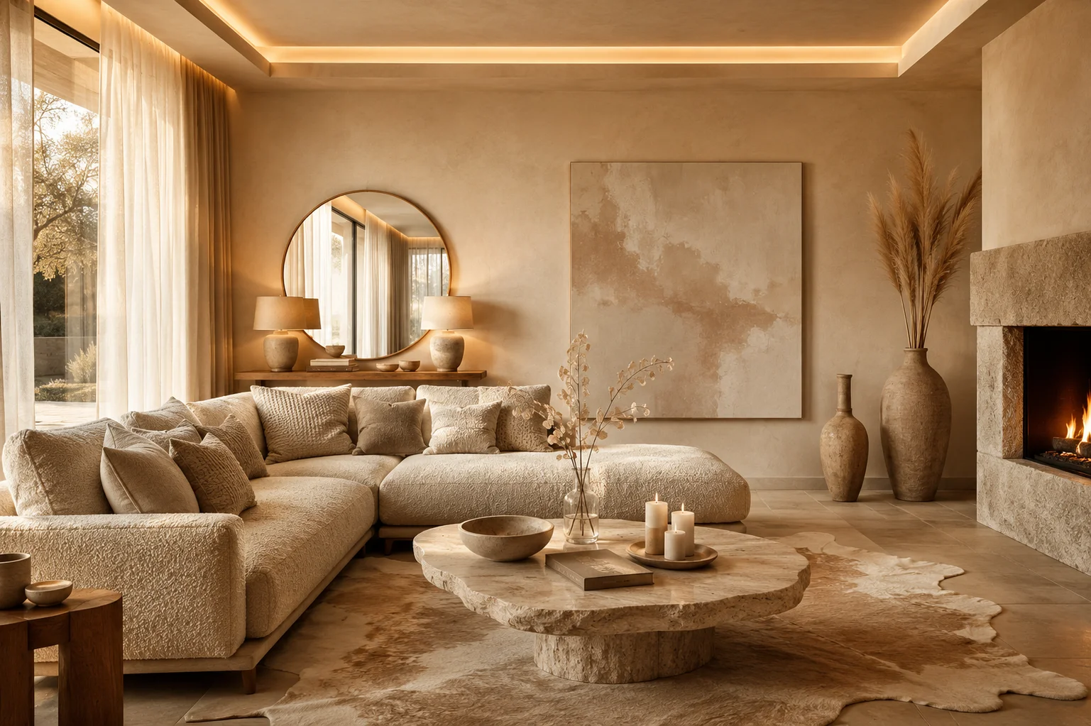
Almost nobody ruins a neutral room with the wrong sofa. They ruin it with the wrong bulb.
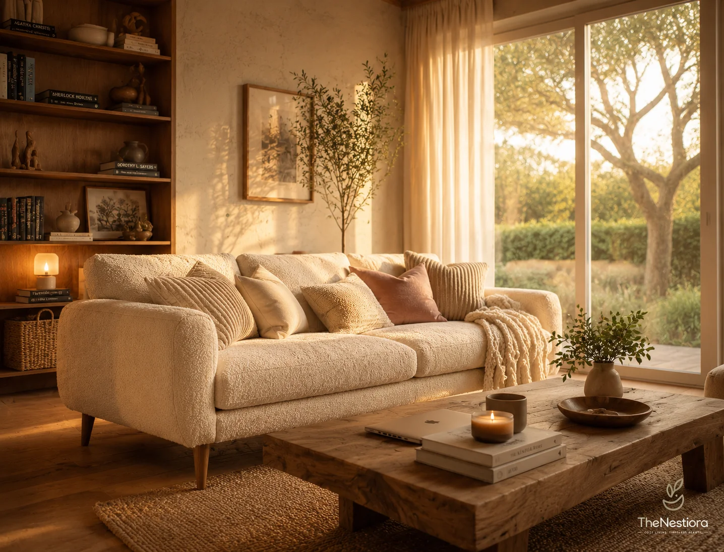
The room below has cream plaster, a bouclé sectional, a travertine table, an oak floor and a brass mirror. Every one of those things sits on the warm side of neutral. There is no grey in the frame and no true white either. That repetition, twenty times over, is the whole trick.
Neutral is a family of temperatures rather than a single colour, and the members of that family do not get along.
The same room, photographed twice
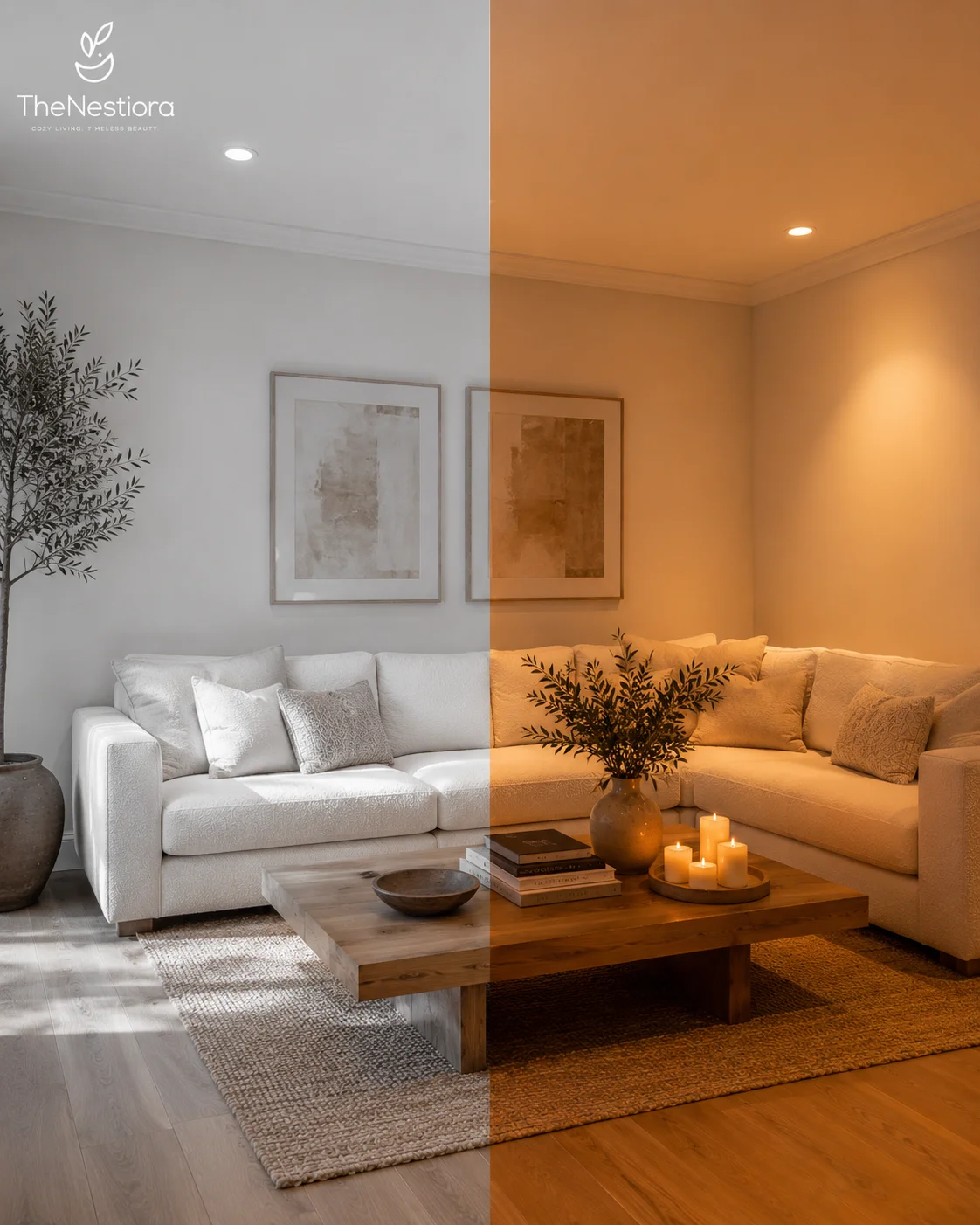
This is one room. Same sofa, same rug, same coffee table, same two framed prints, same oak floor. The left half is under daylight through the window. The right half is under warm evening light. Nothing moved between the exposures.
The sofa shows it most clearly. On the left it is grey-white and slightly cold. On the right the identical fabric is cream and gold. The rug follows it, and so does the wall behind. If you had bought this room on the strength of the left half you would spend the next year wondering why it never felt like the photograph.
That is colour temperature, and it is measured in kelvin. Daylight on a dull afternoon runs 5500K to 6500K. A bulb sold as warm white is 2700K. Cool white, which is what most builders fit because it is cheap and bright, is 4000K. Most rooms contain all three at once.
Audit every bulb in the room before you do anything else. Ceiling, lamps, picture lights, the strip behind a shelf. If the ceiling is 4000K and the lamps are 2700K, the ceiling is undoing the lamps every evening. Buy one temperature, buy it everywhere, and look for a colour rendering index of 90 or above, because a low-CRI warm bulb turns oak muddy rather than honeyed. Philips WarmGlow and Integral’s 2700K range both manage it for a few pounds a bulb.
The window is a light source as well, and a cool one. In a north-facing room you are working against it, and that is the one case where choosing a cool neutral on purpose is the better answer.
Warm white is a decision, not a default
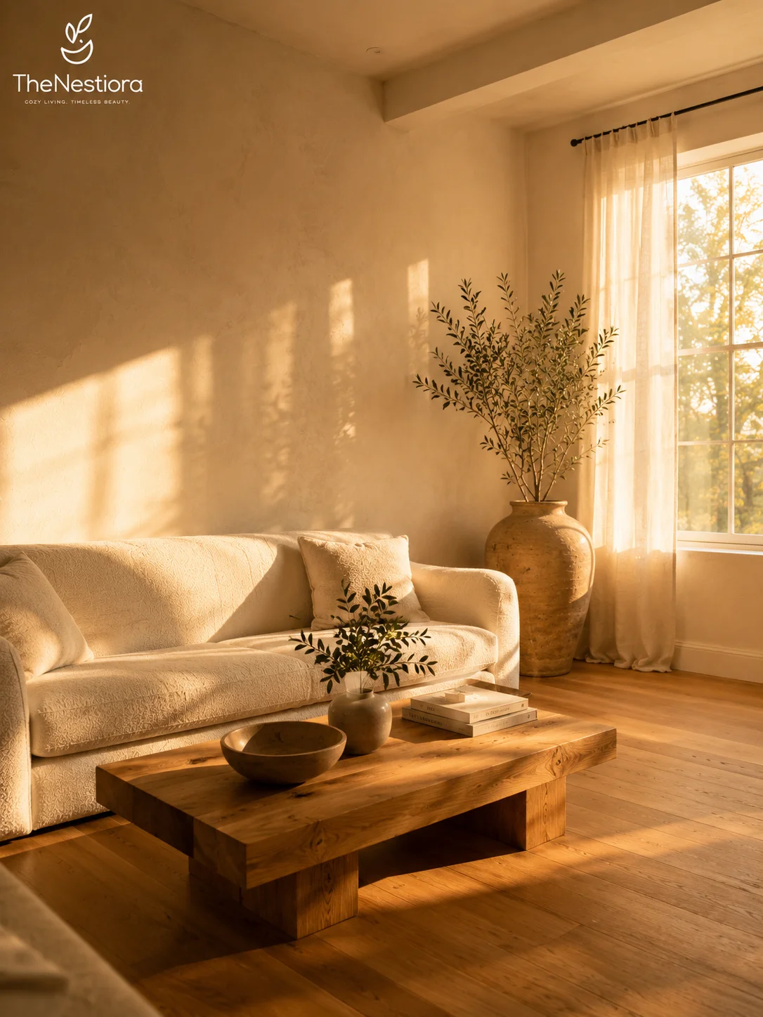
The wall in this photograph is a cream with yellow in it, and the floor beneath it is honey oak rather than pale ash. Watch the shadow the window throws across the plaster: the lit part goes almost butter, and the shaded part stays sandy instead of turning blue-grey. The warmth is in the pigment itself.
Every white has an undertone, and the undertone is what decides whether a neutral room reads calm or clinical. Light reflectance value tells you how light a colour is, not how warm, which is why two paints with the same LRV can behave completely differently. Farrow & Ball Pointing No.2003 sits around LRV 80 with a trace of yellow and is the safest warm white in this country. Shaded White No.201, at roughly LRV 72, is the softer version for a room with less light. Benjamin Moore White Dove OC-17 does the same job on the other side of the Atlantic.
Avoid anything named for a stone, a cloud or a dove if the description mentions grey or blue. Those are cool whites wearing a friendly name, and beside a cream sofa they look like an error.
Test on A2 boards, not on the tiny card the shop gives you, and look at them at eight in the morning, at two in the afternoon and at nine at night. Buy the one that stays warm at all three times. The one that only works at noon will look wrong by February.
Depth without a second colour
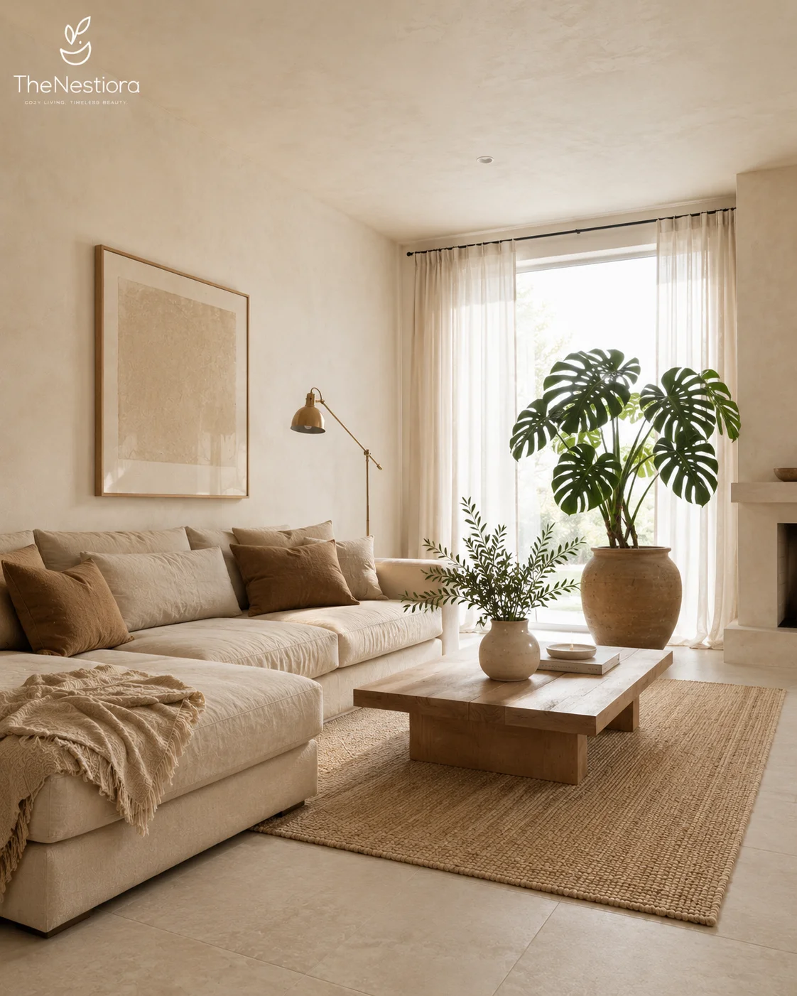
There is one temperature in this room, and four or five values. The wall, the sofa, the rug and the floor are all warm. How light or dark each of them is varies a good deal more.
The wall is the lightest thing in the frame. The sofa is a step darker. The camel cushions are a step darker again, and the single dark brown cushion is the deepest note in the room. That ladder gives the room its structure, and it does the job most people try to do by adding a colour.
This is the part that saves a neutral scheme from blandness, and it is cheaper than it sounds. If everything in a room sits within two steps of light, the room reads flat no matter what the fabric cost. Adding one value step is a cushion or a throw, not a new sofa. Two cushions in a deeper tone than anything else in the room will hold a whole seating area together.
Copy the floor as a pair. Large pale stone underneath, then a jute rug on top that is both a shade darker and considerably rougher. The tonal difference is small. The textural difference is large, and the eye reads both as depth. Weaver Green and Armadillo both sell the woven layer, and IKEA’s LOHALS does a serviceable jute runner for £60 to £120 depending on size.
Where texture carries the colour
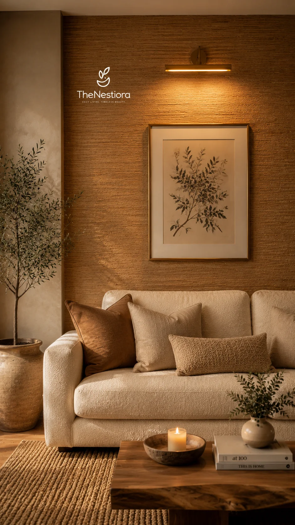
Honey grasscloth, a brass picture light above a botanical print, a cream bouclé sofa, one rust velvet cushion. The picture light throws a pool down the wall and does two jobs with it: it lights the art, and it rakes across the weave so you see texture instead of colour.
Textured natural wallcoverings shift with the light far more than paint does. Put the same grasscloth under a 4000K bulb and it reads khaki. Under 2700K it reads amber. Paint moves a little between the two; grasscloth moves a lot, which is either the reason to buy it or the reason to avoid it, depending on how disciplined your lighting is.
Grasscloth runs roughly £40 to £120 per square metre fitted, and the spread is mostly about whether it is paper-backed or hand-woven. Phillip Jeffries and Arte both carry warm naturals. Limewash is the cheaper route at £25 to £45 per litre, and Bauwerk and Pure & Original both sell it in warm sand and ochre tones. Limewash has the advantage of being brushable by a competent amateur, and the disadvantage of being permanent in the way that only mineral paint is.
Grasscloth is not wipeable, which matters before you order. It marks, it stains, and it cannot be cleaned without changing the surface. A living room wall that nobody leans on is the right place for it. A hallway, a kitchen or the wall behind a dining chair is not.
The surfaces nobody counts
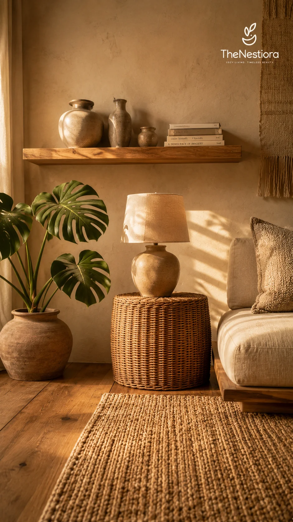
Sand limewash, an oak floating shelf, three unglazed ceramic vessels, a ceramic lamp with a linen shade on a woven rattan drum, a monstera in a terracotta pot, oak floorboards, a jute rug. Every object in that list is warm. There is no metal in this corner at all, and no white plastic anywhere in the frame.
The temperature of a room is decided as much by twenty small surfaces as by the paint, and this is where most neutral schemes quietly fail. The paint gets chosen with care and the grout gets chosen by whoever tiled it. Grout is the easiest fix on the list: Mapei Ultracolor Plus in 132 Jasmine is a warm sand, and 110 Manhattan is a grey that will pull a cream tiled floor cold across a whole room.
Then work down the list of things nobody photographs. Socket and switch plates, where white plastic reads cold against a warm wall and brass or antique bronze plates cost £8 to £25 each. Radiator valves and their plastic caps. Curtain track and its brackets. The underside of a shelf, which catches light from below and shows its colour more than you would expect.
Lampshades deserve their own sentence, because a linen or pleated cotton shade over a 2700K bulb is the cheapest warm object you can put in a room. A cool grey paper shade over the same bulb cancels most of the benefit for the sake of saving four pounds.
Wood has a temperature too
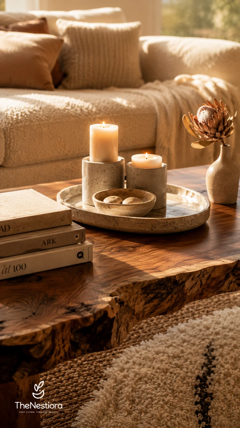
A burl coffee table with a travertine tray on it, two stone candle holders, three books, a dried protea in a cream vase. The burl is dark and warm and full of movement. The travertine beside it is a pale sand with holes in it, honed rather than polished.
Species and finish both matter, and they matter separately. Oak, walnut and iroko are warm timbers. Ash, maple and birch are cooler and greyer, which is why pale ash furniture so often reads Scandinavian and slightly cold even in a warm room. On top of that, the finish decides how much of the timber’s own colour survives. Osmo Polyx-Oil 3032 Clear Satin and Fiddes Hard Wax Oil both leave oak honeyed. A whitewash pushes the same board towards grey, and a grey stain takes it there completely.
Travertine is the stone to know for warm neutral rooms. Honed and unfilled is the warmer look and the more forgiving one, and it runs £60 to £140 per square metre depending on grade and thickness. Polished and filled travertine is cooler and more formal, and it will fight a limewash wall.
Beeswax burns at roughly 2600K, warmer than any bulb you can buy for a domestic fitting, and the flame is around 1800K at its base. The small pool of light in this photograph is warmer than the rest of the room for exactly that reason.
Light is a material
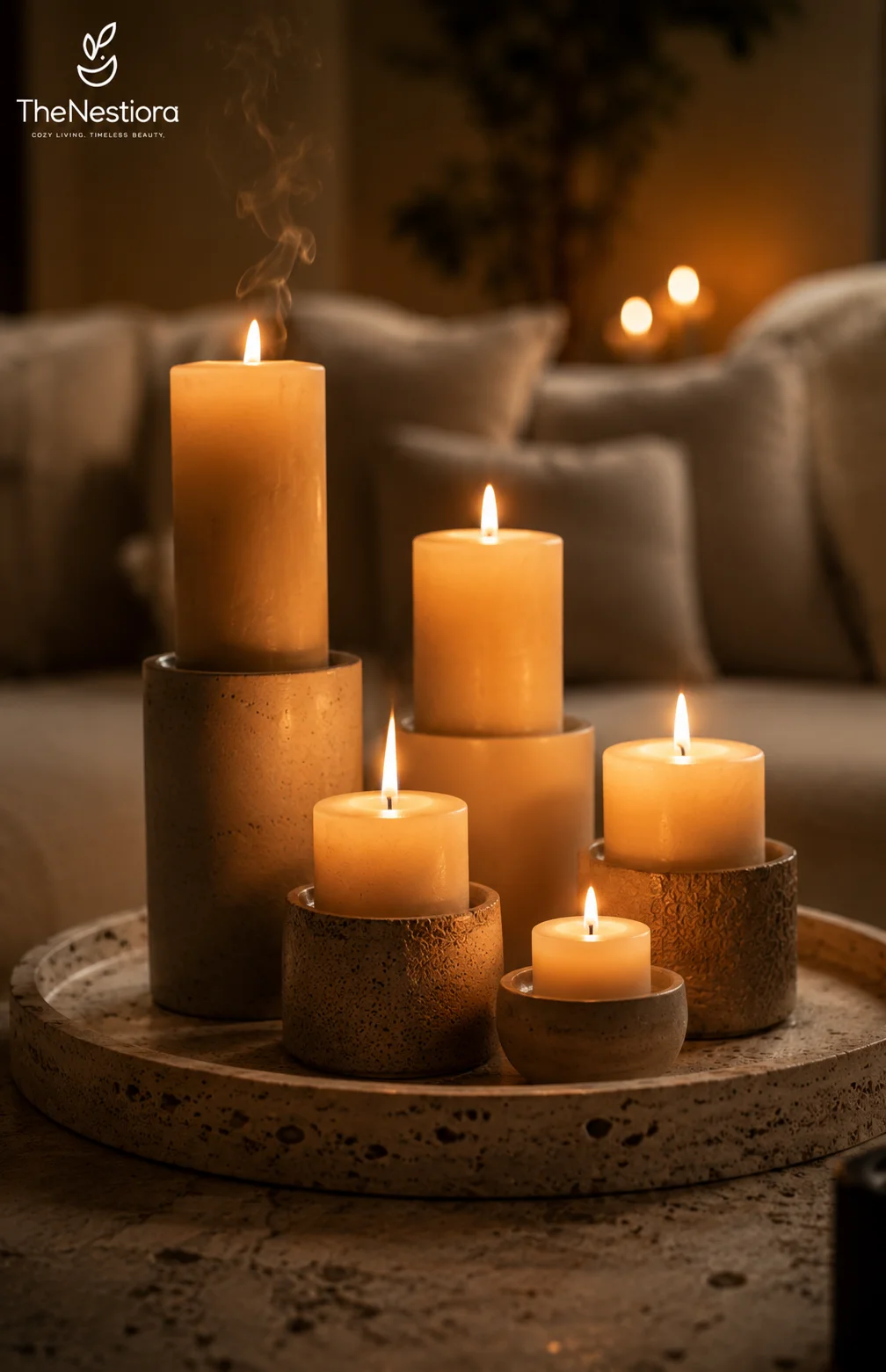
Five candles in travertine and textured stone holders, on a travertine tray, in front of a sofa that is blurred into cream. There is warm light in the background too, out of focus, which tells you the candles are not the only source in the room.
Light is the last material you choose and the one that overrules the others. A room of correctly chosen warm surfaces under a 4000K ceiling fitting will still read cold, and no amount of shopping will fix it. This is why the order of operations matters: paint and stone are expensive and slow to change, bulbs are about four pounds and take ninety seconds.
What matters is the number of sources, not their wattage. Three to five lamps below eye level make a room feel gathered in a way one bright ceiling fitting never will. Light from above throws shadows downward and flattens every surface it touches. Light from below and beside rakes across materials and shows the texture.
Keep the ceiling fitting for cleaning and for finding things. Live in the room under the lamps. All of them 2700K, all of them dimmable, and ideally on two or three separate switches so you can drop the level as the evening goes on instead of choosing between everything on and everything off.
The test is at eight in the evening
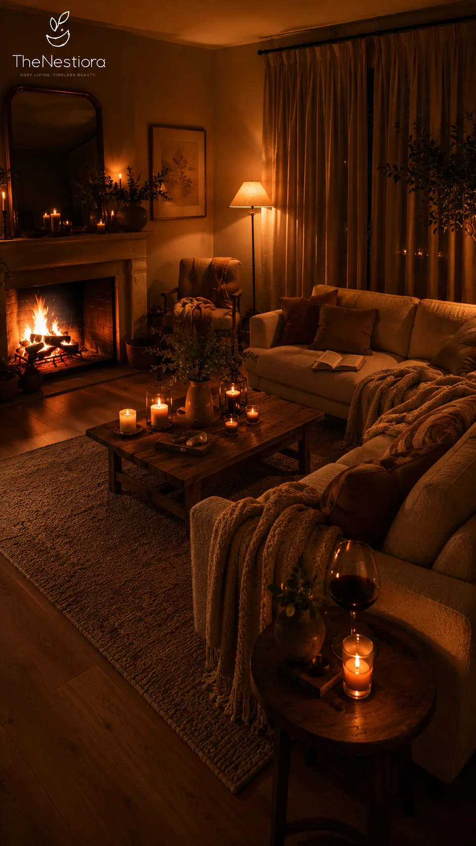
Cream sofa, dark brown cushions, a chunky knit throw, one lit floor lamp with a cream shade, an open fire, candles on the coffee table and more on the mantel, a glass of wine, a book left open. The corners of the room are dark and nobody has tried to light them.
Judge a neutral room twice: once in daylight and once after dark. The daylight version is largely outside your control, since it depends on the weather and the orientation of the house. The evening version is entirely within it, and it is the one you will live in for most of the year.
The evening audit takes two minutes. Turn off the ceiling light. Turn on every lamp. Leave the room and walk back in. If it reads golden and the corners fall away into shadow, you are finished. If it reads flat and evenly lit, you have too much overhead and not enough low, and that is a bulb problem rather than a decorating problem.
The fire in this photograph is the warmest object in the frame, around 1000K at the base of the flame, and the floor lamp is the second. Nothing here is trying to be a feature. The warmth comes from six or seven small sources instead of one, and that is what makes the room feel lived in rather than staged.
Warm or cool, surface by surface
| Surface | Warm choice | Cool choice |
|---|---|---|
| Wall paint | Farrow & Ball Pointing No.2003 | Farrow & Ball Wevet No.273 |
| Floor | Honey oak, oiled | Grey-washed oak, lacquered |
| Rug | Jute, sisal, undyed wool | Grey polypropylene |
| Grout | Mapei Ultracolor Plus 132 Jasmine | Mapei Ultracolor Plus 110 Manhattan |
| Metal | Unlacquered brass, antique bronze | Chrome, brushed nickel |
| Bulb | 2700K, CRI 90 or above | 4000K cool white |
| Lampshade | Linen or pleated cotton | Grey paper |
| Wall texture | Grasscloth, limewash, sand plaster | Flat matt emulsion |
Read that table as a set of decisions you make once and then stop making. The failure mode is picking from both columns, room by room, and then wondering why the whole house feels slightly off.
Frequently asked
Frequently Asked Questions
Can warm and cool neutrals live in the same room if they are kept apart?
Distance helps less than people hope. The eye compares the two ends of a room constantly, and what registers is the contrast. One cool object in a warm room reads as an error rather than as an accent.
Which is the safer default, warm or cool?
Warm, in almost every British and North American home, because the artificial light is warm and the daylight is not reliable. Warm neutral is also more forgiving of timber floors, which most houses already have.
Do I have to repaint to rescue a grey-looking room?
Not usually. Change the bulbs first, all of them, and live with that for a week. Paint is the expensive variable and it is frequently innocent. If the room is still wrong after the light is right, then repaint.
What light reflectance value should a warm neutral sit at?
Between roughly 70 and 85 for a main wall in a room with decent light. Below 70 the room darkens noticeably, and above 85 you lose the warmth you were paying for in the first place.
Is a grey sofa a mistake in a warm neutral room?
Only if the grey is genuinely cool. Greige, which is a grey with brown in it, behaves like a warm neutral and sits happily beside cream, oak and brass. Ask for the undertone before you ask for the name.
How many bulbs do I actually need to change?
Every one in the room, in a single go. Half a job leaves you with a ceiling fighting the lamps, which is the exact condition you were trying to fix, and it is harder to diagnose because it looks intermittent.
In order
- Choose warm or cool and write it down before you buy anything else.
- Replace every bulb in the room with one temperature at 2700K and CRI 90 or above.
- Test paint on A2 boards at three times of day, not on a shop swatch.
- Build depth from four or five values inside that one temperature.
- Change the grout and the socket plates before you change the paint.
- Keep timber warm: oak, walnut and iroko, finished in hard wax oil.
- Layer several low lamps, all warm, and leave the ceiling off after dark.
This article may contain affiliate links. We may earn a commission at no extra cost to you.