10 Fall Window Designs That Leave the Glass Empty

Add us as a preferred source to see more stories on Google.
Most fall window paintings fail for the same reason, and it is not your shaky lines.
They cover too much glass.
Once paint fills the middle of your window, the room behind it goes dim and flat, and your design stops looking decorative and starts looking like frosting. The windows people save are almost always mostly empty. A few pumpkins along the sill. Leaves down one edge. A little lettering, then nothing.
So the skill you actually need is not drawing. You need to know where to stop.
These ten designs all leave the view intact, and each one tells you where its empty space goes.
Where the paint goes
Before you choose a design, decide which part of your glass stays empty. Everything else you do follows from that.
Build the scene into one corner
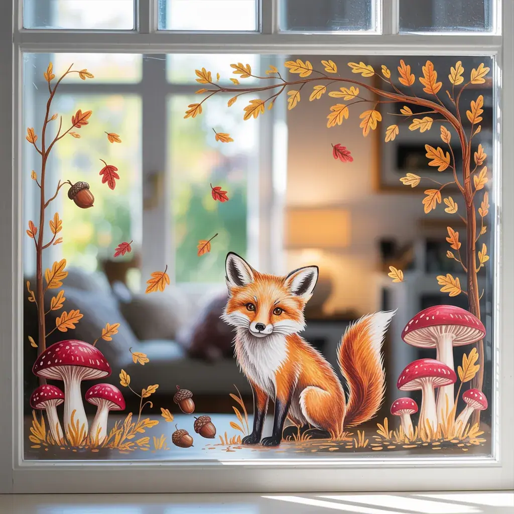
A woodland scene reads best when it grows out of a single corner rather than sitting marooned in the centre. Anchor your heaviest elements low, a fox, some mushrooms, a few acorns, then let your leaves climb one side and thin out as they go. That gradient is what makes it feel like weather rather than wallpaper. You follow the density up and out, and the clear glass in the middle still does its job for you. This layout also forgives mistakes, because the busy part is small and the empty part carries most of the window.
Use white on dark glass instead of colour
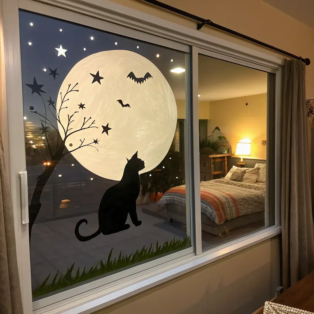
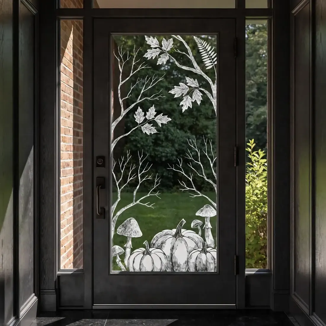
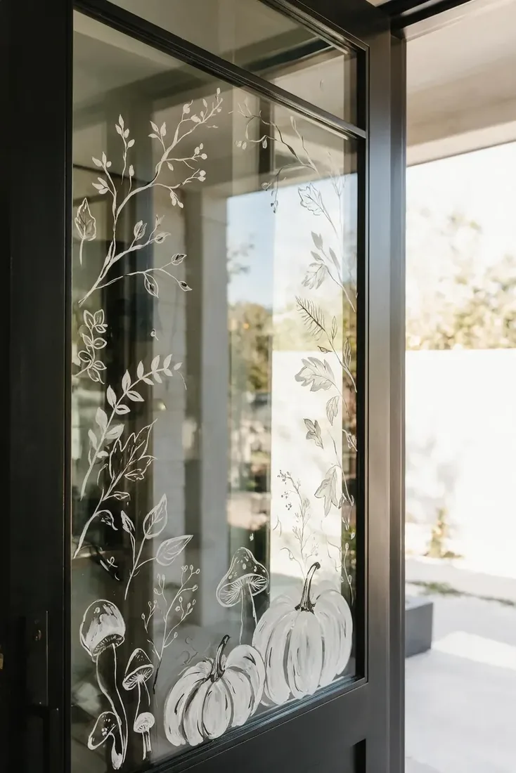
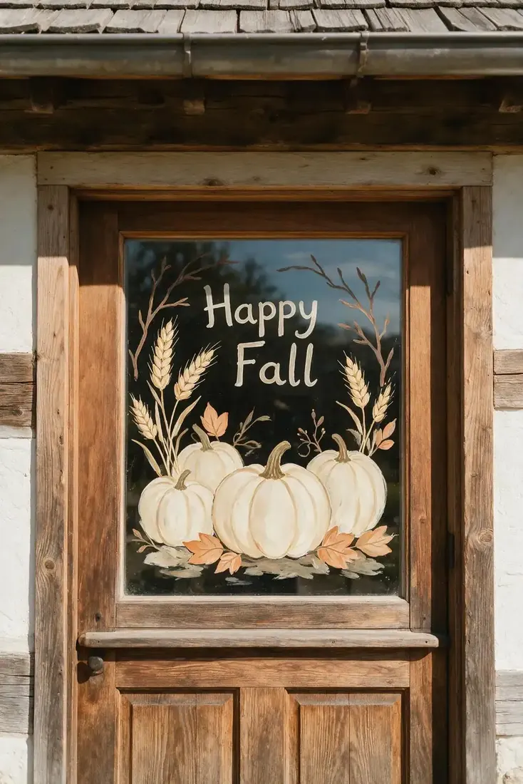
On a dark framed door, or any glass with shade behind it, orange disappears and white sings. Paint in white line work alone and you get contrast without weight. It reads as botanical illustration rather than seasonal decoration, which is why you can leave it up into November. Draw your outlines only and leave the shapes unfilled. The garden showing through becomes your fill. This is also the most forgiving option for anyone nervous about painting, because a line drawing is far easier to control than a block of colour.
Give a character its own window
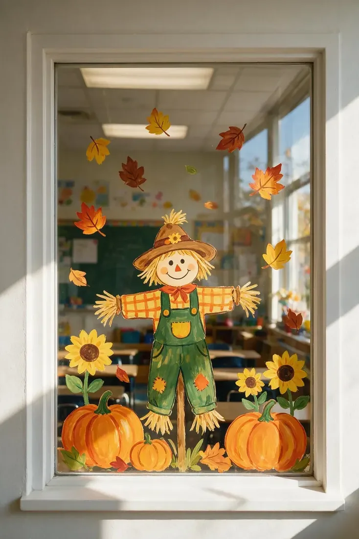
A scarecrow, a fox or a big sunflower works best when it owns one pane and nothing competes with it. Put your figure roughly centre, keep it large, and let the supporting bits stay small and low. Crowding a character with too many props is what makes a window look like a sticker sheet. If your window has several panes, treat them as separate pictures rather than one mural, since the frames already break your scene up whether you like it or not.
Frame the glass with an arch of leaves
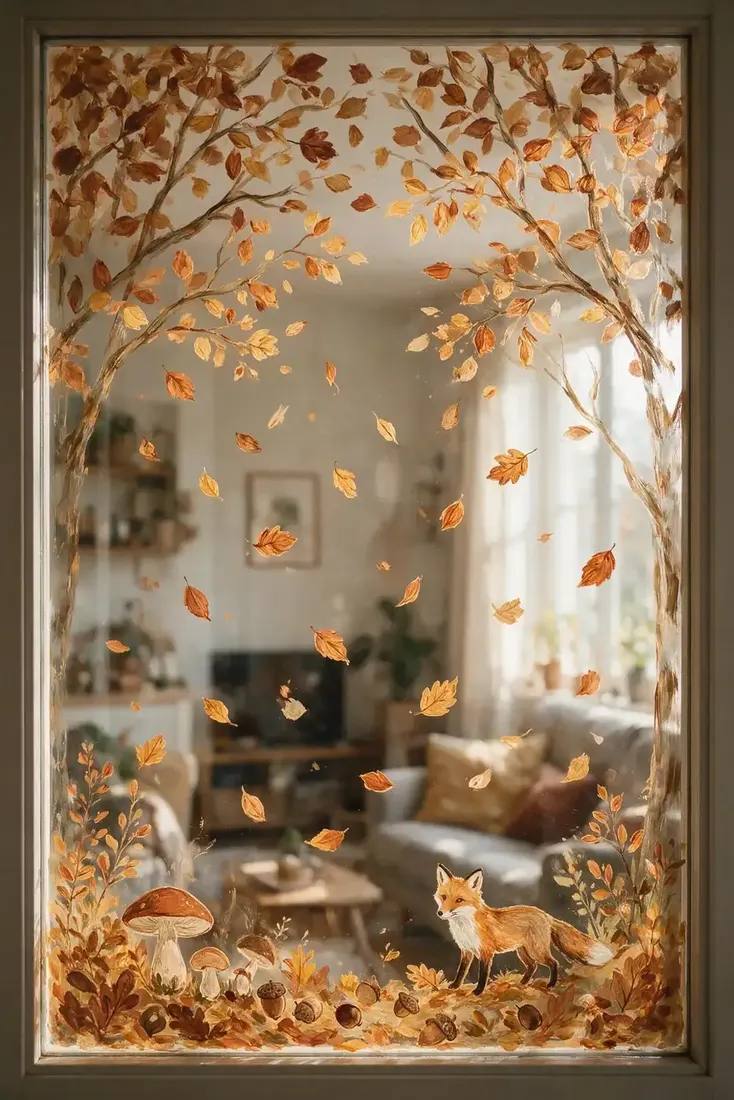
An arch is the most useful shape you can learn. Run your leaves and branches across the top and part way down both sides, then stop. You get a full, generous look and your centre stays completely clear, so the room keeps every bit of its light. The trick is to taper it. Heavy at the top corners, thinner as it comes down, and nothing at all below halfway. Painted evenly all the way round, an arch turns into a border, and a border is much harder to make look intentional.
Designs that sit low
If you are unsure, paint along the bottom. It is the safest layout you can pick for any window in your house.
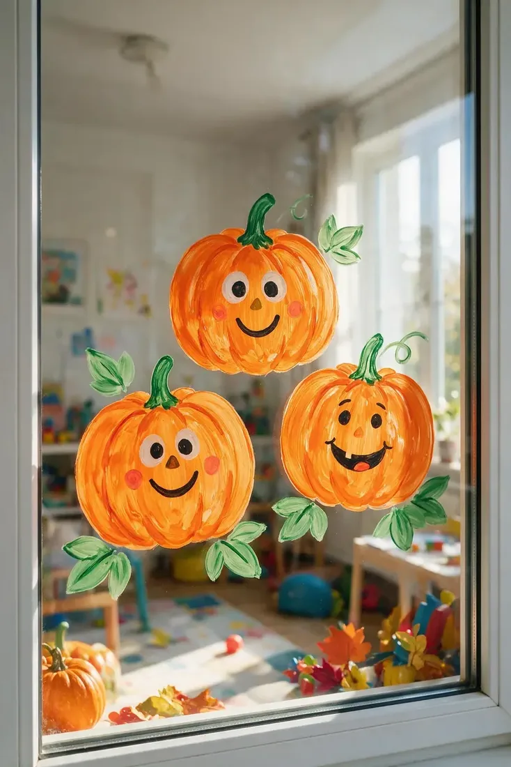
Line up a pumpkin patch on the sill
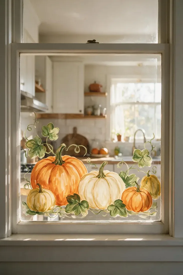
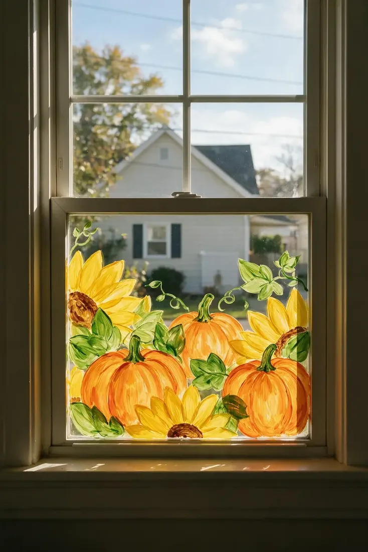
Pumpkins along the lower pane are your reliable choice, and they suit a kitchen window better than anything else because they sit below your eye level while you work. Vary your sizes and let a couple overlap, since a row of evenly spaced identical pumpkins reads as a pattern rather than a patch. Mix cream and pale green in with your orange if your kitchen is soft toned. Add a few curling vines to link them, then stop. The clear glass above is doing more for the room than another pumpkin would.
Let leaves fall down a narrow window
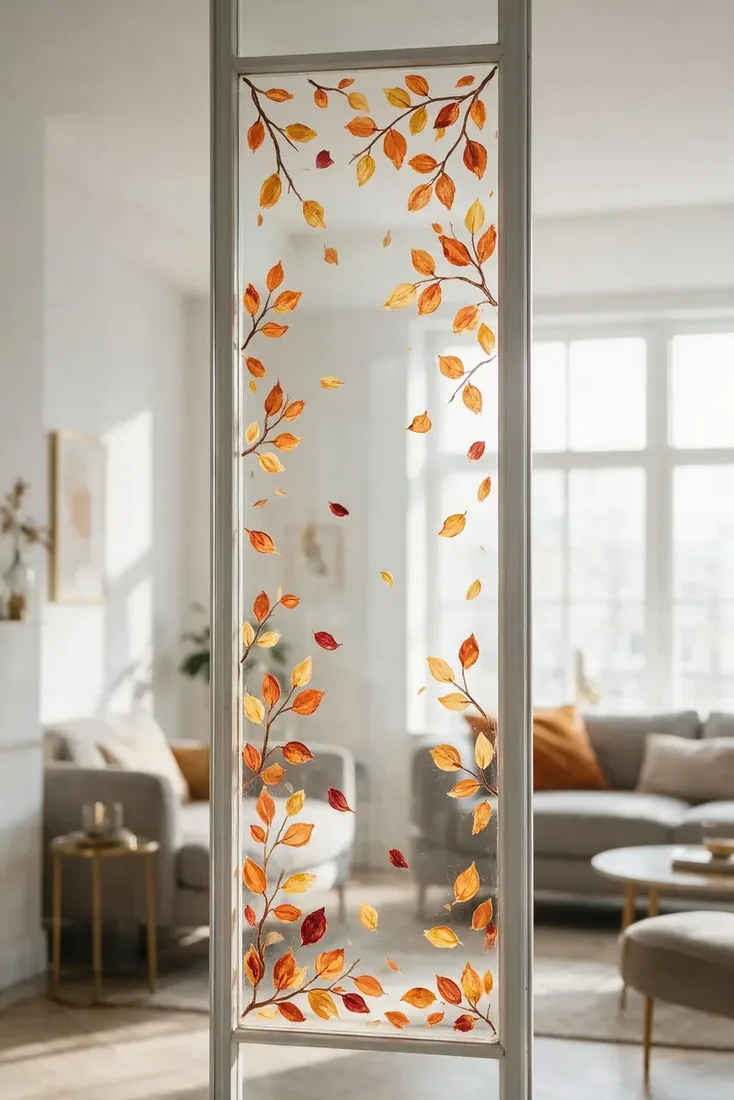
Tall narrow windows and side panels defeat most designs, because you have no room for a scene. Falling leaves solve that for you. Scatter yours from the top and thin them toward the bottom, keeping your spacing irregular so it looks like drift rather than a chart. Six or seven leaves is usually plenty. This is also the fastest design here, and the one to choose when you want your house to feel seasonal by this evening rather than this weekend.
Think about how it reads from the pavement
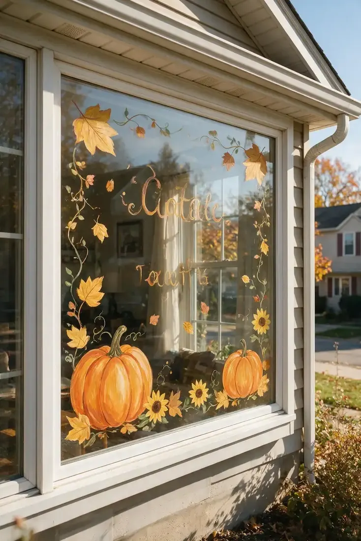
Anything you paint on a front-facing window has two audiences, and the one outside stands further away than you think. Before you commit, stand where a visitor would stand and look back. Your fine detail vanishes at that distance, while bold shapes and clear lettering hold. That is why exterior-facing designs want fewer, larger elements than a kitchen window does. Paint it for the pavement, and it will still look good from the sofa. Do it the other way round and it turns to mush from the street.
Lettering, restraint and the quiet options
The last three are for anyone who wants autumn on the glass without the whole harvest.
Draw stems and seed heads instead of pumpkins
Your autumn window does not need a pumpkin. Thin stems, seed heads, grasses and bare branches carry the season just as clearly, and they suit a modern house far better. Keep it all in one colour, work in outline, and spread your shapes thinly across the lower two thirds. The result reads closer to an illustration than a decoration, which means you can leave it up long after the pumpkins would have started to feel out of date. It is a good match for a minimalist decor scheme, and if outlines are as far as you want to go, our easy fall window painting ideas stick to shapes anyone can draw.
Make the lettering the design
When you paint words, they lead and everything else supports. Write them large, roughly centred, and build a low group of pumpkins or wheat underneath rather than wrapping decoration all the way around. Squeezing lettering into a busy scene is the most common mistake here, because the words end up competing with leaves for the same space and neither wins. Sketch your phrase on paper at the right proportion first, then copy it up. Your spacing is the hard part, not the letterforms.
Keep the palette to three or four colours
Sunflowers and pumpkins together are cheerful precisely because there are only three colours doing the work: yellow, orange and green. Add red, brown, cream and purple and your window goes muddy, especially with light coming through it. Pick your three or four before you start, and put the rest of the box away where you cannot reach it. This single decision does more for a finished window than any amount of careful brushwork, and it is the difference between a design that looks chosen and one that looks like whatever was in the box.
Choosing a design for your window
| Your window | Design that suits it | Leave empty |
|---|---|---|
| Kitchen window | Pumpkin patch along the sill | Everything above the lower pane |
| Front door glass | White line work or lettering | The centre, at eye height |
| Tall narrow pane | Falling leaves | Most of it, spacing is the design |
| Large living room window | Corner scene or leaf arch | The middle third |
| Street-facing window | Bold shapes, large lettering | Fine detail, it will not read |
| Modern or dark frame | Stems and seed heads in one colour | Colour itself, mostly |
The Empty Glass Formula
- Decide what stays clear before you decide what to paint. The empty part is the design.
- Paint the biggest shapes first. Pumpkins, lettering and branches go down before a single small leaf.
- Hold yourself to three or four colours. Light through glass exaggerates a muddy palette.
- Taper anything you repeat. Leaves and vines should thin out, not march evenly across.
- Check it from where it will be seen. The pavement for a front window, the doorway for a kitchen.
- Test the paint on a hidden corner first. Removal is the part people regret, not application.
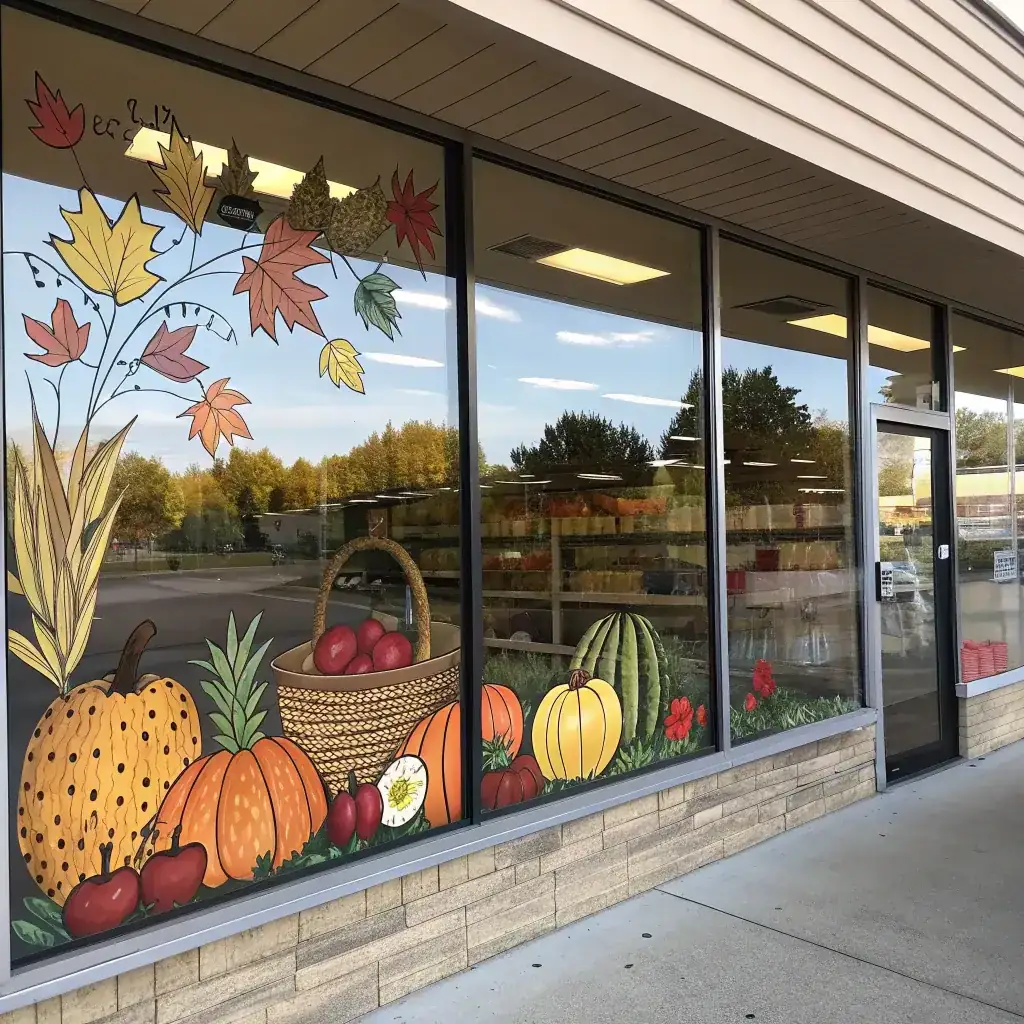
Follow that order and your design mostly assembles itself, because every decision you make is smaller than the one before it. There are more seasonal projects in our DIY ideas section, and if the window belongs to a shop rather than a house, our fall window painting ideas for stores work to a very different rule.
What paint should you use?
Look for paint sold for glass, or washable window markers, and read the label for removal instructions before you open it. Markers give you cleaner lines and suit lettering. Brush paint gives you softer, fuller shapes and covers your larger areas faster.
Whichever you choose, test a small patch somewhere hidden and leave it a day. Some lift off with warm water and a cloth, others need a scraper, and a few can mark your older glass or a painted frame. If you are renting, or your glass has a coating or film on it, that test matters more than any design decision on this page.
Start clean, too. Dust and fingerprints stop your paint sitting evenly, and a quick wash beforehand saves you a lot of patchy edges later.
Frequently Asked Questions
What paint is best for window painting?
Paint sold specifically for glass, or washable window markers. Markers give cleaner lines and suit lettering, while brush paint covers larger areas and gives fuller shapes. Check the label for removal instructions before you buy.
How do I stop my window painting looking cluttered?
Leave the middle of the glass empty. Put the design at the edges and along the bottom, keep to three or four colours, and taper anything you repeat so it thins out rather than filling the pane evenly.
Do I need to be good at drawing?
No. The layout matters far more than the linework. Simple shapes placed with space around them read better on glass than detailed drawing crammed into a full window, and slightly uneven lines are what make it look handmade.
What should I paint first?
The largest shapes. Lay down pumpkins, lettering or main branches while you still have the whole window to judge against, then add small leaves and details around them once those are in place.
Will window paint damage my glass?
Most products made for glass come off cleanly, but it varies and older glass, coatings and painted frames can react differently. Test a hidden corner and leave it a day before painting the whole window, especially in a rental.
When should I paint my fall window?
Early autumn works well, since a leaf or pumpkin design carries right through to late November. If you want Halloween touches, add bats or ghosts to an existing fall design in October rather than repainting the whole window.
This article may contain affiliate links. We may earn a commission at no extra cost to you.