Your Store Window Has Three Seconds to Read

Add us as a preferred source to see more stories on Google.
Your shop window gets about three seconds.
That is roughly how long someone walking past gives it before they look away, and it is the only measurement that matters here. A design that rewards close inspection is a design almost nobody will inspect.
This changes what you should paint. Fine detail vanishes at pavement distance. Small lettering vanishes sooner. And anything covering the glass hides the one thing that actually sells your shop, which is the sight of a warm, busy interior with people in it.
So these nine designs are judged on two things: what a passer-by understands in three seconds, and how much glass stays clear.
Designs that survive the distance test
Each of these reads clearly from the other side of the road.
Put the harvest along the bottom and leave the rest
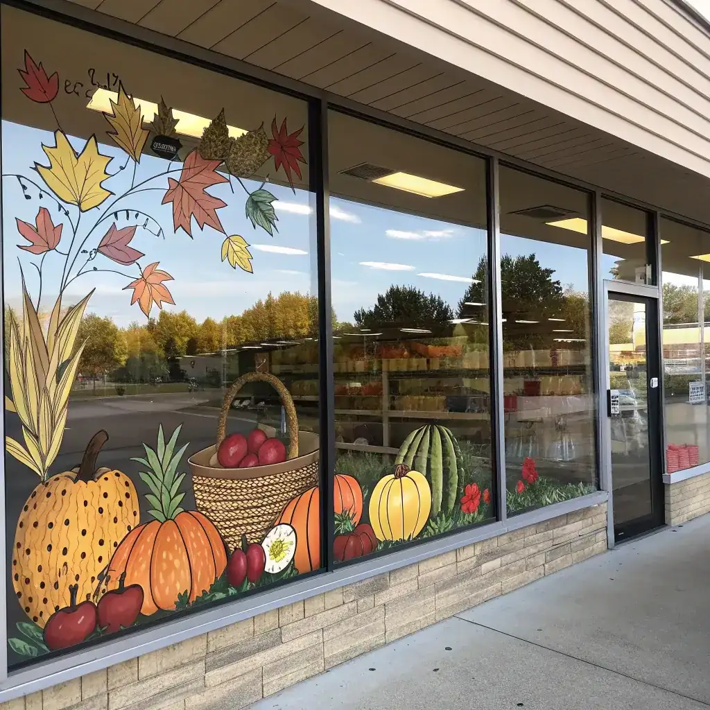
A market scene of pumpkins, squash, apples and corn works because your shapes are large, recognisable and grouped. Keep the whole arrangement in the lower third of the glass and let the upper two thirds show your shop. Group the produce rather than scattering it, since a cluster reads as one confident image at distance while scattered items read as clutter. This is the strongest option for a food shop, a farm shop or a greengrocer, where the painted goods echo the real ones.
Paint one oversized element instead of many small ones
A single enormous sunflower, one large pumpkin or one tall stand of wheat will beat a busy scene every time from thirty paces. Scale is what carries across a street, not detail. If you are nervous about your painting ability, this also helps you, because a large simple shape is far more forgiving than a small intricate one. Put it at one end of your window and let it run off the edge of the glass rather than floating in the middle.

Frame the window rather than filling it
Paint pumpkins and trailing vines around the outer edges of your glass and leave a clear centre. Your display stays completely visible, the frame does the seasonal work, and passers-by look through the decoration at your stock rather than at the decoration itself. This is the safest choice for any shop whose window display is doing the selling, which covers most boutiques, gift shops and homeware stores.

Designs that say what you sell
The best storefront windows tell people what is inside before they read a word.
Paint what you actually sell
A bakery window with a painted pie, apples and wheat is doing two jobs at once, since it is seasonal and it is a menu. Pick three or four things you genuinely sell that suit autumn, paint them large, and skip the rest. You are not illustrating your whole range, you are giving somebody a reason to slow down. This works just as well for a florist, a butcher, a deli or a garden centre.

Use the steam, not just the cup
Coffee cups painted on a cafe window are common enough that they have stopped registering. What still works is the steam, because a curl of steam reads as warmth from a distance in a way a cup outline does not. Paint your cups large, give them generous steam, and put one or two pumpkins low beside them. On a cold morning that painted warmth is the whole pitch.

Carry your brand colours into the season
Your window should still look like your business in October. If your branding is neutral, work in cream, brown, soft orange and muted green rather than the brightest autumn palette. A bolder identity can carry stronger colour without looking loud. Using the lettering style you already use on your signage and packaging costs nothing and makes the seasonal work read as deliberate rather than borrowed.

Quieter options and the message
Try white line work if colour fights your brand
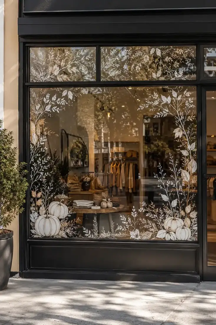
White botanical outlines on clear glass give you an autumn window without a drop of orange. It suits modern retail, salons, studios and any business whose interior is carefully styled. Because it is outline only, your display shows straight through it, and it photographs well, which matters if your shop front does any work on social media.
Let flowers carry it when pumpkins do not suit you
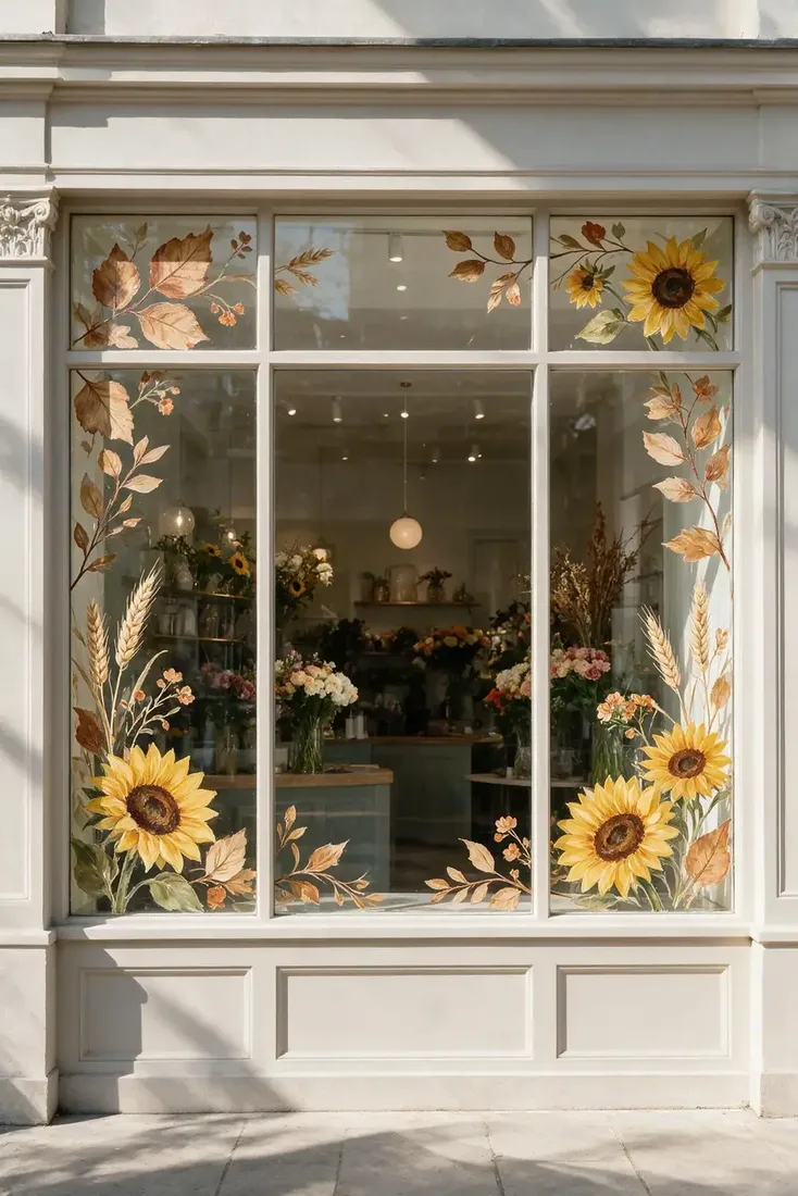
Sunflowers, seed heads and dried grasses read as autumn without the Halloween adjacency, which is useful for florists, salons and boutiques where a jack o lantern would be wrong. Concentrate them around the frame and keep the middle open. Muted, faded tones read as more expensive than bright ones, and that impression carries across a street even when the detail does not.
Make the offer the biggest thing on the glass
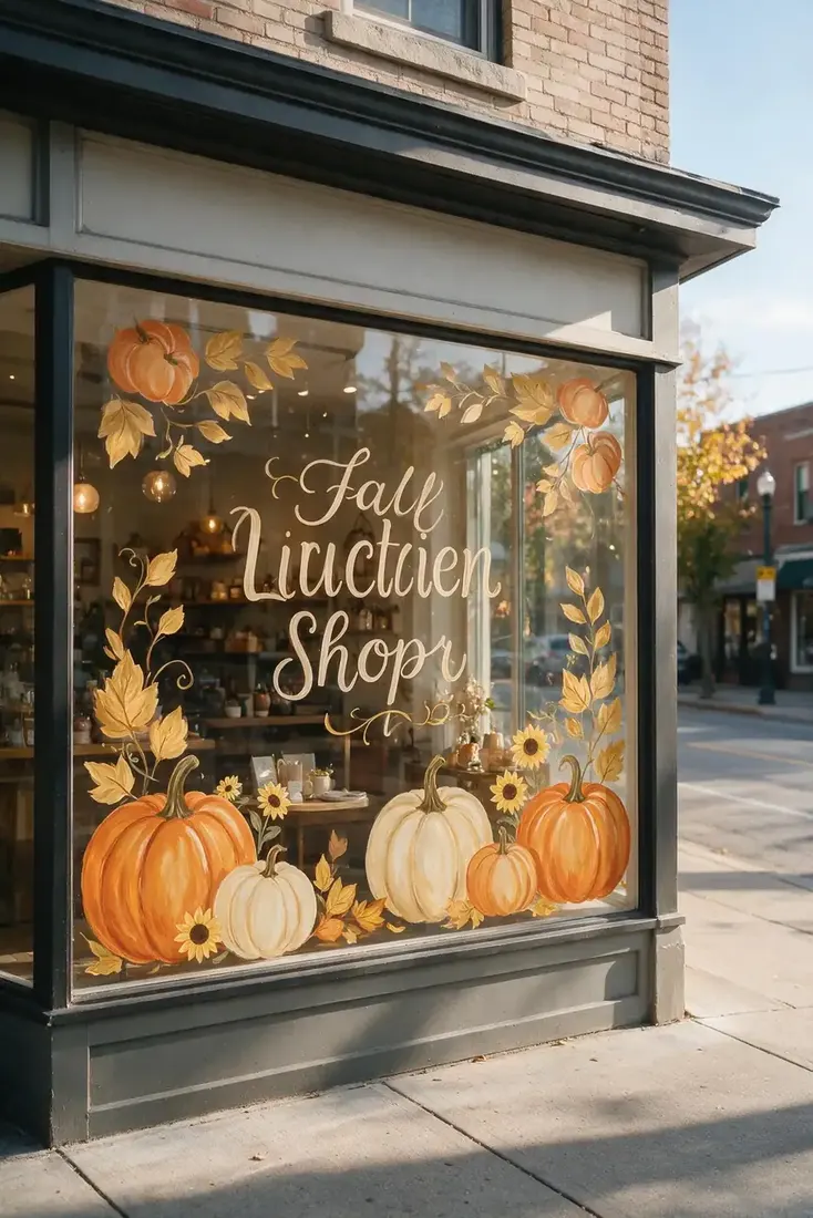
If your window is carrying a message, whether that is an autumn sale, a seasonal menu or new stock, the words must be the largest element and everything else must sit around them. Keep the message to three or four words. Decoration wrapped tightly around lettering is the most common reason a storefront message goes unread, because your eye cannot separate the words from the leaves at distance.
Choosing by business type
| Your business | Design that fits | Keep clear |
|---|---|---|
| Cafe | Large cups with generous steam | The seating area, people sell it |
| Bakery or deli | Three or four things you sell | The counter and display case |
| Boutique or gift shop | Painted frame, clear centre | The whole window display |
| Florist or salon | Sunflowers, seed heads, grasses | The middle at eye height |
| Farm shop or grocer | Grouped harvest along the bottom | Everything above the produce |
| Modern retail or studio | White line work, outline only | All of it, essentially |
The Three Second Formula
- Judge every decision from across the street. That is where your customer is standing.
- One focal point, never two. A strong message or a strong image, and support for whichever you chose.
- Bold shapes beat fine detail. Scale travels. Detail does not.
- Lower half and outer edges only. The clear glass is selling for you.
- Use your own brand colours. A generic orange window belongs to no business in particular.
- Agree the removal date before you paint. Nothing looks worse in December than October.
Work through those in order and the design decides itself, because each answer narrows the next. For home windows where none of these constraints apply, see our fall window painting ideas.
Paint, glass and getting it off again
Commercial glazing is not house glazing. Shop fronts are often toughened, tinted, coated or filmed, and a product that lifts cleanly off a kitchen window can be far more stubborn on yours. Test a small hidden section, leave it a day, then remove it and see what you are dealing with before you commit to the whole frontage.
Check your lease as well. Some commercial leases and shopping centre agreements have rules about what you can apply to the glass, and it is a much shorter conversation before the painting than after.
Then put the removal date in the calendar the same day you paint. A seasonal window that stays up past its season stops being a decoration and starts being a sign that nobody is paying attention, which is not the impression you want your shop giving.
If you want simpler shapes to start from, our easy fall window painting ideas reduce every design to circles, ovals and single lines.
Frequently Asked Questions
What makes a storefront window painting work from a distance?
Scale, not detail. Bold shapes and large lettering read from across the street while fine detail disappears. Choose one focal point and let everything else support it rather than competing with it.
How much of a shop window should I paint?
Keep the artwork to the lower half and outer edges. Customers are more likely to come in when they can see a warm, busy interior, so the clear glass is doing as much selling as the design is.
Should I use autumn colours or my brand colours?
Your brand colours, adjusted for the season. Neutral branding suits cream, brown, soft orange and muted green. A generic bright orange window looks like it belongs to any business at all.
How do I paint a seasonal offer on the window?
Make the words the largest element, keep the message to three or four words, and put decoration around them rather than behind or through them. Wrapping lettering tightly in leaves is why most storefront messages go unread.
Is window paint safe on commercial glass?
Not always in the same way as on house windows. Shop fronts are often toughened, tinted, coated or filmed, so test a small hidden section, leave it a day, and remove it before painting the whole frontage.
What if pumpkins do not suit my business?
Use sunflowers, seed heads and dried grasses, or white botanical line work. Both read as autumn without the Halloween association, which suits florists, salons, studios and modern retail far better.
This article may contain affiliate links. We may earn a commission at no extra cost to you.