Paint Your Built-Ins Deep Before They Go In

Add us as a preferred source to see more stories on Google.
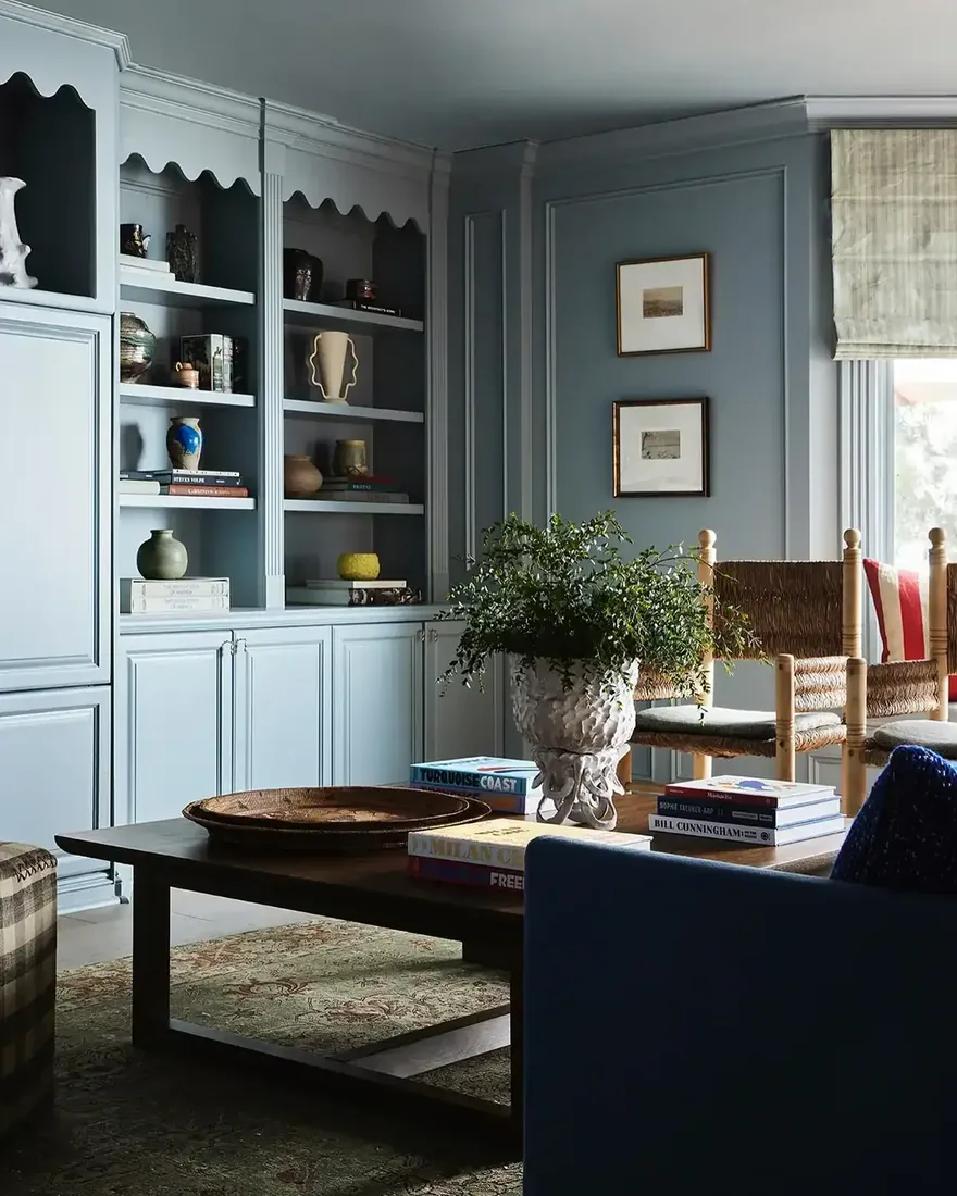
White built-ins are the default and that is exactly the problem. They disappear into the wall when most people hoped for a feature.
Painting them a deep colour turns joinery into architecture, and it is the decision you make too late, after the white ones are already in.
These ten built-ins show you why you choose the paint before the shelves go in.
Colour that decides whether shelves vanish or lead
Pick the finish before the carpenter starts, not after.
Paint the back the same deep tone as the shelves
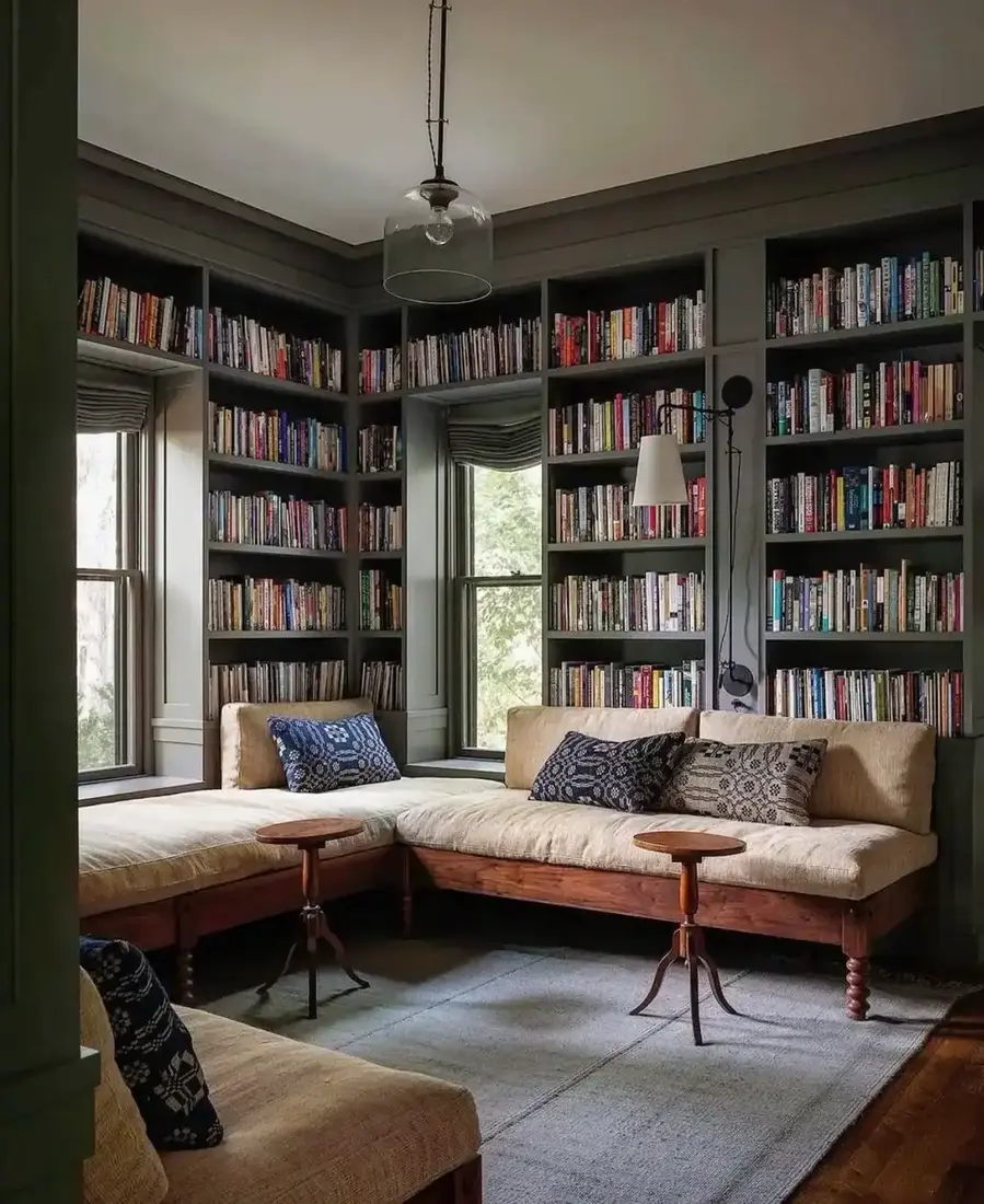
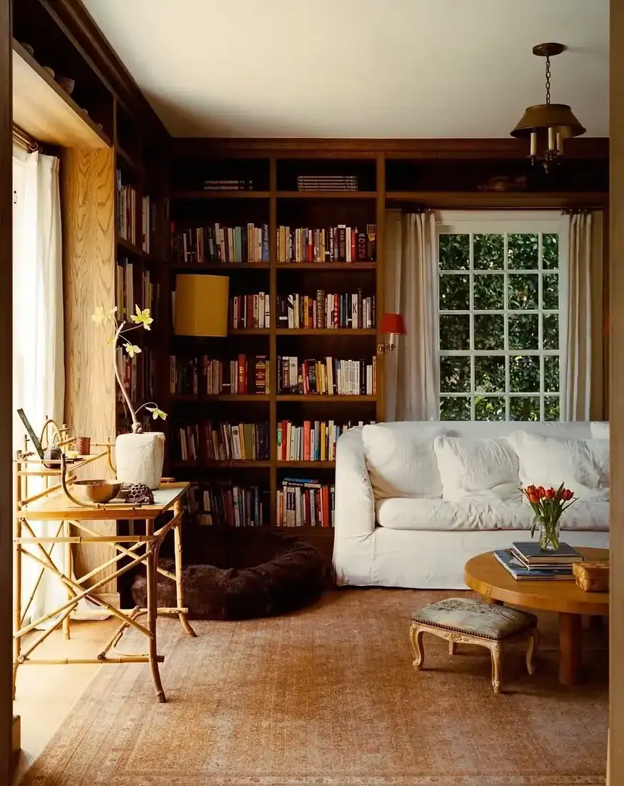
A white back inside a deep shelf fragments the whole unit. Your eye reads a stripe, not a box, and the joinery you paid for looks like two materials fighting. Coat the back panel in the same deep colour as the shelves, shelves included, and the whole alcove reads as one piece. You get a calm, hollowed volume that holds books without jitter. When you look from the doorway, the colour should feel continuous, not framed.
Use deep tone to make a shallow alcove feel deeper
Pale paint flattens a shallow box and exposes every inch of depth you do not have. A deep tone does the opposite. Because shelf shadow and paint sit closer in value on dark walls, the back appears to recede and the alcove reads deeper than it is. You can use this to calm a wall that is too thin for true built-ins. Keep the rest of the room lighter so the dark joinery reads as furniture, not as a cave you built.
Choose satin or eggshell and skip gloss
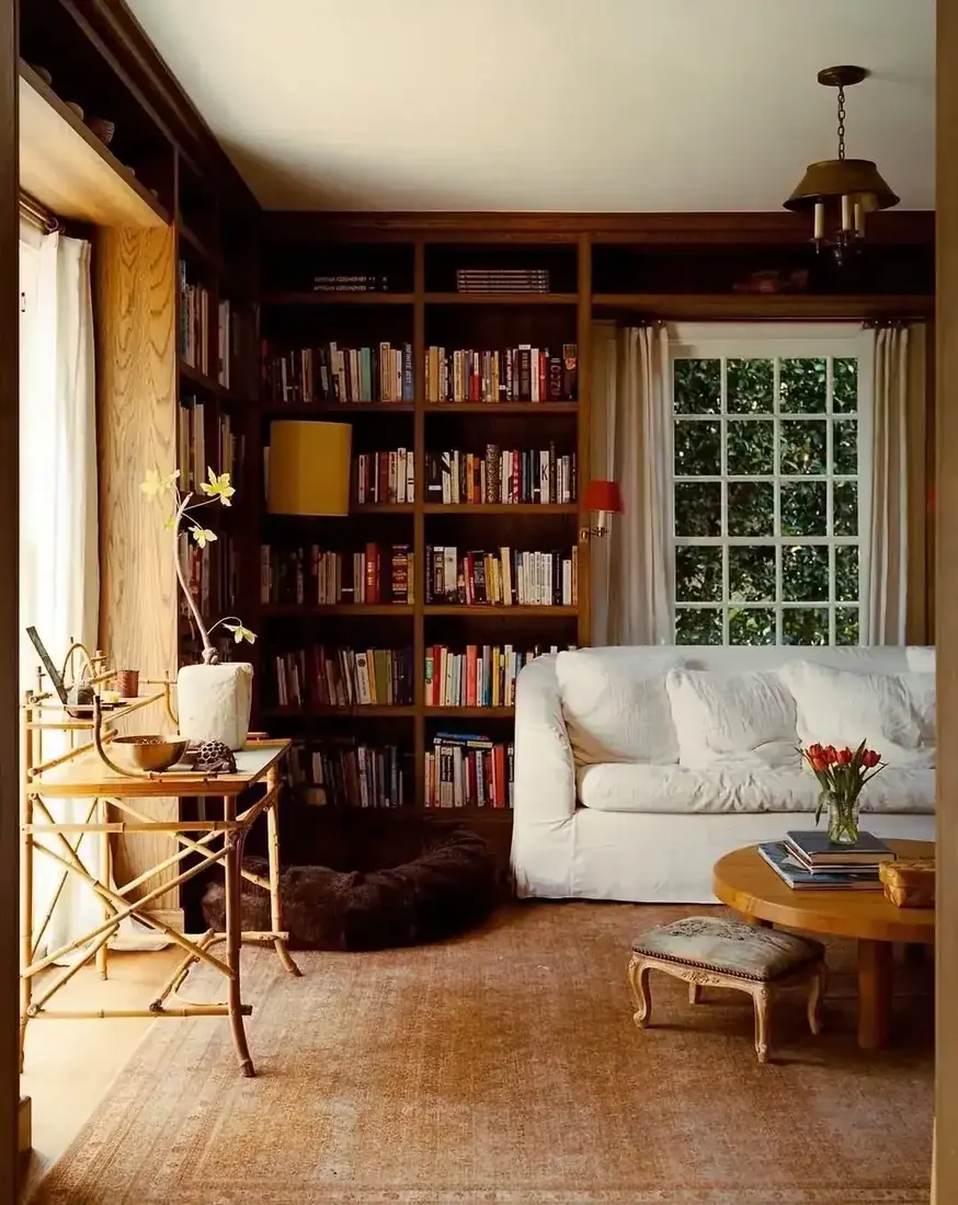
Large flat joinery punishes gloss. Every brush mark, roller edge and sanding scratch shows when light rakes across it. Satin or eggshell softens reflection and lets the colour sit. You still get a wipeable surface for a living room, but the sheen stays quiet. Test your chosen deep colour in both finishes on a scrap. Under a picture light, satin will look even, gloss will look rippled, and you will see why painters steer you away from gloss on big planes.
Give every shelf breathing room on dark paint
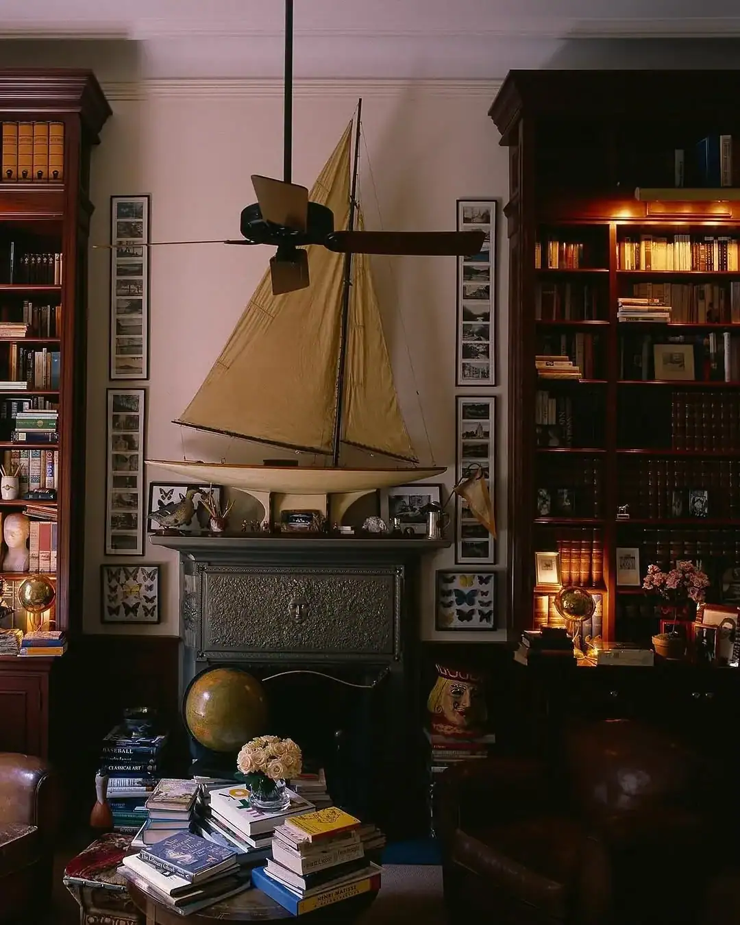
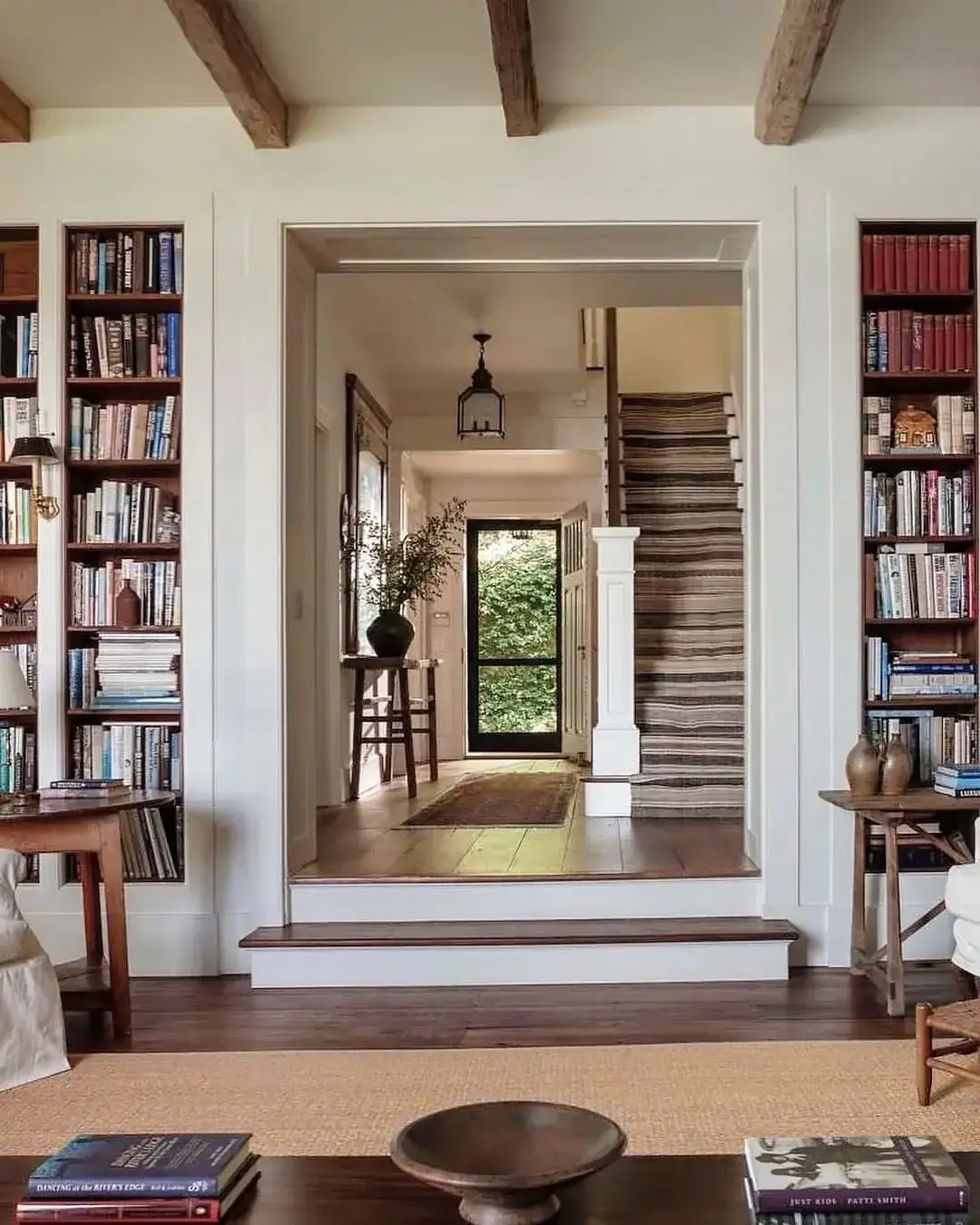
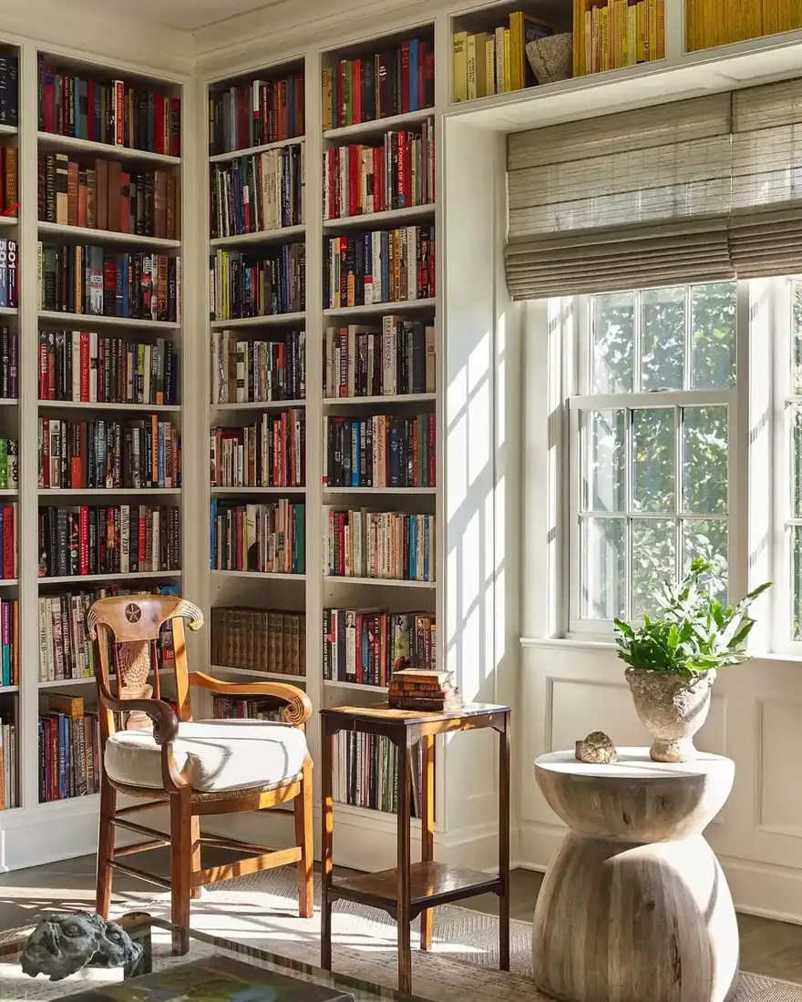
Dark shelves make colour-blocked books sing, but only when you leave air. Leaving roughly a third of each shelf empty lets your eye read what is there, and on dark paint that gap looks intentional rather than sparse. Pull books forward so spines sit slightly back from the shelf edge in a consistent line. That alignment gives you a shadow line that lifts the dark joinery, and you keep the empty third as part of the composition, not as leftover space.
Let books be the colour on dark shelves
Mixed spines can look cluttered on white, where each colour pops hard. On dark shelves the same mix reads as a collected palette because the background absorbs contrast. You can group by colour loosely rather than strictly, so the arrangement looks gathered over time rather than catalogued. Keep direct sun off those spines where you can, since cloth and paper fade faster than you expect, and you will keep that colour you counted on.
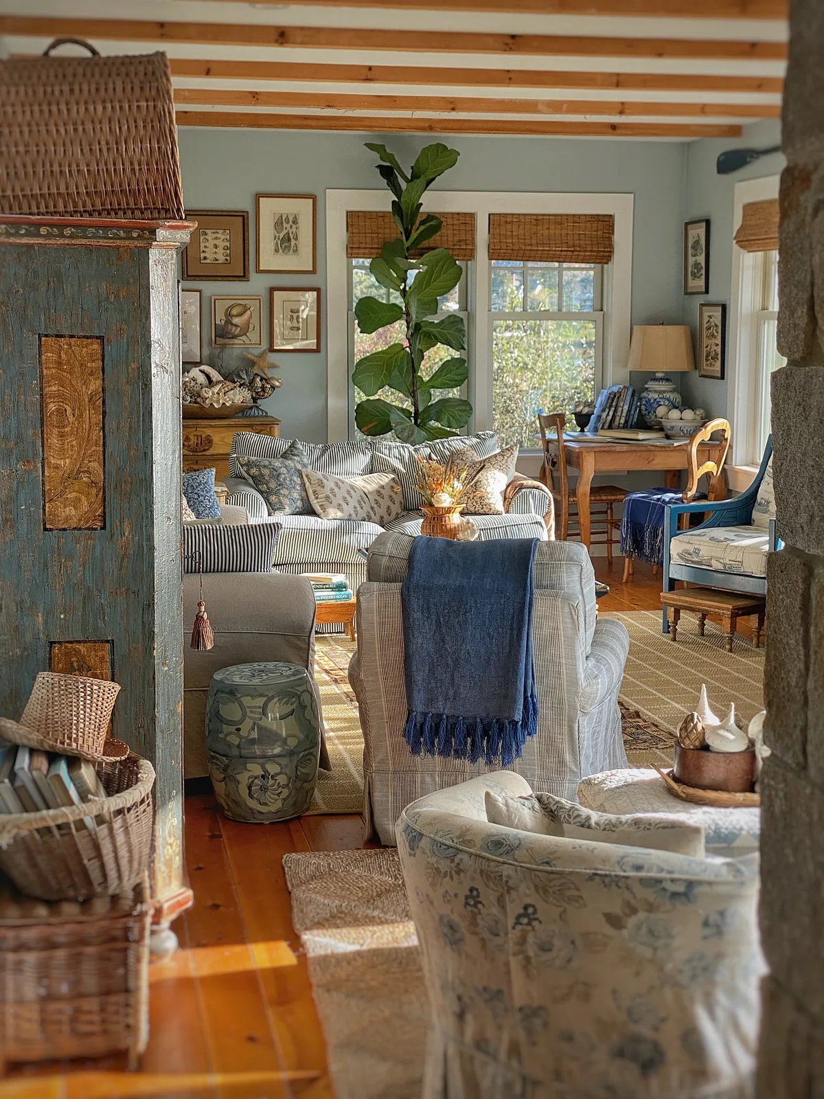
Keep coastal shelves quiet and let texture talk
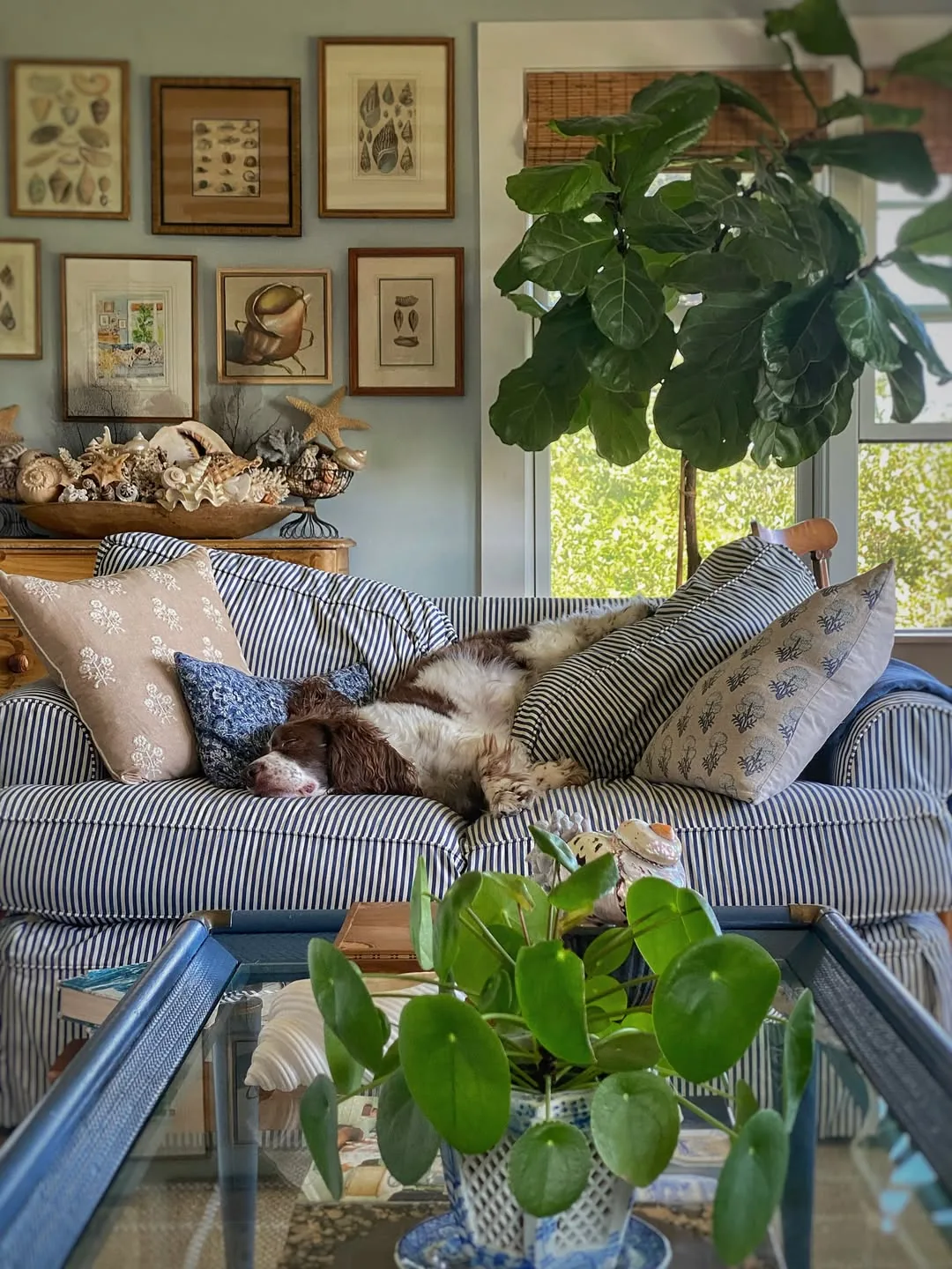
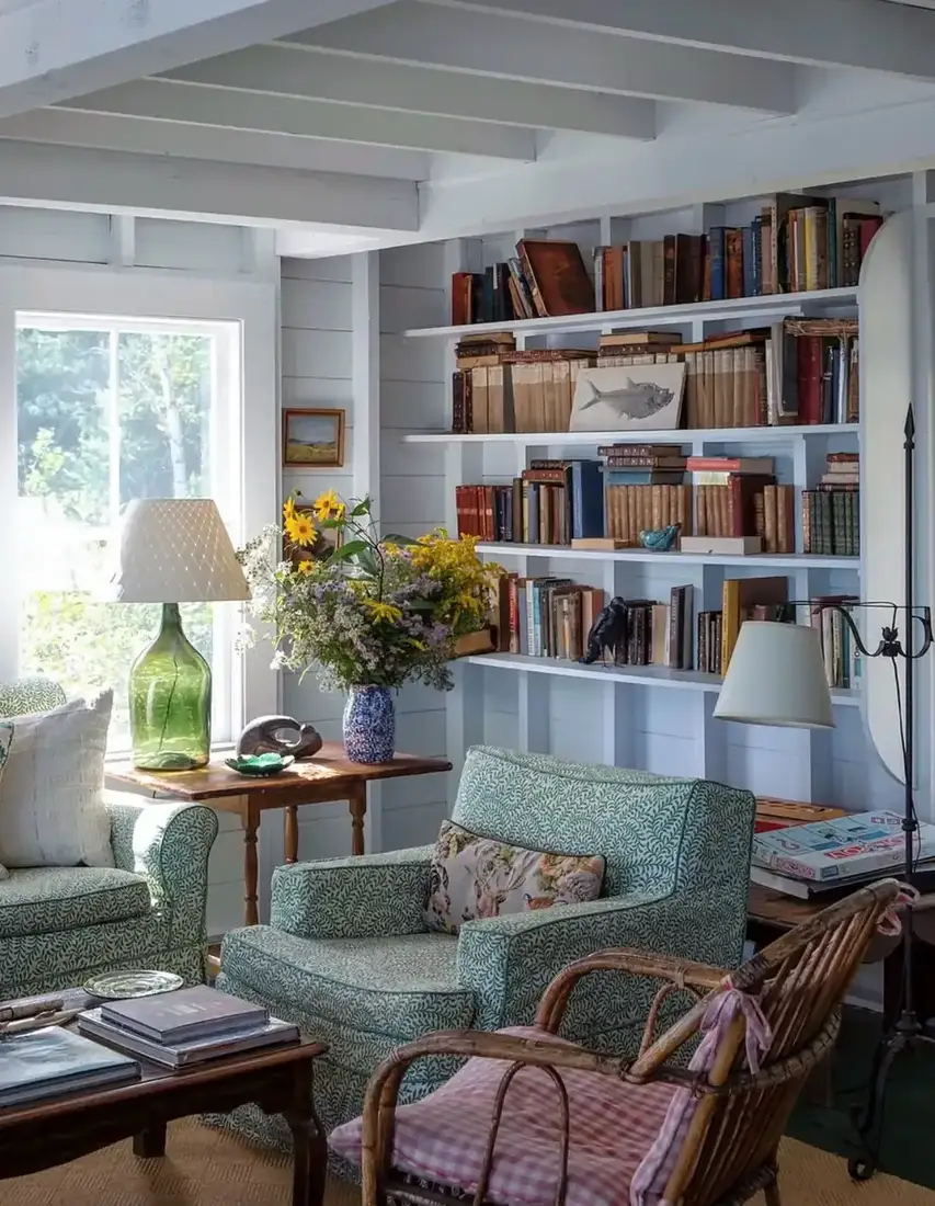
A coastal palette does not need shells on every shelf to read as coastal. Paint your built-ins a soft deep blue or putty, keep the back matched, and let one natural texture do the hinting. A single woven basket on the bottom shelf, or linen boxes on one shelf only, tells the story without turning your living room into a shop. Leave the rest for books and air, and you keep the beach as an echo you feel rather than see.
Seats, doors and light that make deep shelves work
Deep colour absorbs light, so you must give it back.
Frame a window seat you will actually use
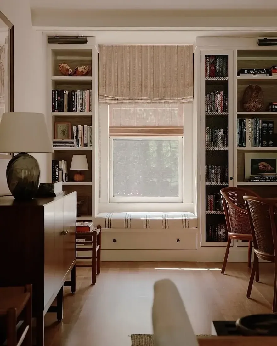
Deep joinery makes a window seat feel built in rather than added on. Because the colour already defines the architecture, the cushion and storage below read as part of the same piece. Build storage into the base, because that is the cheapest storage in the house, and add a back cushion rather than a hard wall so you can lean. Light over the shoulder beats light from the window in front, which backlights a book and tires you.
Keep glass where shelves would make the wall heavy
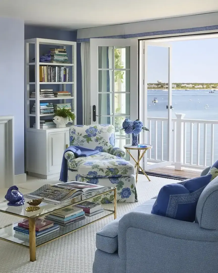
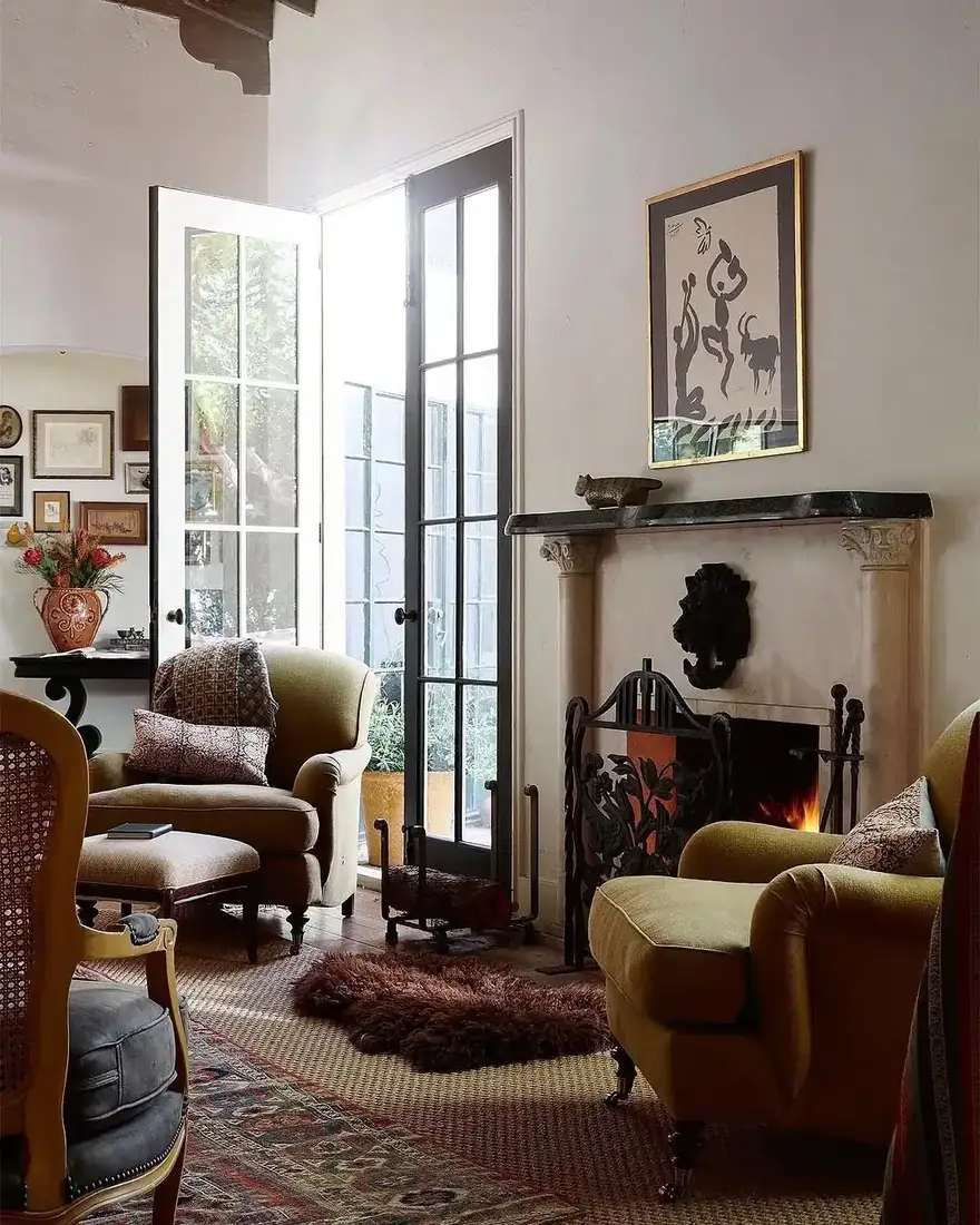
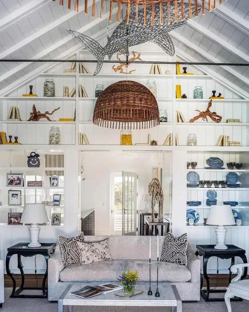
A wall of shelves can close a room. Breaking the run with a door or glazed opening keeps the volume legible. French doors inside the book wall let light pass where shelves would block it, and the dark paint on either side reads as framing rather than bulk. You keep the joinery on both sides matched in depth to the chimney breast so the wall reads flat, and you let the glass be the pause.
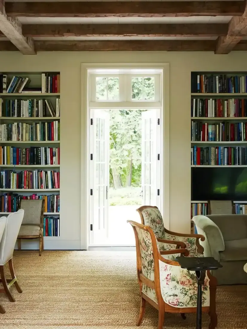
Hide clutter behind one calm door
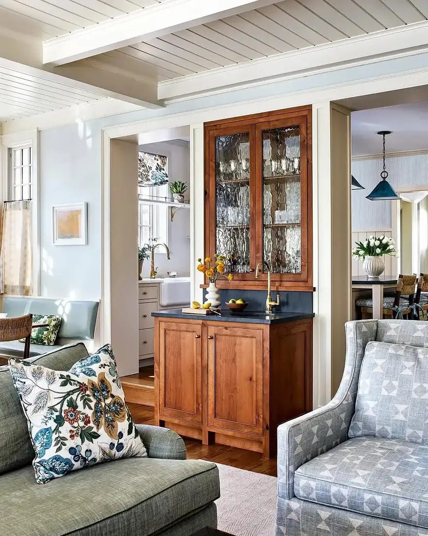
Not every bay needs to be open. One closed bay with doors gives you a place for the mess you do not want styled, and because the doors are painted the same deep tone, the wall stays calm. Use that bay for the bar, the games or the paperwork, and you keep the open shelves honest. The room feels furniture-like rather than fitted, and you avoid the shop look that comes from a wall of all-open shelves.
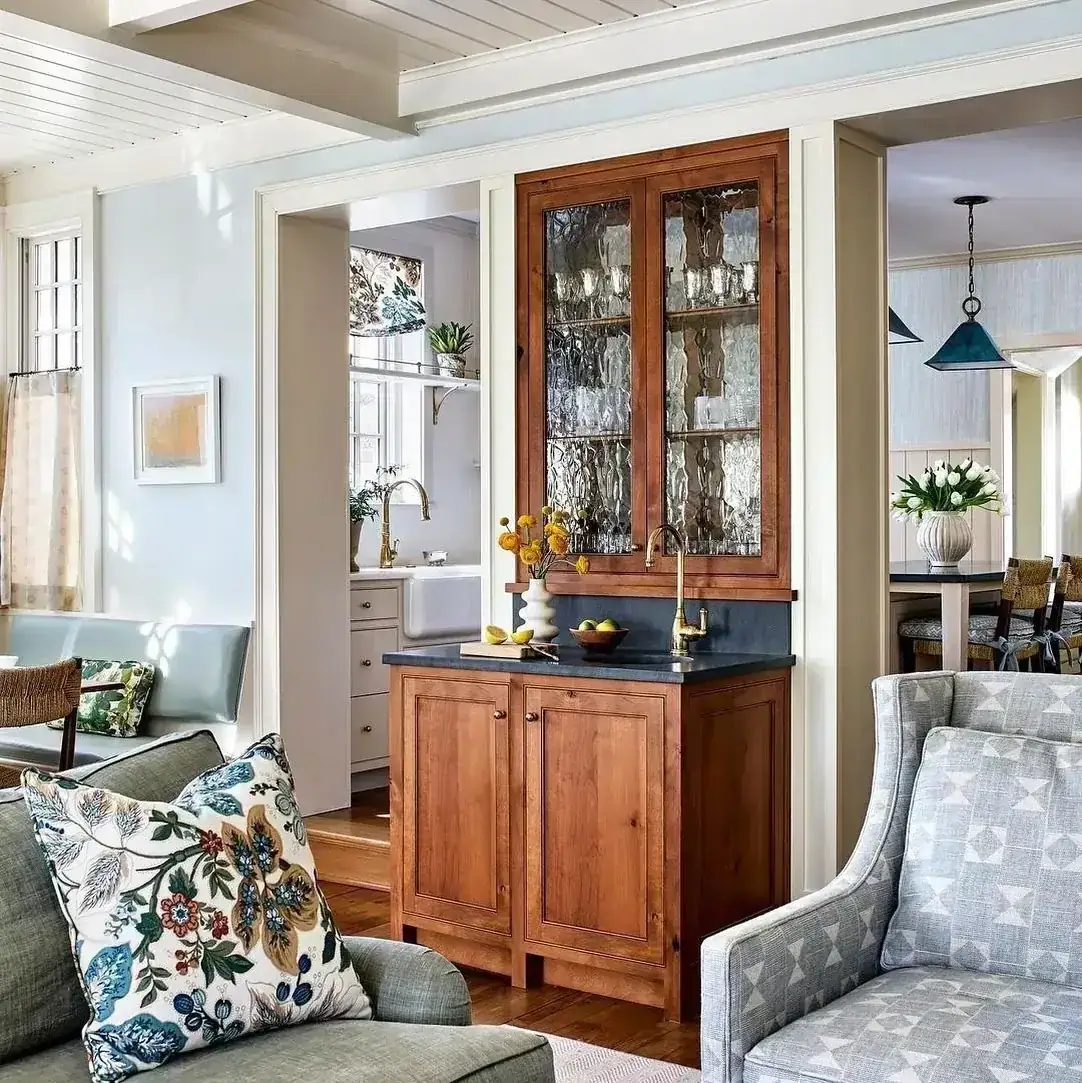
Add light inside dark joinery as part of the build
Inside painted shelves, lighting matters more than elsewhere because the colour absorbs light. A deep alcove with no light looks like a hole, even when the rest of the room is bright. Add a picture light above or a slim bar tucked under the shelf above, wired in, so the back washes evenly. Dim it for evening. When you can see the texture of the spines and objects you placed, you know the dark is doing its job rather than swallowing it.
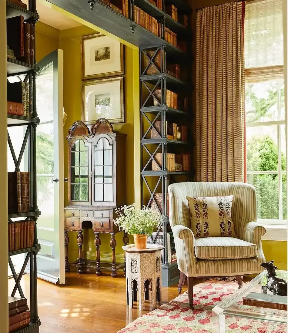
Built-ins that hide versus built-ins that lead
| Choice | How it reads | When you use it |
|---|---|---|
| White built-ins, white walls | Joinery disappears | You want shelves to vanish |
| Deep colour, matched back | Joinery leads the room | You want a feature you see from the hall |
| Satin or eggshell | Soft, even | Large flat joinery in a living room |
| Gloss | Shows every mark | Avoid on big planes |
| Dark shelves with mixed books | Collected, intentional | You own mixed spines |
| White shelves with mixed books | Can look cluttered | Be stricter with grouping |
The Built-In Bookshelf Formula
- Match the back to the shelves. White back inside colour splits the unit. Paint it the same deep tone.
- Go deep to add depth. Shallow alcoves read deeper when shadow and paint sit close.
- Pick satin or eggshell. Save gloss for small trim, not wall joinery.
- Leave a third empty. Pull books forward in a consistent line and let air be part of the styling.
- Treat books as colour. On dark shelves, loose colour grouping looks gathered, not messy. Keep sun off spines.
- Light the inside. Dark paint absorbs light, so wire warm light into the joinery from the start.
Keep those six and your built-ins become the collected backbone of the room.
Once the joinery is in, bookshelf styling ideas covers what goes on it, and fireplace built-in ideas covers the run beside a hearth.
Frequently Asked Questions
Should I paint my built-ins white or a deep colour?
White disappears into the wall. A deep colour turns the joinery into a feature you see from the doorway. Choose before the shelves go in so the whole unit feels intentional.
Do I need to paint the back of the bookshelf?
Yes, the same colour as the shelves. A white back inside a coloured shelf fragments the box and makes the joinery look like an afterthought.
What paint finish is best for built-in bookshelves?
Satin or eggshell. Gloss shows every brush mark on a large flat, while satin stays soft and wipeable for a living room.
How full should built-in shelves be?
Leave roughly a third of each shelf empty. Pull books forward so spines align slightly back from the edge, and let the gap read as design.
Do books look better on dark or light shelves?
Mixed spines look intentional on dark shelves because the background absorbs contrast. On white they can read as clutter unless you edit strictly.
How do I light dark built-ins?
Add warm light inside the joinery as part of the build, not after. Deep colour absorbs light, so the alcove needs its own source to feel alive at night.
This article may contain affiliate links. We may earn a commission at no extra cost to you.