A Full Shelf Reads as Storage, Not Style

Add us as a preferred source to see more stories on Google.
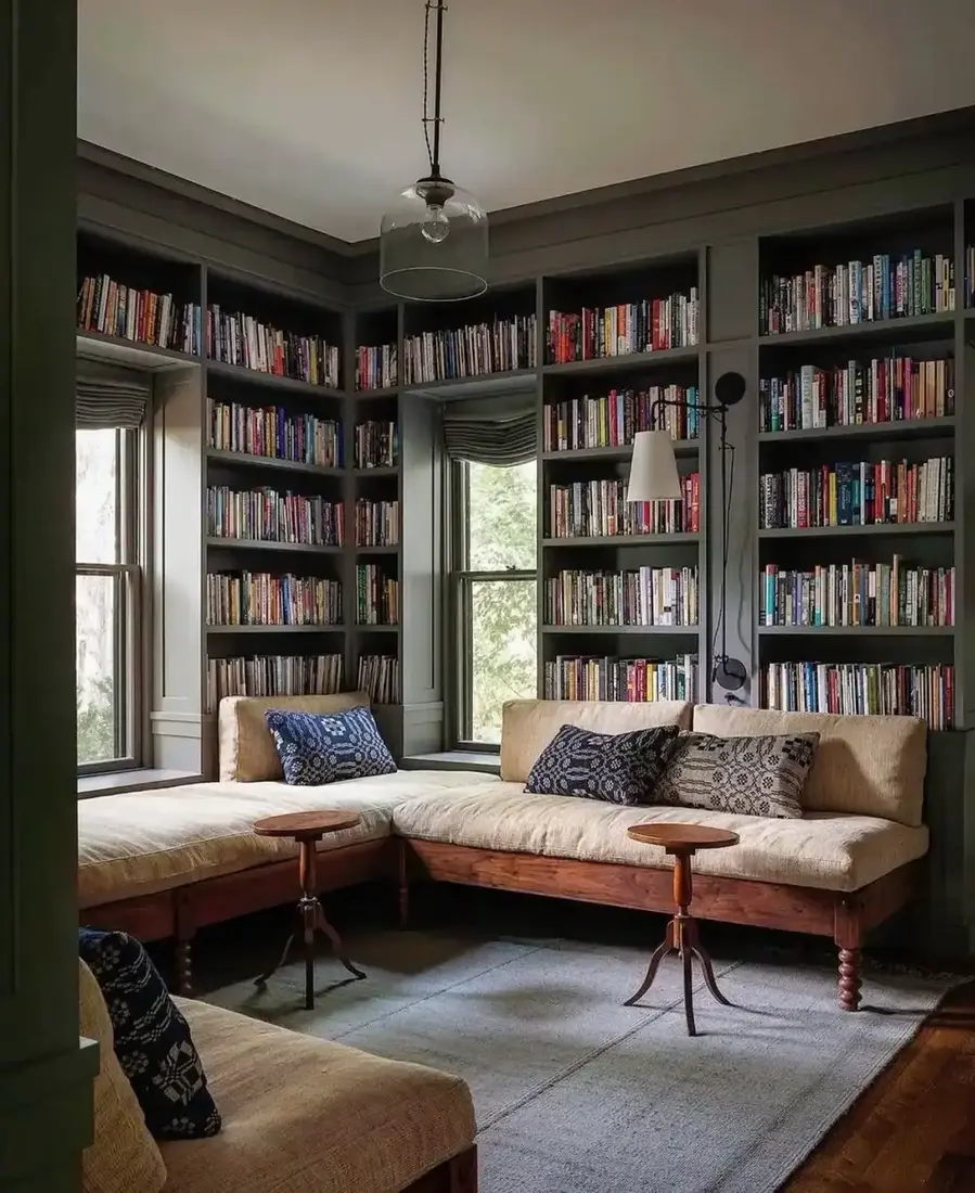
Rows of spines lined up flush read as storage you stacked, not a shelf you styled.
The difference is not more books or better objects. It is negative space, and most people are afraid to leave any.
These nine shelves show you how to leave a third empty on purpose and let what remains breathe.
Air and line that make a shelf read
Start with emptiness, then give the books a clean edge.
Keep a third of the shelf for air
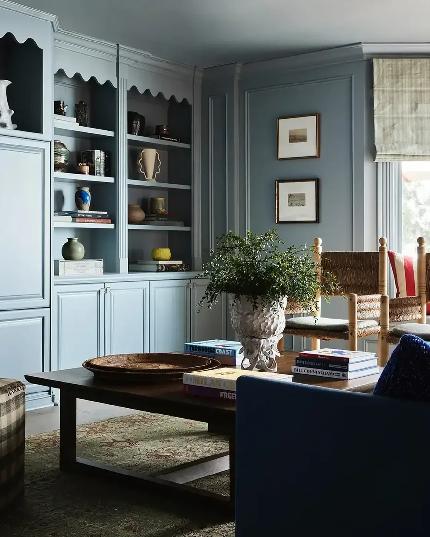
The library that feels calm does so because a third of each shelf holds nothing. Objects need that gap to read as objects, and books need it to read as chosen rather than crammed. When you leave the third empty, you create a pause that lets your eye rest between groups. Step back to your doorway and you will see the pause you made. Try removing one stack per shelf and you will see the whole wall exhale. The room feels larger because the shelf does, which is the same trick behind built-in bookshelf living room ideas.
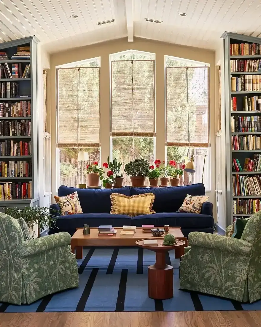
Pull spines into one quiet line
Books look tidy when their spines sit slightly back from the shelf edge in a consistent line. That small shadow in front adds depth you lose when books are pushed to the back wall or jammed forward unevenly. Align the line across the shelf, tallest to shortest with a gentle step, and you give the shelf a front edge it was missing. Keep that line even and you keep the shelf quiet. You will notice the shelf reads as a composed row rather than a pile you tidied.
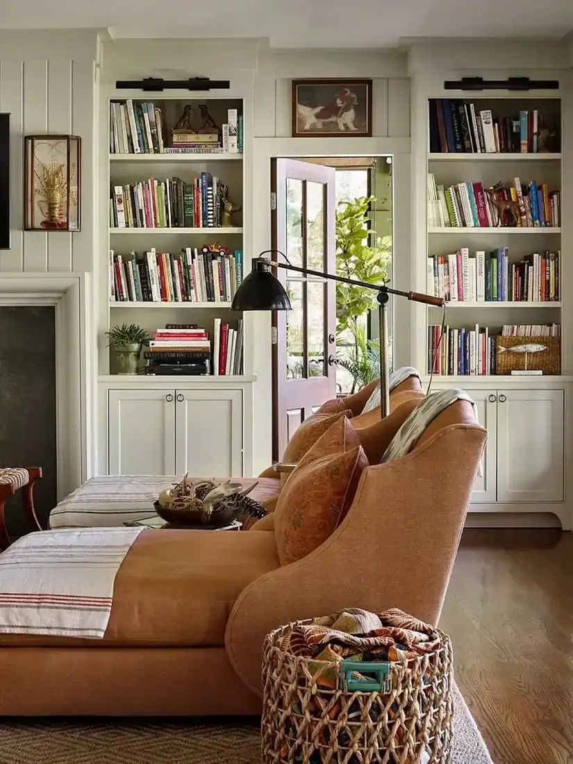
Alternate vertical rows with a horizontal stack
All-vertical reads as a library, all-horizontal reads as a shop. Mixing the two tells your eye the shelf is styled by a person, not filled by a system. Stand a short row, lay a stack of three and top it with a small object, then stand another row. The change in direction creates rhythm without adding colour. Keep the stacks loose, not perfect, so the shelf feels used and calm at once, and you keep the eye moving.
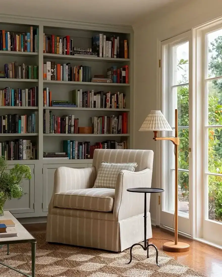
Colour and light that protect the shelf
What you put with the books matters as much as the books.
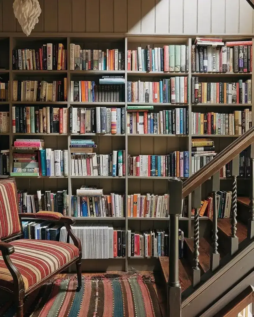
Group colour loosely, not strictly
Strict colour blocking reads as a catalogue, not a collection. Loose grouping reads as gathered over time. Keep blues near blues, warms near warms, but let a spine drift where it wants, so you avoid the hard line of a strict sort. When you pull plain colours from the background of a cover rather than its brightest spot, the shelf stays quiet. You get a palette that feels intentional without looking sorted for a photograph.
Keep sun off the spines you love
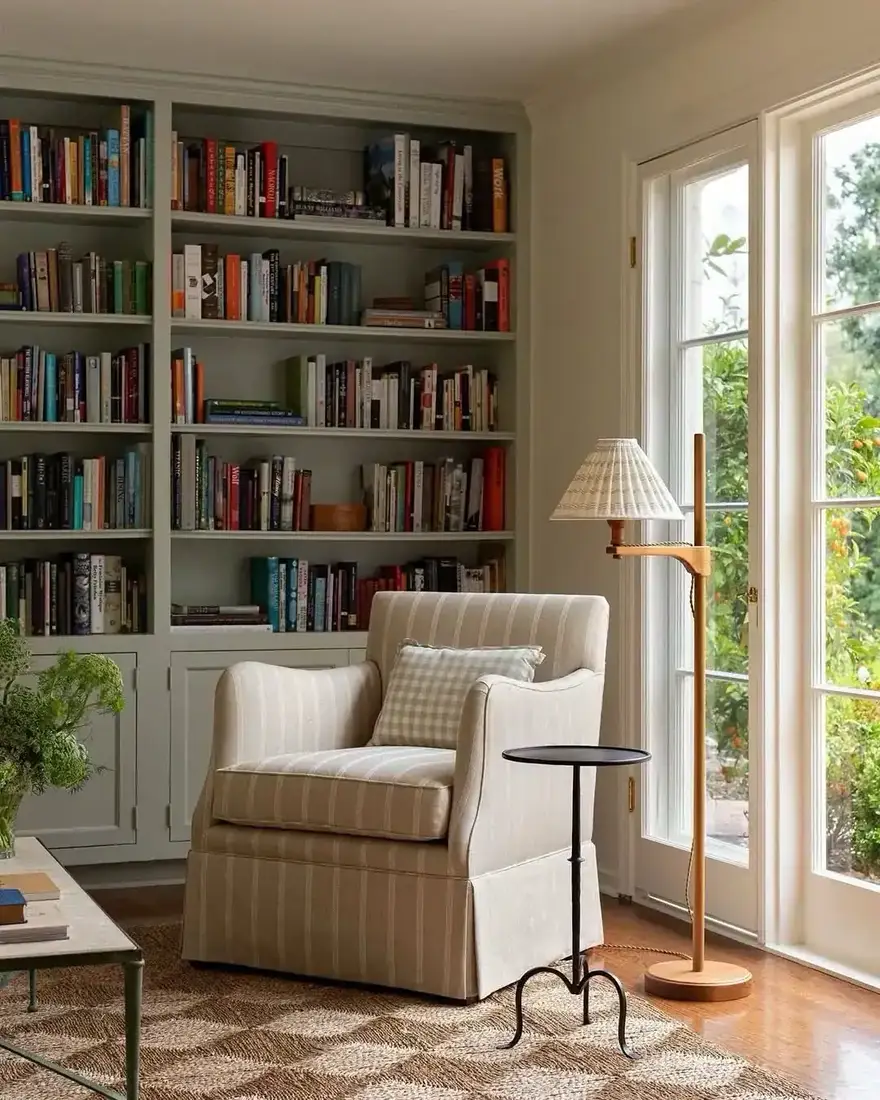
Direct light through a nearby window fades cloth and paper faster than you expect, especially reds and deep blues. You keep your favourite jackets brighter when you turn the shelf out of the sun path or add a light filter, and you protect the cloth you paid to keep. If the shelf must sit in sun, rotate the books you display and keep the best editions on the shadier side. You will thank yourself next year when the spines still hold their colour.
Echo one object, not a collection
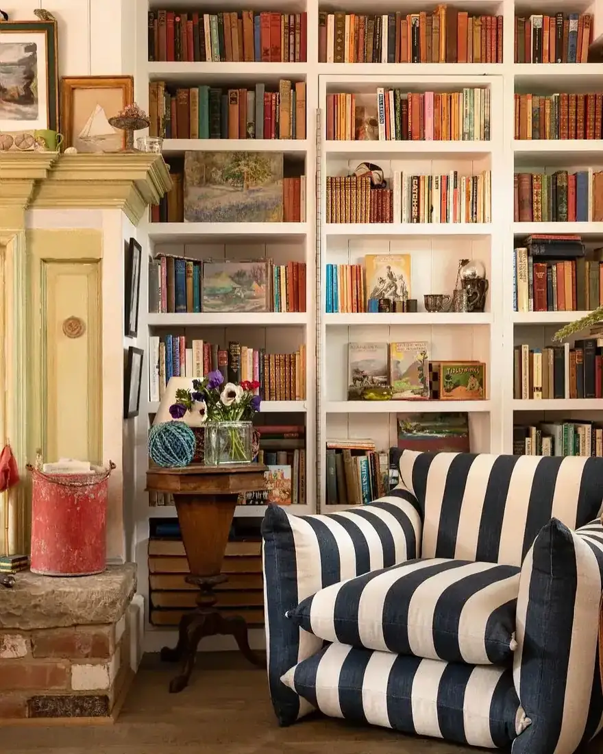
A shelf that holds one small ceramic on a stack reads as calm. A shelf that holds five small ceramics reads as a shop. Choose one object per shelf, or one per two groups, and give it the empty third as its field. That single piece, wood, ceramic or a small plant, gets attention because nothing competes beside it, and you feel the shelf breathe. You will find the wall feels more expensive when each object has its own air.
The wall you live with, not just look at
Shelves should make the room more useful, not just more photographed.
Vary height inside the wall
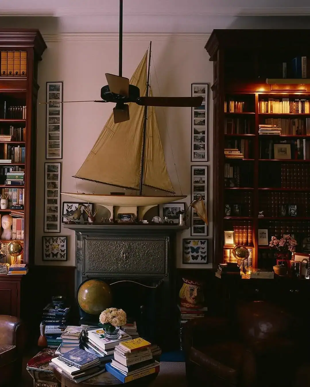
Books and objects of one height make a flat skyline that bores the eye. Mix a tall vase behind a low stack, a mid-height frame, and a low horizontal form. That variation across three tiers gives you a skyline you can read from the doorway. Keep the tallest behind, the mid in front of books, and the low along the edge, and you create depth without adding more things. When you vary height that way, you guide the eye across the wall and you keep the shelf interesting from across the room.
Add a window seat so shelves get used
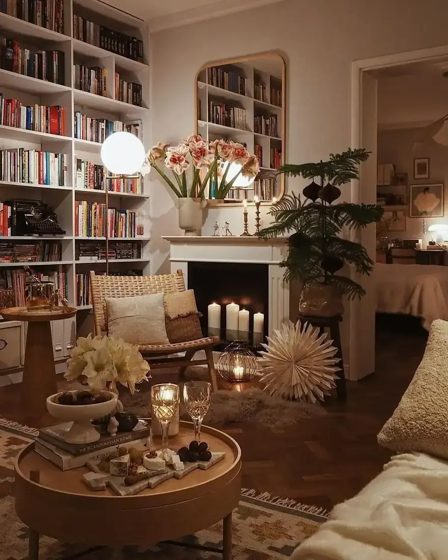
A shelf wall without a place to read stays a display. A window seat between two stacks turns storage into habit. Build storage into the base, because that is the cheapest storage in the house, and keep a back cushion so you can lean without a hard wall behind you. Light over the shoulder beats light from the window in front, which backlights a book and tires you. When you test both, you feel the difference in minutes and you keep the seat you built. You will reach for the book that lives nearest the seat.
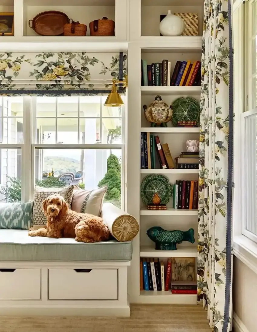
Let one wall stay calm so the other can talk
A room where every shelf shouts at once exhausts you. Keep one shelf wall restrained, with books and a single plant, and let the other hold the stacks and colour. That contrast gives your eye a quiet place to rest and a place to explore. When you step back, the calm wall makes the styled wall look more collected, and you feel the room breathe. You learn to leave one wall quiet on purpose, and you use that quiet to make the other wall speak.
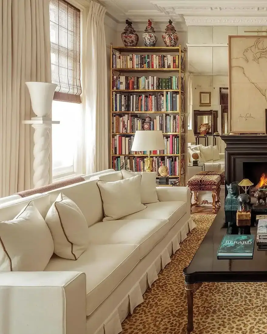
Styling choices at a glance
| Choice | How it reads | When you use it |
|---|---|---|
| A third empty | Objects read as objects | Any shelf that feels packed |
| Spines pulled forward | Clean front line, shadow | Books pushed to back wall |
| Vertical plus horizontal | Rhythm without colour | All-vertical looks like storage |
| Loose colour grouping | Collected over time | Strict rainbow looks catalogued |
| Sun off spines | Keeps colour true | Shelf in direct light |
The Bookshelf Styling Formula
- Leave a third empty. Let air be part of the composition.
- Align spines slightly back from the edge. Keep the line consistent across the shelf.
- Mix stacks and rows. One horizontal stack for every two vertical rows.
- Group colour loosely. Blues near blues, warms near warms, no strict sorting.
- Protect from sun. Turn spines out of direct light or rotate what you show.
- One object per shelf. Let the empty third be its field.
Keep those six and your shelves look gathered, not filled.
Frequently Asked Questions
How empty should a styled bookshelf be?
Roughly a third of each shelf. Objects need the gap to read as objects, and books need it to read as chosen rather than crammed.
Should I push books to the back of the shelf?
No. Pull spines forward so they sit slightly back from the shelf edge in a consistent line. That small shadow adds depth.
Should I stack books horizontally or stand them vertically?
Mix both. One horizontal stack among vertical rows gives rhythm.
How do I group books by colour?
Loosely rather than strictly. Keep similar tones near each other so the shelf reads collected, not catalogued.
Will sun fade my books?
Yes. Direct sunlight fades cloth and paper faster than you expect. Keep spines out of the sun path or add a filter.
How many objects should I add per shelf?
One for every two book groups at most. When you leave the empty third as its field, the object reads as intentional.
This article may contain affiliate links. We may earn a commission at no extra cost to you.