Your Brass Finish Can Ruin Your Blue Cabinets

Add us as a preferred source to see more stories on Google.
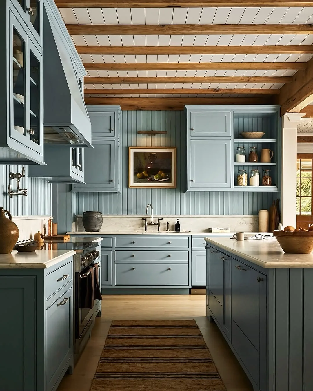
Everyone agrees navy plus brass wins. Nobody mentions the brass has to match the blue.
Polished brass on pale powder blue shouts like jewelry on a sundress. Antique brass on deep navy disappears entirely. The most pinned combination in kitchens fails daily on finish alone, before paint placement even enters the conversation.
Depth decides finish, placement decides weight, and your evening bulbs decide everything. Here are blue kitchen cabinet ideas that earn their reputation instead of assuming it.
Grade the blue before anything else
You’ll sort depths the way painters sort values. Three ideas place every blue correctly.
Sort your blues into three buckets
Pale powder, dusty mid-tone and deep navy behave like different colors entirely. You’ll assign your favorite to its bucket first, because each bucket carries different rules for metal, light and placement. Treating all blues as one color is the original mistake.
You’ll notice pale blues need the most protection: soft light, muted company, gentle contrast. Mid-tones forgive nearly everything and suit most rooms. Navies demand light, shine and confidence. When you know your bucket, every later choice narrows to the few that flatter it. Vagueness about depth causes most blue regret.
Test navy at night, never at noon
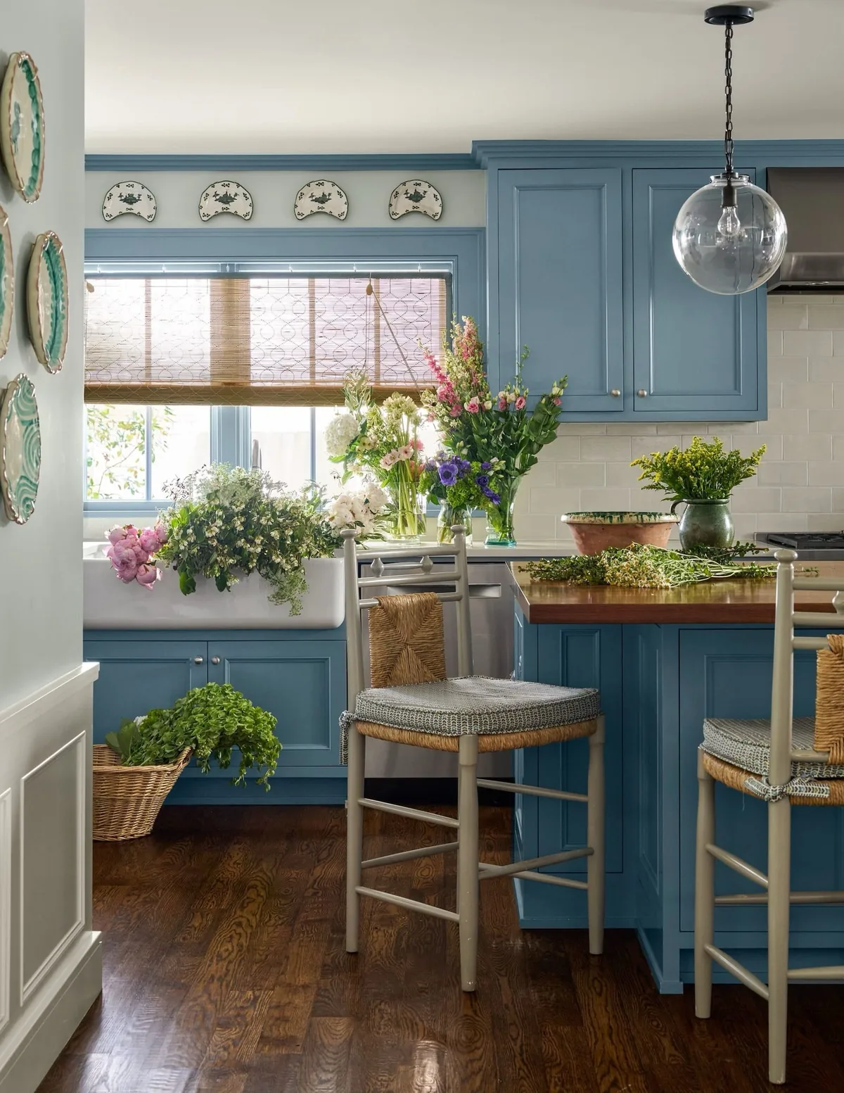
Showroom spots flatter navy into richness your kitchen may never reproduce. You’ll judge your finalists at 9pm under your own bulbs, when navy shows its true evening self. Dim rooms drag navy toward black, and no hardware rescues a color that only worked under retail lighting.
You’ll also test with your actual lamp plan burning, not the overheads alone. Under-cabinet strips, pendants and sconces each shift navy differently. When the color holds depth without going flat black at night, you’ll sign. Noon approval means nothing in a room you cook in after dark.
Keep full navy out of small dim rooms
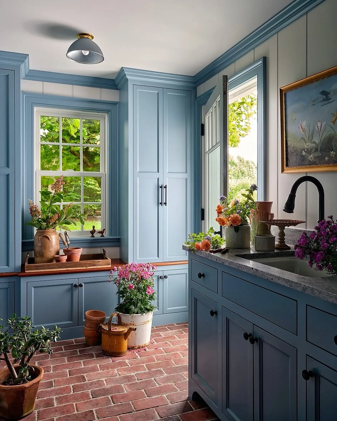
Navy on every cabinet in a tight dim kitchen closes the walls in daily. You’ll confine deep blue to lowers or the island where light is weakest, keeping uppers cream or open. The color stays bold and intentional instead of oppressive, and the room keeps breathing.
You’ll break this rule only with generous windows or serious layered light to earn it. Small bright rooms take more navy than large dim ones, because light matters more than footage. When in doubt you’ll paint the island navy first and live with it a season. Reversible drama beats permanent regret.
Finish the metal to the depth
One brass does not fit all blues. Four ideas pair them correctly.
Mute the brass as the blue pales
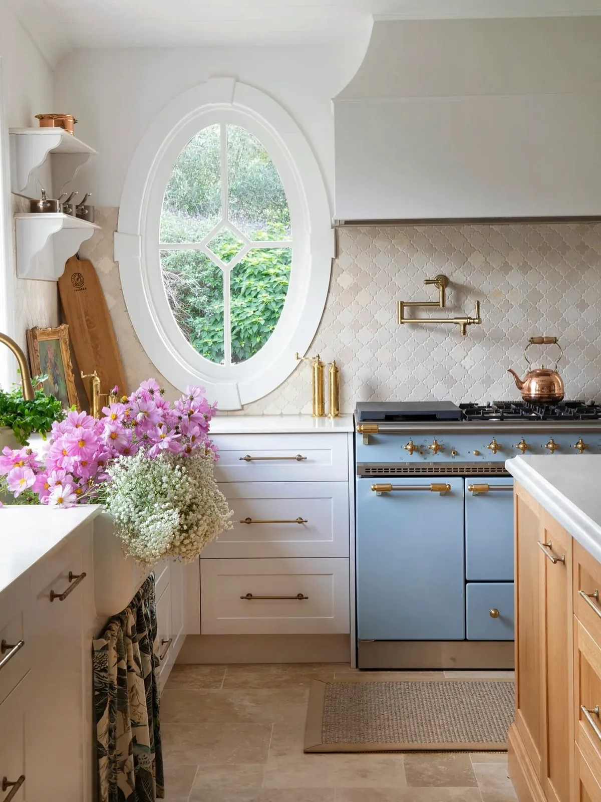
Shine scales inversely with delicacy. You’ll finish pale powder blue with brushed or aged brass that whispers, because polished pulls scream against quiet color. The softer the blue, the quieter the metal, and the whole kitchen stays conversational.
You’ll test pulls against your actual doors, not on the counter alone. Metal reads louder mounted on color than loose in your palm. When the combination feels calm at arm’s length, you’ll order. Loud hardware on pale doors is the fastest way to make an expensive kitchen look anxious.
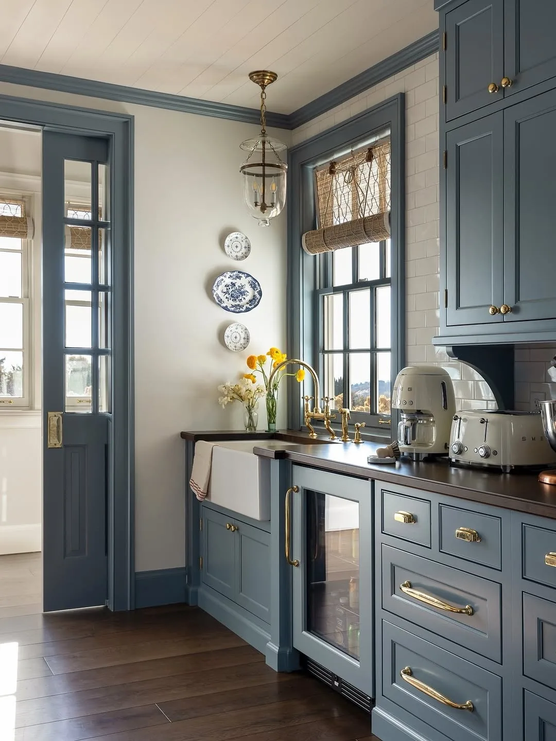
Shine the brass as the blue deepens
Navy swallows quiet metals whole. You’ll finish deep blues with satin or polished brass carrying enough reflection to stand out of the dark. Antique patina that charms on dusty blue simply vanishes on navy, leaving expensive hardware invisible.
You’ll carry the shine through faucet and pendants so the metal reads as one decision. Scattered finishes on dark cabinets look accidental, while one reflective family glows like jewelry against midnight. When brass catches lamplight across the room, you’ll know the finish earns its place. Dark blue demands metal with presence.
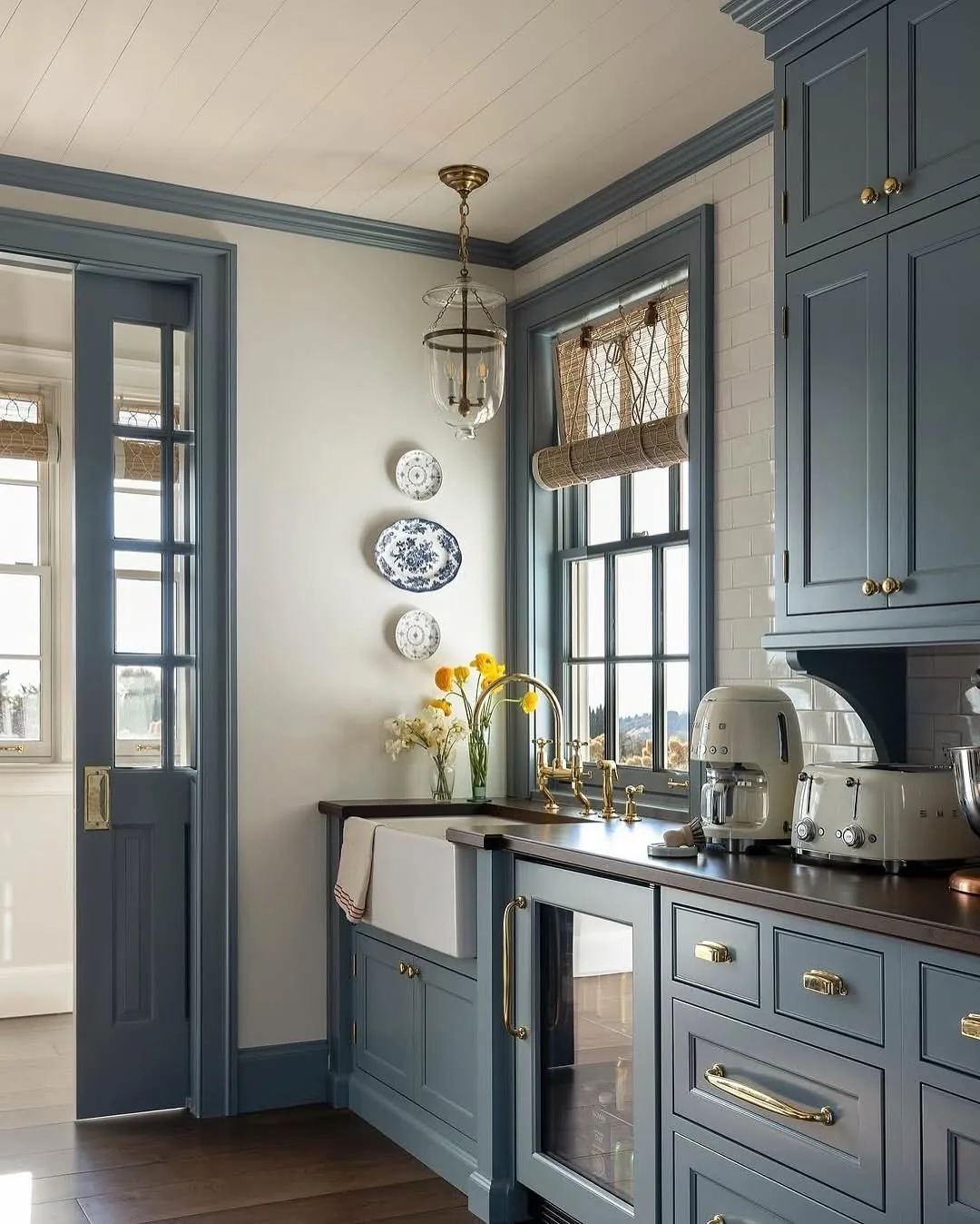
Unify every brass or admit the clash
Mixed brass tones read as mistakes, never eclecticism. You’ll source pulls, faucet and lighting in one finish family so they age together. Unlacquered pieces patina over their first year while lacquered stay bright, and mixing the two splits your metals into visibly different ages.
You’ll buy one knob first and live with it a month by the sink. That single piece previews patina, fingerprints and cleaning reality better than any showroom. When the whole room’s metal comes from one decision, the palette holds for decades. Scattered sourcing shows within a year, and you’ll see it daily.
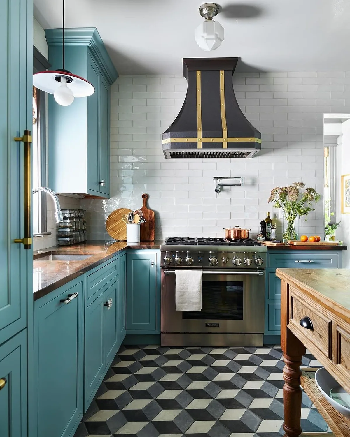
Ground blue with black in one measured dose
Black range hoods, faucets or island bases sharpen blue kitchens like eyeliner. You’ll dose it once, maybe twice, and stop. Black repeats the depth of navy at a different texture, giving the eye a second anchor without another color to manage.
You’ll keep black matte or satin, never glossy, against blue. Shine belongs to brass here; black works as shadow. A black faucet with brass pulls sounds mixed but reads layered when each metal owns its role. When black stays in its lane, blue looks tailored. When it spreads, the kitchen goes tuxedo.
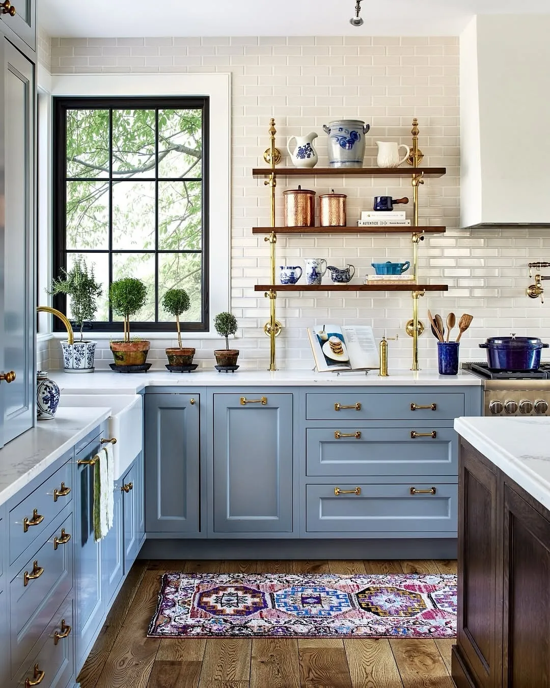
Set blue into the room
Placement, stone and cottage charm decide whether blue belongs. Four ideas settle it in.
Pair blue with marble, never cold quartz
White marble veining lifts blue the way cream lifts navy walls. You’ll choose honed marble or warm quartzite with movement, because flat blue-white engineered slabs chill the palette clinical. Stone should warm blue, not file it away.
You’ll carry a door sample to the yard and judge in daylight. Showroom spots lie about temperature the way they lie about navy. When veining picks up your wood tones and brass hints, the stone joins the family. Cold slabs make even perfect blues feel installed rather than designed.
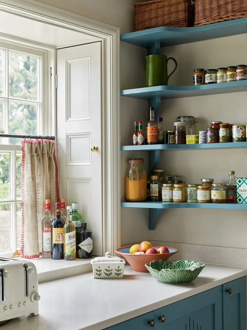
Open shelves to relieve blue density
Blue lowers with open shelving above breathe where blue uppers would press. You’ll style cream dishes and wood boards against the blue, letting daily objects warm the color. Our open shelving kitchen ideas guide covers depths, brackets and the dusting reality.
You’ll edit shelves to breathing room, because crowded shelves on blue read as clutter faster than on white. Three objects per shelf with air between them beats a full display. When open wood and cream hover over blue, the kitchen gains a cottage ease that full cabinetry never offers. Density needs relief, and shelves are it.
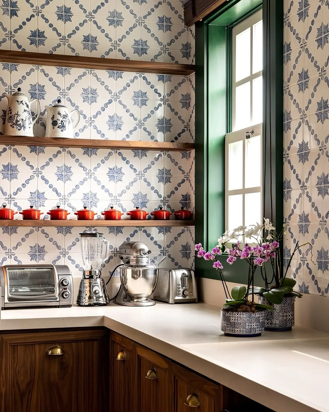
Tile pattern at one address only
Patterned tile plus blue cabinets plus veined stone equals three patterns arguing. You’ll grant pattern a single address: backsplash or floor, never both. The other surfaces stay quiet so the chosen one sings.
You’ll pull one color from the tile into a textile elsewhere, a runner or Roman shade, so the pattern belongs to the room. Orphan patterns decorate while related ones compose. When tile, blue and stone each know their role, the kitchen reads designed in one sitting. Two pattern addresses start a feud you’ll referee daily.
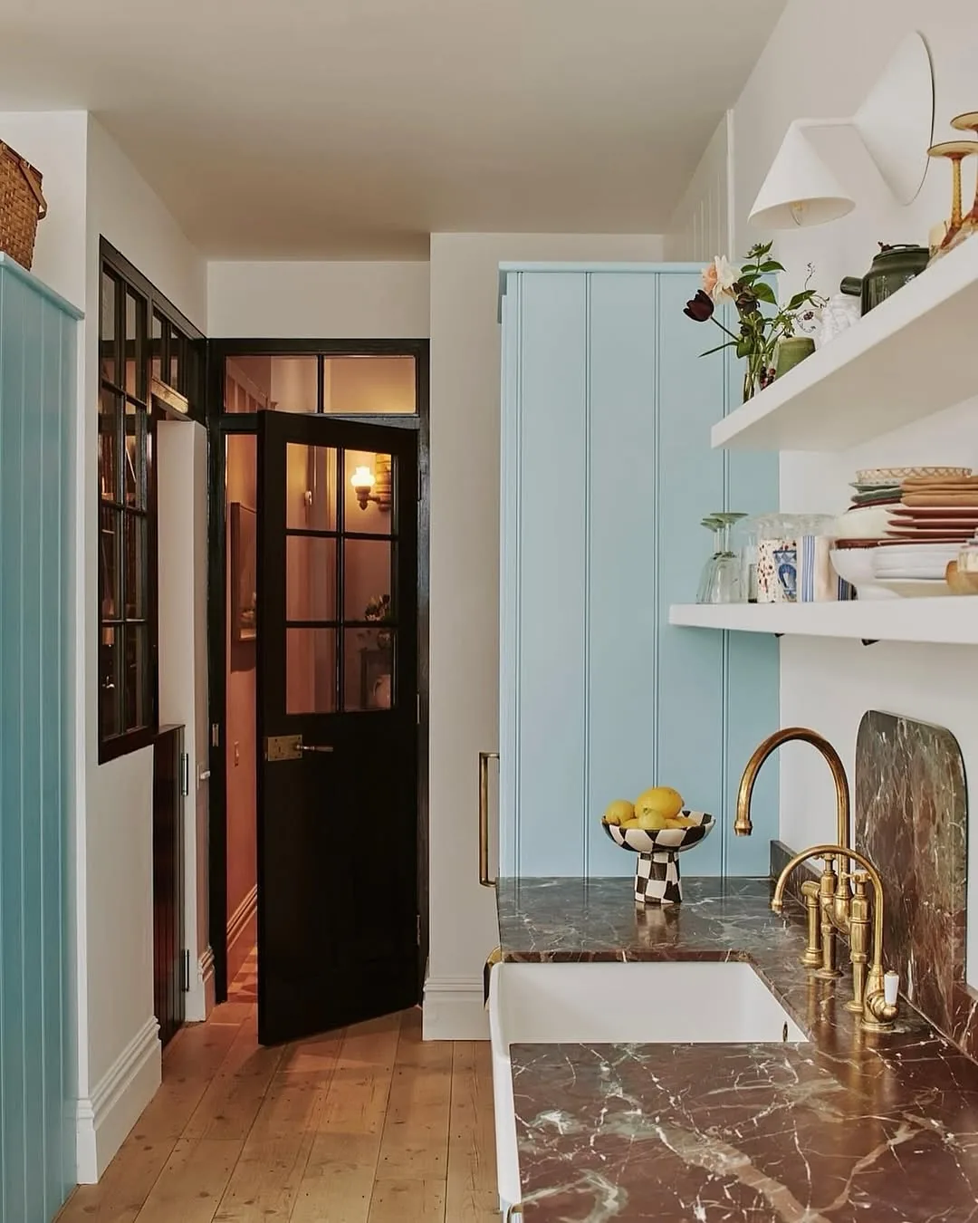
Keep one jewel for the pantry nook
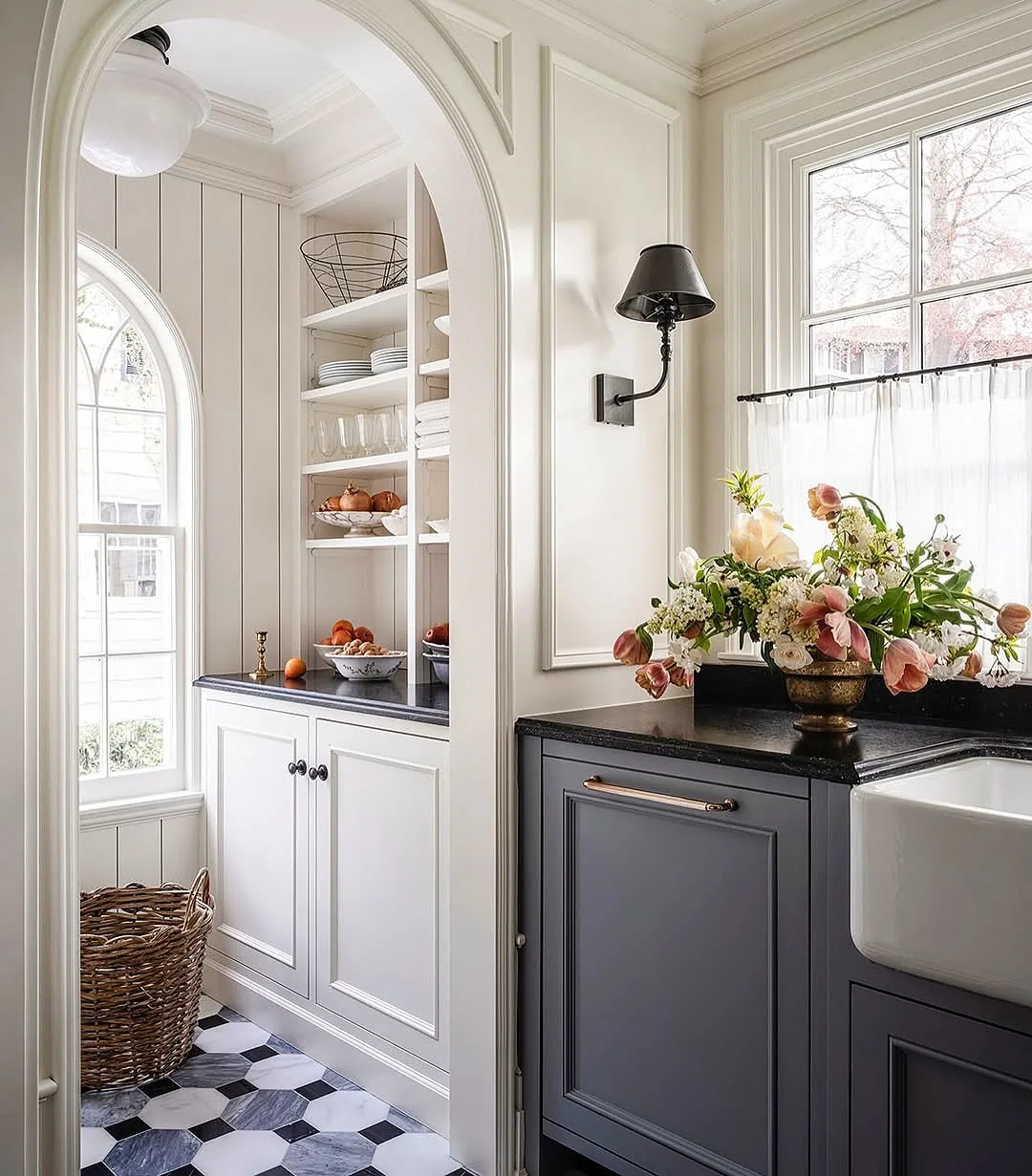
Small blue spaces take risks big kitchens can’t. You’ll drench the pantry, bar nook or scullery in your boldest blue with marble and brass, creating a jewel box off the main room. For planning that back kitchen as a working room, see our butler pantry and scullery ideas. Confined drama delights precisely because you can leave it.
You’ll light the nook warmly and line shelves in cream so contents glow against the blue. These secondary spaces forgive the navy-black depth that would crush a main kitchen. When the bold move lives behind a doorway, you’ll enjoy it forever without negotiating it daily.
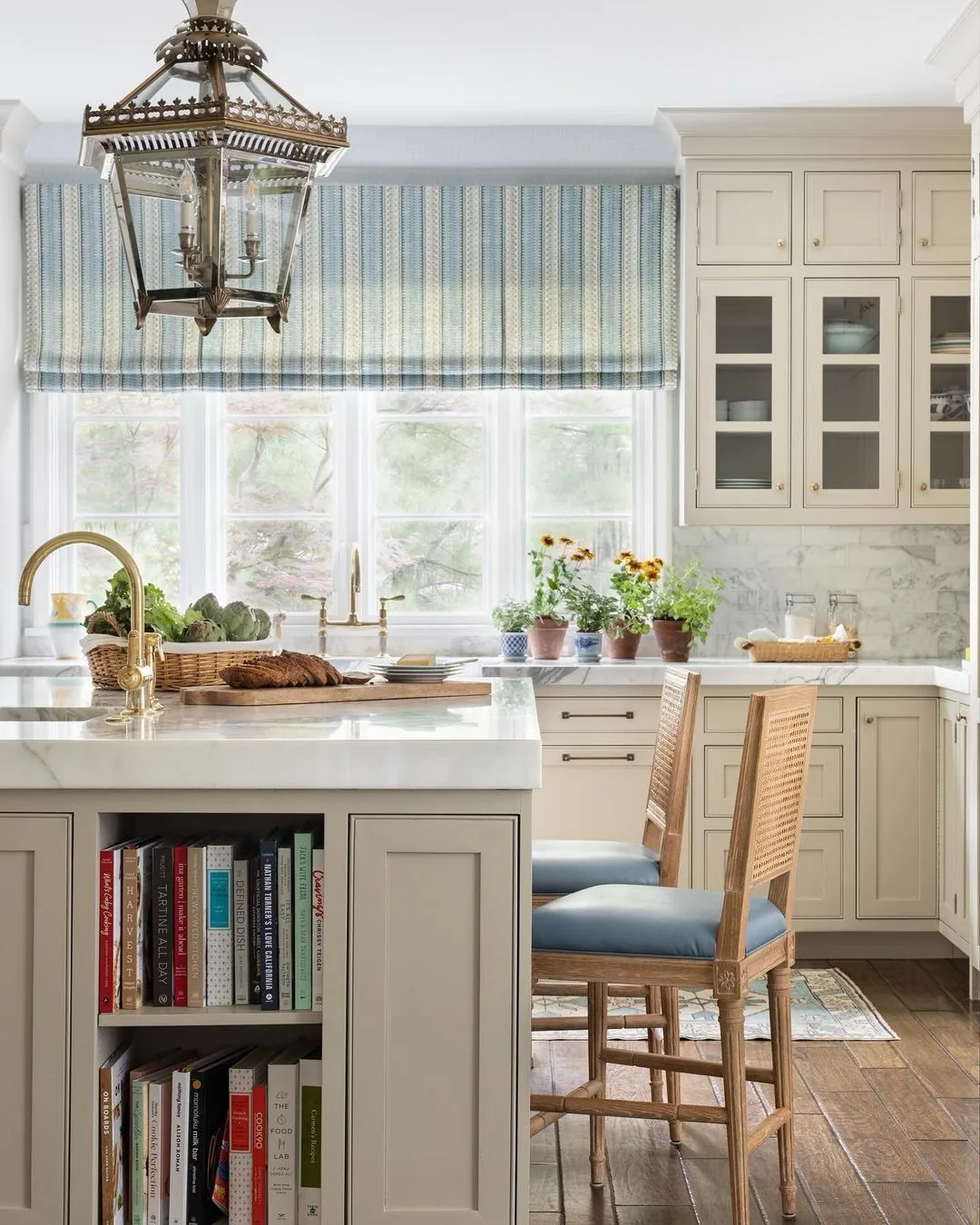
Tune blue to your house style
Coastal, cottage and farmhouse each pull blue differently. Four ideas speak each dialect.
Salt the coastal blue with sun-bleach
Coastal blue means pale, weathered and relaxed. You’ll choose soft teal-tinged blues with weathered brass, linen shades and light woods that read sun-bleached rather than decorated. The palette should feel found on a walk, not ordered from a catalog.
You’ll keep whites warm and woods pale, because coastal lives on bleached brightness. Stark contrasts belong to navy kitchens, not shore ones. When the room feels like noon in July year-round, you’ve salted correctly. Coastal blue whispers where navy announces, and both are right in their own houses.
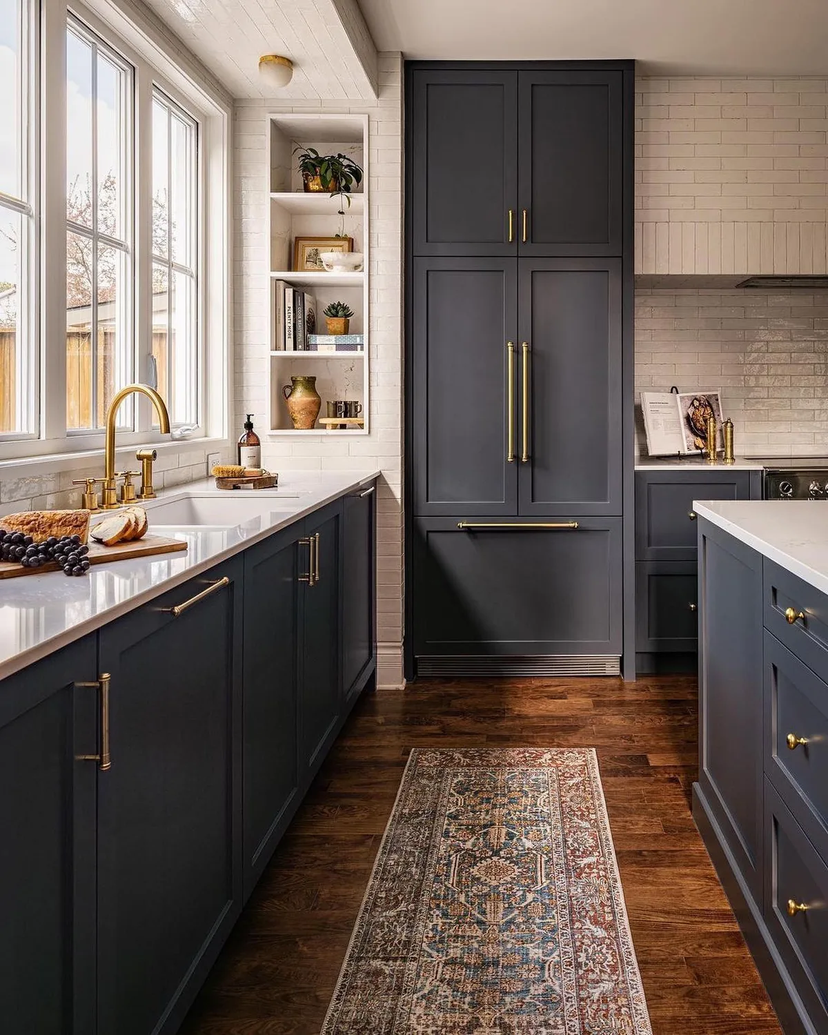
Age the cottage blue gracefully
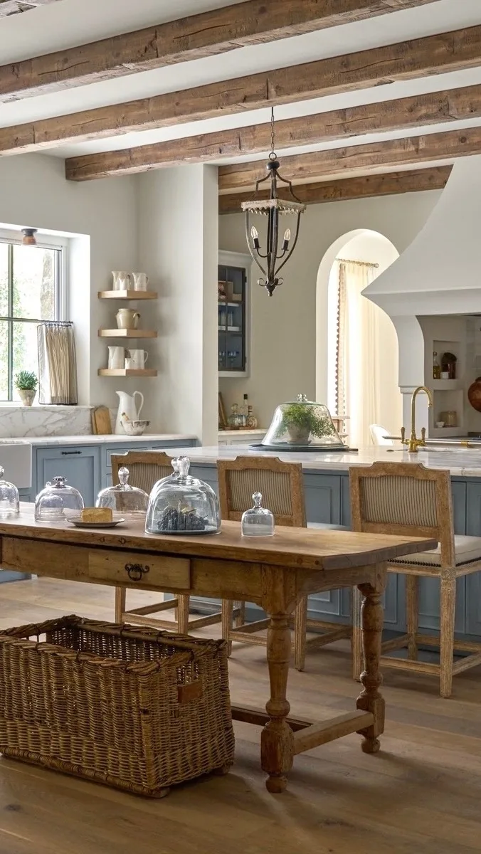
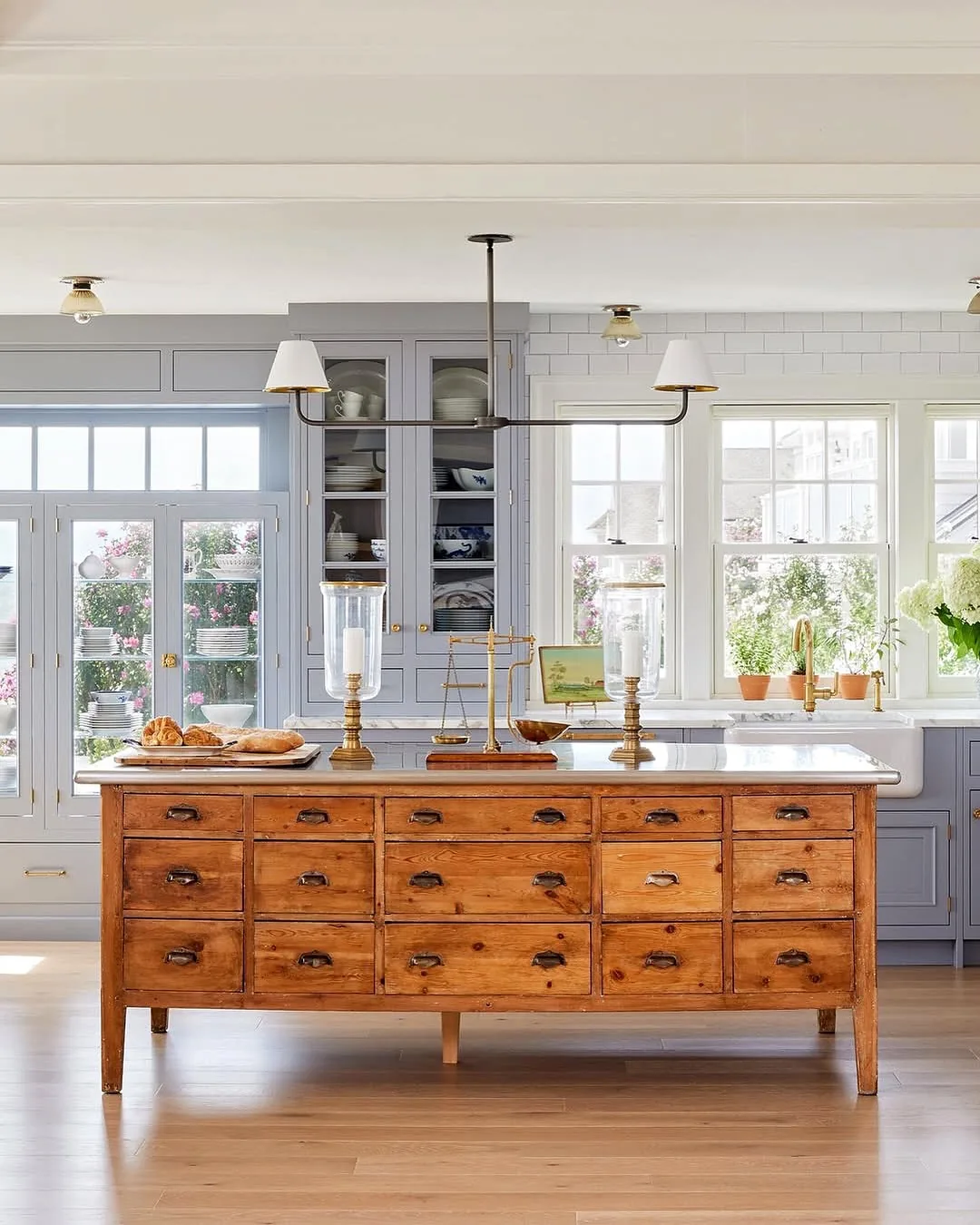
Cottage blue wants chalky softness and honest wear. You’ll pick dusty slate or powder blue with antique cup pulls, then let edges wear gracefully instead of touching up obsessively. Cottage charm is patina permission, granted in advance.
You’ll pair it with an apron sink and open shelving for the full idiom. Our farmhouse sink ideas guide sizes the basin this look centers on. When blue, sink and shelves share the same soft age, the kitchen feels inherited rather than installed. New cottage kitchens fail by looking too finished.
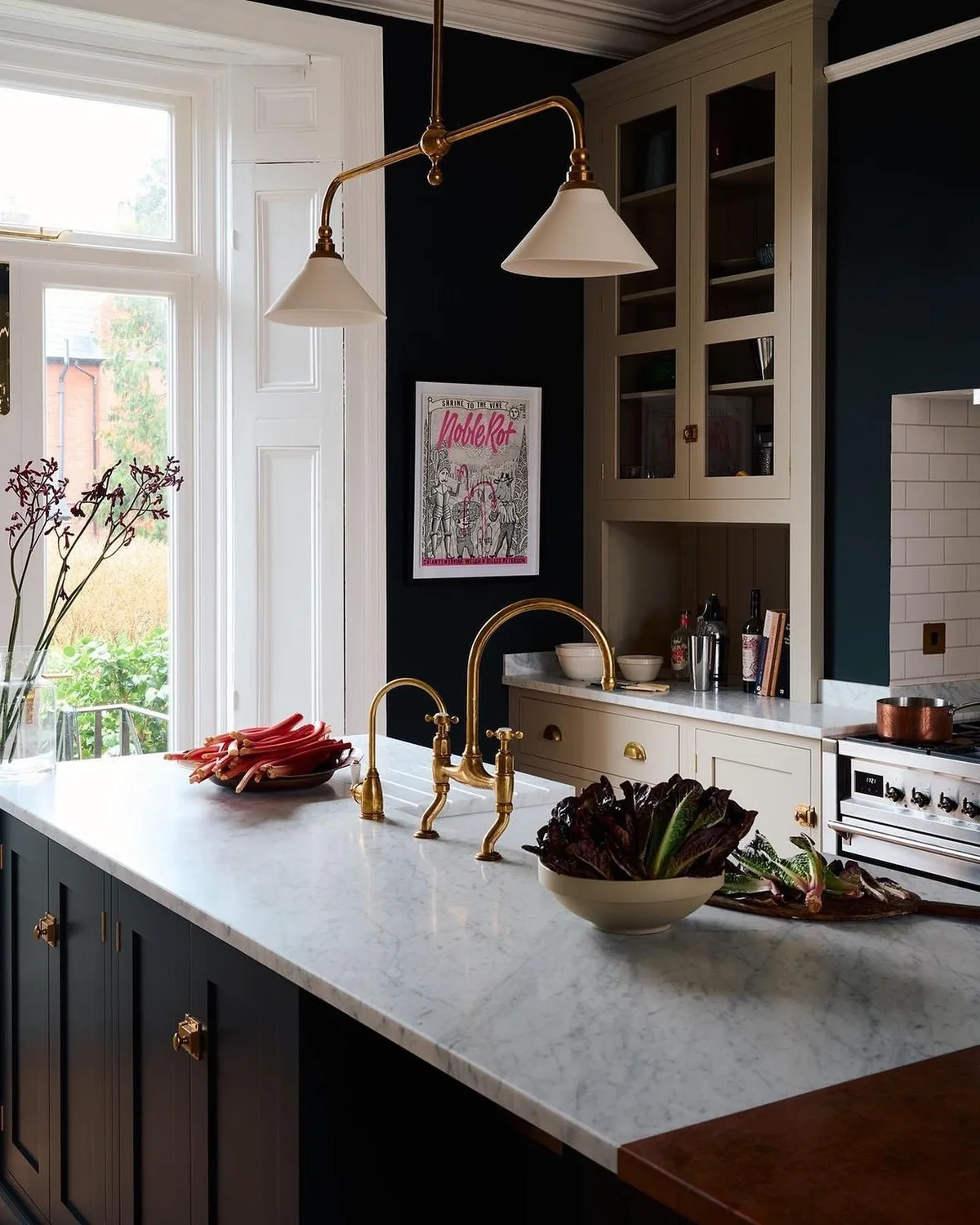
Judge blue kitchen cabinet ideas by your own bulbs first
No showroom replicates your evenings. You’ll screw in your actual bulbs, dim to dinner level and judge every blue finalist there before committing. Under-cabinet strips, pendants and sconces each shift blue differently, and only your room tells the truth.
You’ll photograph finalists at night, since cameras exaggerate casts your eyes forgive. Green-leaning blues go mossy, violet-leaning go icy, and the photo shows it first. When the night shot still pleases you, the color survives real life. Noon approval means nothing in rooms cooked in after dark.
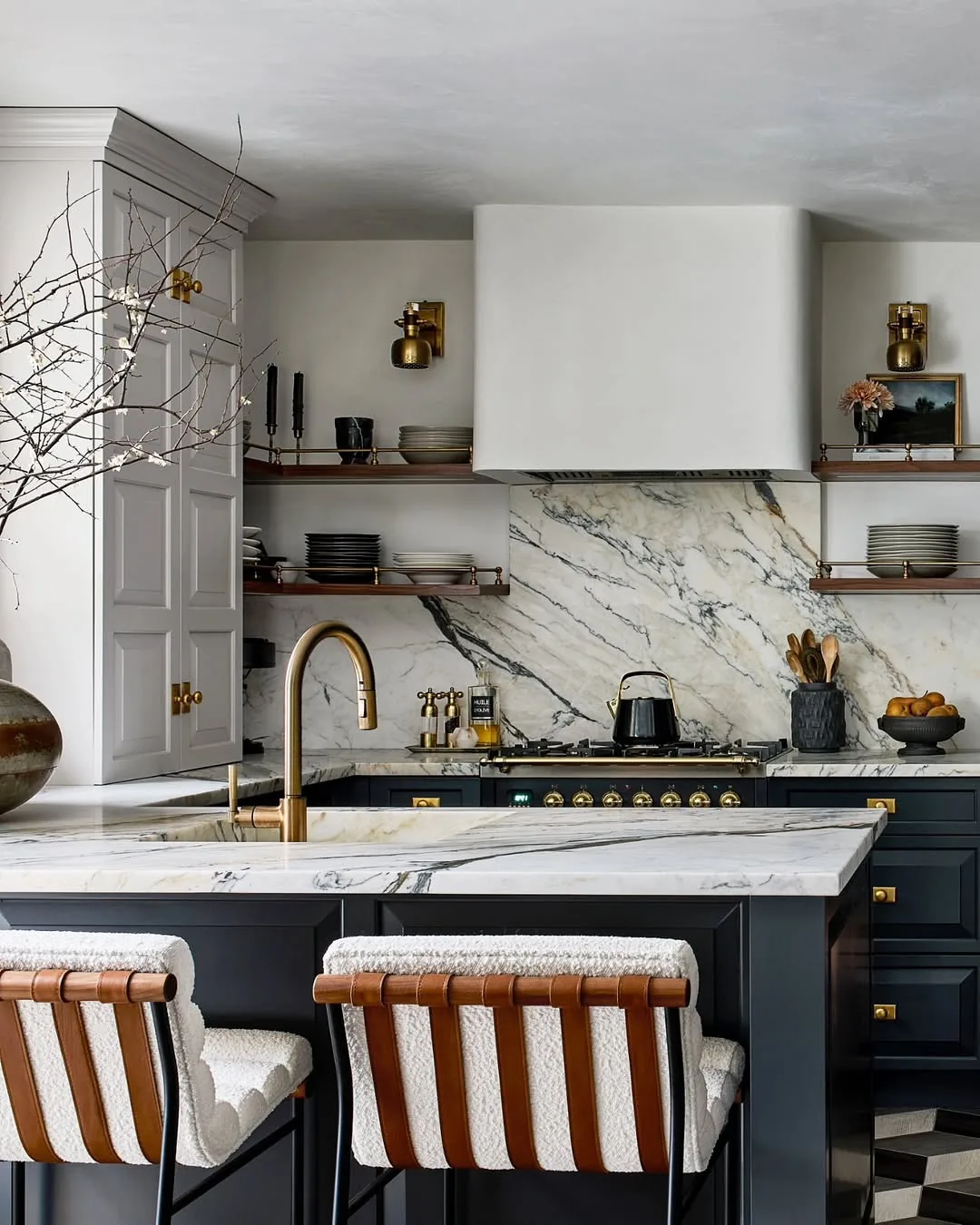
Warm navy walls of cabinetry with timber floors
Navy kitchens on grey floors chill no matter the hardware. You’ll lay warm oak or honey-toned wood beneath blue, pulling brass warmth down to the ground plane. Floors cover the most area, so their temperature vote outweighs every other surface.
You’ll bridge existing cool floors with a large warm runner when replacement waits. That textile layer does surprising thermal work visually. When feet, wood and brass all agree warm, navy relaxes into its celebrated depth. Cold underfoot makes even perfect navy feel like a beautiful refrigerator.
Pale versus dusty versus navy at a glance
| Pale powder | Dusty mid-tone | Deep navy | |
|---|---|---|---|
| Brass | Muted, brushed, aged | Satin, unlacquered | Reflective, polished |
| Placement | Anywhere, gently | Most rooms freely | Lowers, island, nooks |
| Light needs | Forgiving | Moderate | Demands layered warm |
| Stone | Warm white quartz | Warm marble | Honed marble, soapstone |
| Risk | Washes out | Almost none | Reads black when dim |
| Verdict | Softest blue | Easiest blue | Boldest blue |
The Blue Cabinet Formula
If you strip all fifteen ideas down to a plan, it reads like this:
- Bucket the blue. Pale, dusty or navy, each with its own metal and light rules.
- Night-test everything. 9pm under your bulbs decides, never noon in store.
- Finish metal to depth. Muted for pale, reflective for navy, one family throughout.
- Stone warm, tile once. Marble with movement, pattern at one address.
- Place weight low. Navy lives on lowers and islands, cream above.
- Wood underfoot. Warm floors or runners pull brass warmth downward.
Get those six right and blue earns its reputation. You’ll own the timeless kitchen instead of the trendy one.
Frequently Asked Questions
What blue is best for kitchen cabinets?
Dusty mid-tone blues suit most rooms with least risk, and these blue kitchen cabinet ideas return to them constantly. You’ll go pale for airy coastal rooms and navy for confident well-lit ones. Bucket your favorite first, since each depth carries different metal and light rules.
What hardware goes with blue cabinets?
Brass matched to depth: muted brushed or aged on pale blue, reflective satin or polished on navy. You’ll unify pulls, faucet and lights in one family. Mixed metals read as mistakes against blue, never eclecticism.
Is navy too dark for a small kitchen?
Full navy, usually yes. You’ll confine it to lowers or the island with cream above, which keeps drama without closing walls in. Small bright rooms take more navy than large dim ones, since light outranks footage.
What counters suit blue cabinets?
Honed marble or warm quartzite with movement that shares your wood tones. You’ll avoid flat blue-white quartz that chills the palette clinical. Carry a door sample to the yard and judge in daylight.
Can I mix blue cabinets with wood floors?
You’ll insist on it with navy. Warm oak or honey wood pulls brass warmth to the ground plane and stops blue reading cold. Grey floors chill navy beyond what hardware can rescue, so bridge with a large warm runner.
Does blue go out of style in kitchens?
Navy and dusty blues have outlasted every cycle by reading as neutrals with depth. You’ll avoid electric or icy blues that timestamp instantly. Muted complex blues age like libraries, not like trends.
This article may contain affiliate links. We may earn a commission at no extra cost to you.